Basic Form Components
These components are expected to be used within a form element of your own, placed inside the content section of a blade file that extends adminlte::page. Read the usage page for the layout sections, and the components intro for the attribute and slot conventions used below. At next you can see the list of available components:
| Components |
|---|
| InputGroup, Button, Input, InputFile, Options, Select, Select2, Textarea |
A typical page therefore looks like this, and every example of this page is meant to be placed where the comment is:
{{-- resources/views/profile.blade.php --}}

@extends('adminlte::page')

@section('content')
    <form method="POST" action="{{ url('profile') }}">
        @csrf

        {{-- The form components of this page go here --}}

    </form>
@stop
Input Group Component
IMPORTANT
This component is not intended to be used directly, but it provides a base layout and some properties that other components may extend. Read it once, because every other component of this page (and of the advanced form components page) inherits the attributes and the slots described here.
This component represents an empty input group to easily generate form controls by adding text, icons, buttons on either side of textual inputs, custom selects, or custom file inputs. At next, you can see the list of supported attributes.
NOTE
Two abbreviations are used all over the form components:
fgroupstands for form group, the outer container that wraps the label, the control and the validation message of one field.igroupstands for input group, the inner Bootstrap 5.3 input group that holds the control together with its add-ons (an icon, a text, a button placed before or after the control).
| Attribute | Description | Type | Default | Required |
|---|---|---|---|---|
| disable-feedback | Disables the invalid feedback notification for the input group | any | null | no |
| error-key | The key under which Laravel stored the validation message on the $errors bag. Without it, the name attribute is used | string | null | no |
| fgroup-class | Additional classes for the form group, the main container of the component | string | null | no |
| id | The id attribute for the underlying input group item | string | null | no |
| igroup-class | Additional classes for the input-group container | string | null | no |
| igroup-size | The input group size (you can specify sm or lg values only) | string | null | no |
| label | The label for the input group | string | null | no |
| label-class | Classes for the label container (to customize the label) | string | null | no |
| name | The name and default id attribute for the underlying input group item | string | - | yes |
The name attribute is the only required property and will be used as the default id property when no other is provided. Also, the lookup key for validation errors will be automatically generated from the name property if no error-key is specified. For example, when you want to submit multiple files from a file input field, you can setup name property as files[] in order to submit the file names inside an array called files, in this case the auto-generated lookup key for validation errors will be files.
IMPORTANT
Bootstrap 5.3 dropped the form-group class in favour of the spacing utilities, so the main container of the component is rendered with the mb-3 class (the same one used by the AdminLTE v4 form pages). The label is rendered with the Bootstrap 5.3 form-label class, and the classes given with label-class are appended to it.
NOTE
Default spacing. The mb-3 on the form group is only added when you do not provide a bottom margin yourself through fgroup-class. A mb-* or my-* class (values 0 to 5, or auto) in fgroup-class wins and suppresses the default:
<x-adminlte-input name="a"/>                        {{-- class="mb-3" --}}
<x-adminlte-input name="b" fgroup-class="mb-0"/>    {{-- class="mb-0" --}}
<x-adminlte-input name="c" fgroup-class="my-4 px-2"/> {{-- class="my-4 px-2" --}}
Any other class you pass in fgroup-class (a grid column, a padding utility, …) is simply appended and the mb-3 default still applies. This check exists because the Bootstrap spacing utilities are all declared with !important at the same specificity, so simply adding a second margin class would not reliably override the first one — the winner would be decided by the order of the rules in the stylesheet, not by the order you wrote them.
The Card (mb-4) and Progress (mb-2) widgets follow the same rule, but they read the margin from their plain class attribute instead.
NOTE
Bootstrap 5.3 also removed the input-group-prepend and input-group-append wrappers: the add-ons are now direct children of the .input-group element. The prependSlot and appendSlot slots below already emit the correct markup, so your add-ons only need the input-group-text (or a button) element.
You should note that all the others components that extends from this one will have the previous set of attributes available on their interface. This component also defines some slots that can be used to push add-ons into the input group:
Slots
- prependSlot: Use this slot to prepend an add-on in the input group item.
- appendSlot: Use this slot to append an add-on in the input group item.
- bottomSlot: Use this slot to add extra information or markup below the input group item.
On top of those three, the components that wrap a control with inner markup also expose a default slot, which fills the control itself: the option elements of a Select, Select2 or SelectBs, and the initial content of a Textarea or a TextEditor.
Validation State and Accessibility
When the input group is invalid, the control itself declares the state and points at the block holding the message. You do not write the next markup, it is what the component generates for you:
<input id="email" class="form-control is-invalid"
       aria-invalid="true" aria-describedby="email-error">
...
<span id="email-error" class="invalid-feedback d-block" role="alert">
    <strong>The email field is required.</strong>
</span>
The identifier of the feedback block is always the id of the control suffixed with -error. A screen reader therefore announces the error together with the field instead of leaving it unassociated. An aria-describedby of your own wins over the generated one, so pass both identifiers when the field also has a hint.
Every component extending the input group inherits this behaviour, the InputSlider included, where the attributes land on the div that noUiSlider renders into rather than on the hidden input holding the submitted value.
Button
This component represents an AdminLTE styled button. The following attributes are available:
| Attribute | Description | Type | Default | Required |
|---|---|---|---|---|
| icon | An icon for the button (Bootstrap Icons by default) | string | null | no |
| label | The visible label (text) for the button | string | null | no |
| theme | The button style theme: primary, secondary, info, success, warning, danger, light, dark, any outline-* variant, or any color of the AdminLTE extended palette like teal or navy (which requires the assets.extended_colors option to be enabled). The AdminLTE v3 color names are mapped on the fly. See About the theme Attribute | string | 'default' | no |
| type | The button type (button, submit or reset) | string | 'button' | no |
Any other attribute you define will be directly inserted into the underlying button tag. You can, for example, define a class, onclick, title or any other attribute you may need.
IMPORTANT
Bootstrap 5 removed the btn-default class, so the legacy 'default' theme is mapped to the Bootstrap 5 secondary theme. The btn-flat class of AdminLTE v3 does not exist anymore either.
Slots
The default slot is rendered after the icon and the label, so a button can carry markup that the escaped label attribute cannot express:
<x-adminlte-button theme="primary" icon="bi bi-inbox" label="Inbox">
    <span class="badge text-bg-light ms-1">3</span>
</x-adminlte-button>
Examples
{{-- Button with minimal setup --}}
<x-adminlte-button label="Button"/>

{{-- A disabled button --}}
<x-adminlte-button label="Disabled" theme="dark" disabled/>

{{-- Button with themes and icons --}}
<x-adminlte-button label="Primary" theme="primary" icon="bi bi-key"/>
<x-adminlte-button label="Secondary" theme="secondary" icon="bi bi-hash"/>
<x-adminlte-button label="Info" theme="info" icon="bi bi-info-circle"/>
<x-adminlte-button label="Warning" theme="warning" icon="bi bi-exclamation-triangle"/>
<x-adminlte-button label="Danger" theme="danger" icon="bi bi-slash-circle"/>
<x-adminlte-button label="Success" theme="success" icon="bi bi-hand-thumbs-up"/>
<x-adminlte-button label="Dark" theme="dark" icon="bi bi-circle-half"/>

{{-- Button with types --}}
<x-adminlte-button type="submit" label="Submit" theme="success" icon="bi bi-save"/>
<x-adminlte-button class="btn-lg" type="reset" label="Reset" theme="outline-danger" icon="bi bi-trash"/>
<x-adminlte-button class="btn-sm bg-gradient" type="button" theme="info" label="Help" icon="bi bi-question-lg"/>

{{-- Icons only buttons --}}
<x-adminlte-button theme="primary" icon="bi bi-facebook"/>
<x-adminlte-button theme="info" icon="bi bi-twitter-x"/>
At next you can check how the previous set of defined buttons are rendered:

Input
This component represents an input element, and extends from the base Input Group Component, so all the attributes from it will be inherited. Even more, you are able to setup any other attribute you generally use on an input html element without any problem. The component also defines the next additional attributes:
| Attribute | Description | Type | Default | Required |
|---|---|---|---|---|
| enable-old-support | Enable the auto retrievement and filling with the submitted value in case of validation errors | any | null | no |
IMPORTANT
The enable-old-support property offers a similar behavior as using the Laravel old() helper explicitly by your own.
Examples
{{-- Minimal --}}
<x-adminlte-input name="iBasic"/>

{{-- Email type --}}
<x-adminlte-input name="iMail" type="email" placeholder="mail@example.com"/>

{{-- With label, invalid feedback disabled, and form group class --}}
<div class="row">
    <x-adminlte-input name="iLabel" label="Label" placeholder="placeholder"
        fgroup-class="col-md-6" disable-feedback/>
</div>

{{-- With prepend slot --}}
<x-adminlte-input name="iUser" label="User" placeholder="username" label-class="text-info">
    <x-slot name="prependSlot">
        <div class="input-group-text">
            <i class="bi bi-person text-info"></i>
        </div>
    </x-slot>
</x-adminlte-input>

{{-- With append slot, number type, and sm size --}}
<x-adminlte-input name="iNum" label="Number" placeholder="number" type="number"
    igroup-size="sm" min=1 max=10>
    <x-slot name="appendSlot">
        <div class="input-group-text bg-dark">
            <i class="bi bi-hash"></i>
        </div>
    </x-slot>
</x-adminlte-input>

{{-- With a link on the bottom slot, and old support enabled --}}
<x-adminlte-input name="iPostalCode" label="Postal Code" placeholder="postal code"
    enable-old-support>
    <x-slot name="prependSlot">
        <div class="input-group-text text-success">
            <i class="bi bi-map"></i>
        </div>
    </x-slot>
    <x-slot name="bottomSlot">
        <a href="#">Search your postal code here</a>
    </x-slot>
</x-adminlte-input>

{{-- With extra information on the bottom slot --}}
<x-adminlte-input name="iExtraAddress" label="Other Address Data">
    <x-slot name="prependSlot">
        <div class="input-group-text text-primary">
            <i class="bi bi-person-vcard"></i>
        </div>
    </x-slot>
    <x-slot name="bottomSlot">
        <span class="small text-body-secondary">
            [Add other address information you may consider important]
        </span>
    </x-slot>
</x-adminlte-input>

{{-- With multiple slots, and lg size --}}
<x-adminlte-input name="iSearch" label="Search" placeholder="search" igroup-size="lg">
    <x-slot name="appendSlot">
        <x-adminlte-button theme="outline-danger" label="Go!"/>
    </x-slot>
    <x-slot name="prependSlot">
        <div class="input-group-text text-danger">
            <i class="bi bi-search"></i>
        </div>
    </x-slot>
</x-adminlte-input>
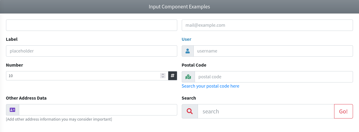
Use the next image as reference to check how every input example is rendered. Please, note in the image the inputs were wrapped inside a Bootstrap Grid System to organize them.
InputFile
IMPORTANT
No plugin is required anymore. Bootstrap 5 styles the browser's native file input with the plain form-control class, so the custom-file structure and the bs-custom-file-input plugin that were needed on AdminLTE v3 were dropped.
This component represents a file input element. This component extends from the base Input Group Component, so all the attributes from it will be inherited. The component also defines the next additional attributes:
| Attribute | Description | Type | Default | Required |
|---|---|---|---|---|
| legend | A label rendered as an input-group-text add-on attached to the file input | string | null | no |
| placeholder | [Deprecated] The placeholder for the input file box. A native file input does not support a placeholder, so the value is accepted and ignored | string | '' | no |
NOTE
Please, note the enable-old-support attribute is not supported here, due to security reasons related to the file inputs fields.
WARNING
The Browse button of a native file input is rendered by the browser itself and can't be relabeled. Because of that, the legend attribute is no longer a replacement of the Browse text: it is rendered as an input-group-text label placed right after the file input. The placeholder attribute has no visual effect at all, it is only kept so that the AdminLTE v3 markup keeps working.
All other attributes you define on the component will be inserted directly on the underlying input[type='file'] element, so you can use the standard attributes too (like accept or multiple).
Examples
{{-- Minimal --}}
<x-adminlte-input-file name="ifMin"/>

{{-- SM size, and prepend icon --}}
<x-adminlte-input-file name="ifPholder" igroup-size="sm">
    <x-slot name="prependSlot">
        <div class="input-group-text text-bg-info">
            <i class="bi bi-upload"></i>
        </div>
    </x-slot>
</x-adminlte-input-file>

{{-- With label and feedback disabled --}}
<x-adminlte-input-file name="ifLabel" label="Upload file" disable-feedback/>

{{-- With multiple slots and multiple files --}}
<x-adminlte-input-file id="ifMultiple" name="ifMultiple[]" label="Upload files"
    igroup-size="lg" legend="Choose" multiple>
    <x-slot name="appendSlot">
        <x-adminlte-button theme="primary" label="Upload"/>
    </x-slot>
    <x-slot name="prependSlot">
        <div class="input-group-text text-primary">
            <i class="bi bi-file-earmark-arrow-up"></i>
        </div>
    </x-slot>
</x-adminlte-input-file>
Use the next image as reference to check how every input example is rendered. Please, note the image was taken with an older package version, the file input now uses the native Bootstrap 5 control.

TIP
If you need a rich file input (drag and drop, previews, chunked uploads, ...), use the InputFileKrajee component, or wire up one of the jQuery free plugins recommended by AdminLTE v4 (for example filepond or dropzone, both installable through php artisan adminlte:plugins install).
Options
This component represents a set of option tags. It can be used with Select, Select2 or SelectBs components. The following attributes are available:
| Attribute | Description | Type | Default | Required |
|---|---|---|---|---|
| disabled | A list of disabled option keys | array | null | no |
| empty-option | Whether to add a selectable empty option to the list. If the value is a string, it will be used as the option label, otherwise no label will be available | bool/string | null | no |
| options | The list of options as key => value pairs | array | - | yes |
| placeholder | Whether to add a placeholder (non selectable hidden option) to the list. If the value is a string, it will be used as the placeholder label, otherwise no label will be available | bool/string | null | no |
| selected | A list of selected option keys | array | null | no |
| strict | Whether to use strict comparison between option's key and the keys of selected/disabled options | bool | false | no |
WARNING
The empty-option and the placeholder attributes are evaluated with isset(), not for truthiness. So passing a literal false (for example :empty-option="false") still adds the option, with an empty label. To leave it out, simply do not define the attribute (or pass null).
The intention of the empty-option attribute is to represent a selectable option that will submit a null value for a selection component. On the other hand, the placeholder adds a non selectable (hidden option) to the list of options that will acts as a placeholder for the selection component. As an example, note the next components definition:
{{-- Options with empty option --}}
<x-adminlte-options :options="['Option 1', 'Option 2', 'Option 3']"
        disabled="1" empty-option="Select an option..."/>

{{-- Options with placeholder --}}
<x-adminlte-options :options="['Option 1', 'Option 2', 'Option 3']"
        disabled="1" placeholder="Select an option..."/>
They will be rendered as the next option elements:
{{-- Options with empty option --}}
<option value="">Select an option...</option>
<option value="0">Option 1</option>
<option value="1" disabled="">Option 2</option>
<option value="2">Option 3</option>

{{-- Options with placeholder --}}
<option class="d-none" value="">Select an option...</option>
<option value="0">Option 1</option>
<option value="1" disabled="">Option 2</option>
<option value="2">Option 3</option>
Other Examples
{{-- Example with empty option (for Select) --}}
<x-adminlte-select name="optionsTest1">
    <x-adminlte-options :options="['Option 1', 'Option 2', 'Option 3']" disabled="1"
        empty-option="Select an option..."/>
</x-adminlte-select>

{{-- Example with placeholder (for Select) --}}
<x-adminlte-select name="optionsTest2">
    <x-adminlte-options :options="['Option 1', 'Option 2', 'Option 3']" disabled="1"
        placeholder="Select an option..."/>
</x-adminlte-select>

{{-- Example with empty option (for Select2) --}}
<x-adminlte-select2 name="optionsVehicles" igroup-size="lg" label-class="text-info"
    data-placeholder="Select an option...">
    <x-slot name="prependSlot">
        <div class="input-group-text text-bg-info bg-gradient">
            <i class="bi bi-car-front"></i>
        </div>
    </x-slot>
    <x-adminlte-options :options="['Car', 'Truck', 'Motorcycle']" empty-option/>
</x-adminlte-select2>

{{-- Example with multiple selections (for Select) --}}
@php
    $options = ['s' => 'Spanish', 'e' => 'English', 'p' => 'Portuguese'];
    $selected = ['s','e'];
@endphp
<x-adminlte-select id="optionsLangs" name="optionsLangs[]" label="Languages"
    label-class="text-danger" multiple>
    <x-slot name="prependSlot">
        <div class="input-group-text text-bg-danger bg-gradient">
            <i class="bi bi-translate"></i>
        </div>
    </x-slot>
    <x-adminlte-options :options="$options" :selected="$selected"/>
</x-adminlte-select>

{{-- Example with multiple selections (for SelectBs) --}}
@php
    $config = [
        "placeholder" => "Select multiple options...",
        "maxItems" => 3,
    ];
@endphp
<x-adminlte-select-bs id="optionsCategory" name="optionsCategory[]" label="Categories"
    label-class="text-danger" :config="$config" multiple>
    <x-slot name="prependSlot">
        <div class="input-group-text text-bg-danger bg-gradient">
            <i class="bi bi-tag"></i>
        </div>
    </x-slot>
    <x-adminlte-options :options="['News', 'Sports', 'Science', 'Games']"/>
</x-adminlte-select-bs>
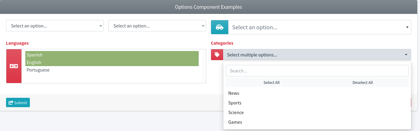
Use the next image as reference to check how every example is rendered. Please, note in the image the selection fields were wrapped inside a Bootstrap Grid System to organize them.
Select
This component represents an option selection element, and extends from the base Input Group Component, so all the attributes from it will be inherited. Even more, you are able to set any attribute you usually will use on a select html element without any problem. The component also defines next additional attributes:
| Attribute | Description | Type | Default | Required |
|---|---|---|---|---|
| enable-old-support | Enable the auto retrievement and selection of the submitted value in case of validation errors | any | null | no |
IMPORTANT
The enable-old-support property offers a similar behavior as using the Laravel old() helper explicitly by your own.
Examples
{{-- Minimal --}}
<x-adminlte-select name="selBasic">
    <option>Option 1</option>
    <option disabled>Option 2</option>
    <option selected>Option 3</option>
</x-adminlte-select>

{{-- Disabled --}}
<x-adminlte-select name="selDisabled" disabled>
    <option>Option 1</option>
    <option>Option 2</option>
</x-adminlte-select>

{{-- With prepend slot, lg size, and label --}}
<x-adminlte-select name="selVehicle" label="Vehicle" label-class="text-info"
    igroup-size="lg">
    <x-slot name="prependSlot">
        <div class="input-group-text text-bg-info bg-gradient">
            <i class="bi bi-car-front"></i>
        </div>
    </x-slot>
    <option>Vehicle 1</option>
    <option>Vehicle 2</option>
</x-adminlte-select>

{{-- With multiple slots and multiple options --}}
<x-adminlte-select id="selUser" name="selUser[]" label="User" label-class="text-danger" multiple>
    <x-slot name="prependSlot">
        <div class="input-group-text text-bg-danger bg-gradient">
            <i class="bi bi-person"></i>
        </div>
    </x-slot>
    <x-slot name="appendSlot">
        <x-adminlte-button theme="outline-dark" label="Clear" icon="bi bi-slash-circle text-danger"/>
    </x-slot>
    <option>Admin</option>
    <option>Guest</option>
</x-adminlte-select>
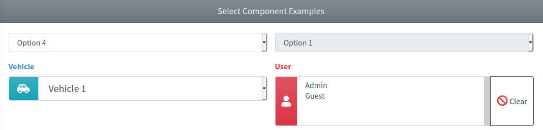
Use the next image as reference to check how every example is rendered. Please, note in the image the selection fields were wrapped inside a Bootstrap Grid System to organize them.
Select2
IMPORTANT
This component requires the Select2 plugin to be enabled on the package configuration file. Read more on the plugins configuration section, and use the @section('plugins.Select2', true) sentence on the blade file where you expect to use the component.
WARNING
The select2 plugin still requires jQuery, which AdminLTE v4 does not bundle anymore. The component initialization code is guarded: when neither jQuery nor the plugin are present, the element stays a plain Bootstrap 5 form-select and nothing breaks. If you want a jQuery free alternative with the same feature set (search, tagging, multiple selection, remote data, ...), use the SelectBs component, which is backed by Tom Select.
This component represents a select2 option selector and includes features like option search and placeholder. The component extends from the base Input Group Component, so all the attributes from it will be inherited. The component also defines next additional attributes:
| Attribute | Description | Type | Default | Required |
|---|---|---|---|---|
| config | Array with the select2 plugin configuration parameters | array | [] | no |
| enable-old-support | Enable the auto retrievement and selection of the submitted value in case of validation errors | any | null | no |
IMPORTANT
The enable-old-support property offers a similar behavior as using the Laravel old() helper explicitly by your own.
The available plugin configuration options are those explained on the plugin documentation. All other attributes you define will be inserted directly on the underlying select element, so you can also use the data-* attributes to configure the plugin.
NOTE
You may also configure the plugin from Javascript/jQuery using the id or name property of the component as the selector for the id attribute, instead of using the config property of the component. However, you may need to invoke the destroy method first.
Examples
{{-- Minimal --}}
<x-adminlte-select2 name="sel2Basic">
    <option>Option 1</option>
    <option disabled>Option 2</option>
    <option selected>Option 3</option>
</x-adminlte-select2>

{{-- Disabled --}}
<x-adminlte-select2 name="sel2Disabled" disabled>
    <option>Option 1</option>
    <option>Option 2</option>
</x-adminlte-select2>

{{-- With prepend slot, label, and data-placeholder config --}}
<x-adminlte-select2 name="sel2Vehicle" label="Vehicle" label-class="text-info"
    igroup-size="lg" data-placeholder="Select an option...">
    <x-slot name="prependSlot">
        <div class="input-group-text text-bg-info bg-gradient">
            <i class="bi bi-car-front"></i>
        </div>
    </x-slot>
    <option></option>
    <option>Vehicle 1</option>
    <option>Vehicle 2</option>
</x-adminlte-select2>

{{-- With multiple slots, and plugin config parameters --}}
@php
    $config = [
        "placeholder" => "Select multiple options...",
        "allowClear" => true,
    ];
@endphp
<x-adminlte-select2 id="sel2Category" name="sel2Category[]" label="Categories"
    label-class="text-danger" igroup-size="sm" :config="$config" multiple>
    <x-slot name="prependSlot">
        <div class="input-group-text text-bg-danger bg-gradient">
            <i class="bi bi-tag"></i>
        </div>
    </x-slot>
    <x-slot name="appendSlot">
        <x-adminlte-button theme="outline-dark" label="Clear" icon="bi bi-slash-circle text-danger"/>
    </x-slot>
    <option>Sports</option>
    <option>News</option>
    <option>Games</option>
    <option>Science</option>
    <option>Maths</option>
</x-adminlte-select2>
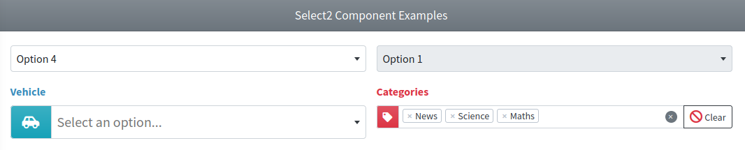
Use the next image as reference to check how every example is rendered. Please, note in the image the selection fields were wrapped inside a Bootstrap Grid System to organize them.
Required Plugin Configuration
The Select2 entry is already present on the plugins section of the configuration file published by the package, and it points to a CDN. It contains the plugin files plus the AdminLTE v4 compatibility stylesheet (adminlte-select2.min.css), which restyles the plugin default theme for Bootstrap 5.3. Because of that, the component forces the default theme unless you explicitly configure another one on the config attribute.
'plugins' => [
    ...
    'Select2' => [
        'active' => false,
        'files' => [
            [
                'type' => 'js',
                'asset' => false,
                'location' => '//cdnjs.cloudflare.com/ajax/libs/select2/4.1.0-rc.0/js/select2.min.js',
            ],
            [
                'type' => 'css',
                'asset' => false,
                'location' => '//cdnjs.cloudflare.com/ajax/libs/select2/4.1.0-rc.0/css/select2.min.css',
            ],

            // The AdminLTE v4 compatibility theme for Select2. The 'rtl' key
            // replaces the location when the RTL mode is active, and the
            // '{version}' placeholder resolves to the installed AdminLTE
            // version.

            [
                'type' => 'css',
                'asset' => false,
                'location' => '//cdn.jsdelivr.net/npm/admin-lte@{version}/dist/css/adminlte-select2.min.css',
                'rtl' => '//cdn.jsdelivr.net/npm/admin-lte@{version}/dist/css/adminlte-select2.rtl.min.css',
            ],
        ],
    ],
    ...
],
If you prefer to serve the files locally, first install the npm package and then publish it into the public/vendor folder:
npm i select2@^4.1
php artisan adminlte:plugins install --plugin=select2
Remember that you also have to make jQuery available on the page (the package does not provide it), and finally use the @section('plugins.Select2', true) sentence on the blade file where you expect to use the component.
NOTE
The select2-bootstrap4-theme plugin that was used on AdminLTE v3 is not needed (nor compatible) anymore, it was replaced by the adminlte-select2.min.css stylesheet shipped with AdminLTE v4.
Textarea
This component represents a textarea element and extends from the base Input Group Component, so all the attributes from it will be inherited. Even more, you are able to set any attribute you usually will use on a textarea html element without any problem. The component also defines next additional attributes:
| Attribute | Description | Type | Default | Required |
|---|---|---|---|---|
| enable-old-support | Enable the auto retrievement and filling with the submitted value in case of validation errors | any | null | no |
IMPORTANT
The enable-old-support property offers a similar behavior as using the Laravel old() helper explicitly by your own.
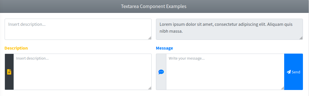
Examples
{{-- Minimal with placeholder --}}
<x-adminlte-textarea name="taBasic" placeholder="Insert description..."/>

{{-- Disabled --}}
<x-adminlte-textarea name="taDisabled" disabled>
    Lorem ipsum dolor sit amet, consectetur adipiscing elit. Aliquam quis nibh massa.
</x-adminlte-textarea>

{{-- With prepend slot, sm size, and label --}}
<x-adminlte-textarea name="taDesc" label="Description" rows=5 label-class="text-warning"
    igroup-size="sm" placeholder="Insert description...">
    <x-slot name="prependSlot">
        <div class="input-group-text bg-dark">
            <i class="bi bi-file-text text-warning"></i>
        </div>
    </x-slot>
</x-adminlte-textarea>

{{-- With slots, sm size, and feedback disabled --}}
<x-adminlte-textarea name="taMsg" label="Message" rows=5 igroup-size="sm"
    label-class="text-primary" placeholder="Write your message..." disable-feedback>
    <x-slot name="prependSlot">
        <div class="input-group-text">
            <i class="bi bi-chat-dots text-primary"></i>
        </div>
    </x-slot>
    <x-slot name="appendSlot">
        <x-adminlte-button theme="primary" icon="bi bi-send" label="Send"/>
    </x-slot>
</x-adminlte-textarea>
Use the next image as reference to check how every example is rendered. Please, note in the image the textarea fields were wrapped inside a Bootstrap Grid System to organize them.