Layout Components
These components are classified under the Layout category and represents the pieces that fill the AdminLTE page layout. At next you can see the list of available components:
| Components |
|---|
| Content Header |
| Navbar Dropdown |
| Navbar Dropdown Item |
| Navbar Custom Menu |
| Navbar Notification |
| Navbar Darkmode Widget |
NOTE
The Navbar Notification and the Navbar Darkmode Widget (<x-adminlte-navbar-darkmode-widget>) are normally placed through the menu configuration instead of by hand, as special menu items. The darkmode widget is fully documented there; the notification widget has its own section below for the cases where you place it yourself.
Content Header
This component represents the header of the page content, the block that the AdminLTE v4 reference layouts (the demo pages shipped with the upstream template) place above the main content with the page title on the left and the breadcrumb trail on the right. The following attributes are available:
| Attribute | Description | Type | Default | Required |
|---|---|---|---|---|
| breadcrumbs | The breadcrumb trail. See The breadcrumbs Attribute | array | [] | no |
| title | The title of the page | string | null | no |
| title-class | The classes for the title element (replaces the default mb-0 fs-3 classes used by the AdminLTE v4 reference layouts) | string | null | no |
Any other attribute you define will be directly inserted into the underlying div.row element. So, for example, you can define a class, id or any other attribute you may need.
NOTE
The component only renders the .row of the header, because the layout already wraps the content_header section inside the .app-content-header > .container-fluid elements. The container of that wrapper is configurable through the classes_content_header option of the layout & styling configuration.
NOTE
When there is no breadcrumb trail (and no breadcrumbSlot), the breadcrumb column is not rendered at all, only the title column is emitted.
The breadcrumbs Attribute
The breadcrumbs attribute takes an array of entries. Each entry may be a plain string (used as the label) or an array with the following keys:
| Key | Description | Type | Default |
|---|---|---|---|
| label | The text of the entry. An entry without label is discarded | string | null |
| url | The URL of the entry. An entry without URL is rendered as plain text | string | null |
| active | Whether the entry is the active one. When not provided, an entry without URL is the active one | bool | null |
The active entry gets the active class and an aria-current="page" attribute, as required by the Bootstrap breadcrumb markup.
Slots
The component provides the following slots:
- default slot: Use this slot to fill the title column with your own markup. It takes precedence over the
titleattribute. - breadcrumbSlot: Use this slot to fill the breadcrumb column with your own markup. It takes precedence over the
breadcrumbsattribute.
Examples
The component goes inside the content_header section of a blade file that extends adminlte::page. The examples below use route() helpers of a fictional application, so replace them with routes of your own:
{{-- Minimal --}}
@section('content_header')
    <x-adminlte-content-header title="Dashboard"/>
@stop

{{-- With a breadcrumb trail --}}
@section('content_header')
    <x-adminlte-content-header title="Dashboard" :breadcrumbs="[
        ['label' => 'Home', 'url' => route('home')],
        ['label' => 'Dashboard'],
    ]"/>
@stop

{{-- With a custom title style --}}
@section('content_header')
    <x-adminlte-content-header title="Users" title-class="mb-0 fs-2 fw-bold"
        :breadcrumbs="['Home', 'Users']"/>
@stop

{{-- With custom markup on both columns --}}
@section('content_header')
    <x-adminlte-content-header>
        <h1 class="mb-0 fs-3">
            Invoice <small class="text-muted">#1042</small>
        </h1>
        <x-slot name="breadcrumbSlot">
            <a class="btn btn-primary btn-sm float-sm-end" href="/invoices">
                Back to the list
            </a>
        </x-slot>
    </x-adminlte-content-header>
@stop
Navbar Dropdown
This component represents a navbar dropdown menu, the block that the AdminLTE v4 reference layouts use for the messages, notifications and tasks menus of the topbar. It renders the li.nav-item.dropdown wrapper, the toggle with its icon and its badge, and the .dropdown-menu with the optional header, divider and footer pieces. The following attributes are available:
| Attribute | Description | Type | Default | Required |
|---|---|---|---|---|
| id | The id of the underlying li wrapper. The toggle gets {id}-toggle as its own id | string | null | no |
| icon | The icon of the dropdown toggle (a Bootstrap Icon) | string | null | no |
| icon-theme | The color of the toggle icon (an AdminLTE color) | string | null | no |
| text | The visible text of the dropdown toggle, placed next to the icon | string | null | no |
| label | The accessible name of the dropdown toggle (an aria-label). See Accessibility | string | null | no |
| badge | The label of the navbar badge attached to the toggle | string | null | no |
| badge-theme | The background color of the navbar badge (an AdminLTE color) | string | null | no |
| size | The size of the dropdown menu (lg or xl). See The size Attribute | string | lg | no |
| align | The alignment of the dropdown menu (start or end) | string | end | no |
| animated | Whether the dropdown menu fades in. See The animated Attribute | bool | false | no |
| caret | Whether the toggle shows the Bootstrap caret | bool | false | no |
| header | The text of the dropdown menu header | string | null | no |
| footer | The text of the dropdown menu footer link | string | null | no |
| footer-url | The url of the dropdown menu footer link | string | # | no |
| menu-class | Extra classes for the .dropdown-menu element | string | null | no |
Any other attribute you define will be directly inserted into the underlying li.nav-item.dropdown element. So, for example, you can define a class, data-* or any other attribute you may need.
NOTE
The header and the footer are only rendered when their attribute (or their slot) is provided, and each one brings its own .dropdown-divider, exactly like the reference layouts do.
The size Attribute
The AdminLTE v4 stylesheet provides two widths for a navbar dropdown menu, .dropdown-menu-lg (280px to 300px) and .dropdown-menu-xl (360px to 420px). The attribute defaults to lg, the size used by every navbar dropdown of the reference layouts. Any value out of that set (for example size="none") drops the modifier and leaves the menu on the default Bootstrap width, so an arbitrary class can never reach the generated markup.
The animated Attribute
The animated attribute adds the .animated-dropdown-menu class, which plays the AdminLTE flipInX animation when the menu opens. Note the stylesheet keys that animation on an .open class over the dropdown wrapper, a Bootstrap 4 leftover that Bootstrap 5 does not emit anymore. So, the component also registers a small script that mirrors the Bootstrap 5 dropdown events into that class. The script is registered only once, no matter how many animated dropdowns the page holds.
Accessibility
The toggle is rendered with role="button" and aria-expanded="false", and the menu points back at it through an aria-labelledby attribute. The icon of the toggle is decorative, it carries an aria-hidden="true" attribute. Therefore, when the toggle holds no visible text, remember to provide a label, otherwise the control has no accessible name.
Slots
The component provides the following slots:
- default slot: Use this slot to fill the dropdown menu with its items. See the Navbar Dropdown Item component.
- headerSlot: Use this slot to fill the dropdown header with your own markup. It takes precedence over the
headerattribute. - footerSlot: Use this slot to fill the dropdown footer link with your own markup. It takes precedence over the
footerattribute.
Examples
Place the component inside the content_top_nav_right (or content_top_nav_left) section of a blade file that extends adminlte::page. The route() calls and the images below belong to a fictional application, replace them with your own:
{{-- The messages dropdown of the reference layouts --}}
<x-adminlte-navbar-dropdown id="messages" icon="bi bi-chat-text"
    label="{{ __('Messages') }}" badge="3" badge-theme="danger"
    footer="{{ __('See all messages') }}" :footer-url="route('messages')">

    <x-adminlte-navbar-dropdown-item title="Brad Diesel"
        img="{{ asset('img/user1.jpg') }}" text="Call me whenever you can..."
        time="4 Hours Ago" marker="bi bi-star-fill" marker-theme="danger"
        :url="route('messages.show', 1)" divider/>

    <x-adminlte-navbar-dropdown-item title="John Pierce"
        img="{{ asset('img/user8.jpg') }}" text="I got your message bro"
        time="4 Hours Ago" :url="route('messages.show', 2)"/>

</x-adminlte-navbar-dropdown>

{{-- The notifications dropdown, on the extra large size --}}
<x-adminlte-navbar-dropdown id="notifications" icon="bi bi-bell-fill"
    label="{{ __('Notifications') }}" badge="15" badge-theme="warning"
    size="xl" animated header="15 {{ __('Notifications') }}">

    <x-adminlte-navbar-dropdown-item icon="bi bi-envelope"
        text="4 new messages" time="3 mins" divider/>

    <x-adminlte-navbar-dropdown-item icon="bi bi-people-fill"
        text="8 friend requests" time="12 hours"/>

</x-adminlte-navbar-dropdown>

{{-- With a caret, a visible text and custom slots --}}
<x-adminlte-navbar-dropdown icon="bi bi-list-task" text="{{ __('Tasks') }}"
    caret align="start">

    <x-slot name="headerSlot">
        <b>{{ __('Pending tasks') }}</b>
    </x-slot>

    <x-adminlte-navbar-dropdown-item title="Design a nice theme">
        <div class="d-flex justify-content-between">
            <span>Design a nice theme</span>
            <span class="fs-7 text-secondary">20%</span>
        </div>
    </x-adminlte-navbar-dropdown-item>

</x-adminlte-navbar-dropdown>
Navbar Dropdown Item
This component represents an item of a Navbar Dropdown menu. It provides the two item layouts used by the AdminLTE v4 reference layouts, the media one (an image next to a .dropdown-item-title, the excerpt and the time) and the inline one (an icon, the text and the time pushed to the end of the item). The following attributes are available:
| Attribute | Description | Type | Default | Required |
|---|---|---|---|---|
| title | The title of the item. It fills the .dropdown-item-title element of the media layout | string | null | no |
| text | The text of the item. It's the excerpt on the media layout and the whole text on the inline one | string | null | no |
| time | The time related to the item | string | null | no |
| icon | The icon of the item, only used by the inline layout (a Bootstrap Icon) | string | null | no |
| icon-theme | The color of the item icon (an AdminLTE color) | string | null | no |
| img | The url of the image shown by the media layout | string | null | no |
| img-alt | The alternative text of the image | string | '' | no |
| marker | The icon shown at the end of the title on the media layout (a Bootstrap Icon) | string | null | no |
| marker-theme | The color of the marker icon (an AdminLTE color) | string | null | no |
| url | The url of the item | string | # | no |
| divider | Whether a .dropdown-divider is emitted right after the item | bool | false | no |
Any other attribute you define will be directly inserted into the underlying a.dropdown-item element.
NOTE
The item uses the media layout as soon as a title or an img is provided, otherwise it uses the inline one.
NOTE
The image of a media item is decorative by default (img-alt is an empty string), because the title next to it already names the item. Provide an img-alt whenever the image carries information of its own.
Slots
The component provides the following slots:
- default slot: Use this slot to fill the item with your own markup. It replaces the content generated from the attributes, but the item still keeps its
a.dropdown-itemwrapper, itsurland itsdivider.
Examples
{{-- A media item --}}
<x-adminlte-navbar-dropdown-item title="Nora Silvester"
    img="{{ asset('img/user3.jpg') }}" img-alt="Nora Silvester"
    text="The subject goes here" time="4 Hours Ago"
    marker="bi bi-star-fill" marker-theme="warning" url="/messages/3" divider/>

{{-- An inline item --}}
<x-adminlte-navbar-dropdown-item icon="bi bi-file-earmark-fill"
    icon-theme="info" text="3 new reports" time="2 days" url="/reports"/>

{{-- With custom content --}}
<x-adminlte-navbar-dropdown-item url="/tasks/1">
    <x-adminlte-progress theme="success" value="20" with-label/>
</x-adminlte-navbar-dropdown-item>
Navbar Custom Menu
This component represents the div.navbar-custom-menu wrapper of the AdminLTE v4 stylesheet. It keeps the dropdown menus of its items anchored to the end of the navbar, and, on the small breakpoint, it turns them into floating panels with their own background and border. Use it to group the navbar items placed on the right side of the topbar. The following attributes are available:
| Attribute | Description | Type | Default | Required |
|---|---|---|---|---|
| nav-class | Extra classes for the inner ul.navbar-nav element | string | null | no |
Any other attribute you define will be directly inserted into the underlying div.navbar-custom-menu element.
Slots
The component provides the following slots:
- default slot: Use this slot to fill the inner
ul.navbar-navelement with the navbar items.
Examples
@section('content_top_nav_right')
    <x-adminlte-navbar-custom-menu nav-class="ms-auto">

        <x-adminlte-navbar-dropdown id="messages" icon="bi bi-chat-text"
            label="{{ __('Messages') }}" badge="3" badge-theme="danger"/>

        <x-adminlte-navbar-dropdown id="notifications" icon="bi bi-bell-fill"
            label="{{ __('Notifications') }}" badge="15" badge-theme="warning"/>

    </x-adminlte-navbar-custom-menu>
@stop
Navbar Notification
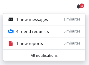
This component represents a notification icon with a badge, meant to be placed on the top navbar. It is the component behind the navbar-notification special menu item, and you only need it directly when you prefer to place the widget on a blade section instead of on the menu configuration.
| Attribute | Description | Type | Default | Required |
|---|---|---|---|---|
| badge-color | The color of the badge (an AdminLTE color). Without it, the badge only carries the AdminLTE .navbar-badge style | string | null | no |
| badge-label | The initial content of the badge. Without it, no badge is rendered at all | string | null | no |
| dropdown-footer-label | The label of the footer link of the dropdown. Only used on the dropdown mode, and a magnifier icon is rendered when it is left out | string | null | no |
| enable-dropdown-mode | Whether a click opens a dropdown instead of following the link | bool | false | no |
| icon | The icon of the widget, for example bi bi-bell-fill | string | yes | |
| icon-color | The color of the icon (an AdminLTE color) | string | null | no |
| id | The id attribute of the underlying li wrapper. It is also the handle the periodic update uses, so it has to be unique on the page | string | yes | |
| update-cfg | The configuration of the periodic update, see below | array | [] | no |
Any other attribute you define will be directly inserted into the underlying a element. In particular, the href attribute is the target of the widget: on the default mode a click follows it, and on the dropdown mode it becomes the target of the footer link.
The update-cfg Attribute
When this array is filled, the widget polls your application for new data and updates itself. The accepted keys are:
| Key | Description |
|---|---|
url | The url to fetch, as a string or as a [path, parameters] array |
route | A route name instead of an url, as a string or as a [name, parameters] array |
period | The polling period, in seconds. Without it (or with a value lower than one) the widget is never polled |
The expected json answer, and a complete controller example, are documented on the internal updating procedure of the special menu items page.
NOTE
An url or a route that can not be resolved only leaves the widget without its periodic update, it does not break the page that holds the component.
Examples
Place the component inside the content_top_nav_right section of a blade file extending adminlte::page:
@section('content_top_nav_right')

    {{-- A plain notification icon linking to a page of your application --}}
    <x-adminlte-navbar-notification id="msgNotification" icon="bi bi-envelope-fill"
        icon-color="info" badge-label="3" badge-color="danger"
        href="{{ url('messages') }}"/>

    {{-- A notification opening a dropdown, refreshed every 30 seconds --}}
    <x-adminlte-navbar-notification id="allNotifications" icon="bi bi-bell-fill"
        icon-color="warning" badge-label="0" badge-color="danger"
        href="{{ url('notifications/show') }}"
        dropdown-footer-label="All notifications"
        :update-cfg="['url' => 'notifications/get', 'period' => 30]"
        enable-dropdown-mode/>

@stop