Advanced Form Components
These components are expected to be used within a form element of your own, placed inside the content section of a blade file that extends adminlte::page, exactly like the basic form components. What makes them advanced is that most of them are backed by an extra Javascript library, which you have to enable first. At next you can see the list of available components:
| Components |
|---|
| DateRange, InputColor, InputDate, InputFileKrajee, InputSlider, InputSwitch, SelectBs, TextEditor |
Underlying Plugins on AdminLTE v4
AdminLTE v4 is jQuery free, so on the 4.x releases of this package every advanced form component was moved to the vanilla Javascript plugin recommended by AdminLTE v4. The next table summarizes what backs each component now.
NOTE
A plugin key is the name of an entry of the plugins array on your config/adminlte.php file, which tells the package which stylesheet and script files to add to the page. Enabling it for one view is done with a @section('plugins.<Key>', true) sentence at the top of that blade file — which only works on a file that extends adminlte::page, since it is the layout that reads those sections. See the plugins configuration page for the whole picture.
| Component | Plugin | Plugin key | Requires jQuery |
|---|---|---|---|
| DateRange | Flatpickr | Flatpickr | no |
| InputColor | none (native input[type=color]) | – | no |
| InputDate | Flatpickr | Flatpickr | no |
| InputFileKrajee | krajee-bootstrap-file-input | KrajeeFileinput | yes |
| InputSlider | noUiSlider | NoUiSlider | no |
| InputSwitch | none (native Bootstrap 5.3 switch) | – | no |
| SelectBs | Tom Select | TomSelect | no |
| TextEditor | Quill | Quill | no |
IMPORTANT
Every component below exposes a config attribute, an array handed over to the underlying plugin as its options. It still accepts the AdminLTE v3 plugin properties. Whenever a v3 property has an equivalent on the new plugin it is translated on the fly, otherwise it is silently dropped. Each section below lists exactly which properties became no-ops.
NOTE
With the exception of KrajeeFileinput, all the plugin keys above are already present on the plugins section of the config/adminlte.php file you published at installation time, pointing to a CDN. You only have to enable the plugin on the blade file where you use the component, with a @section('plugins.<Key>', true) sentence. For KrajeeFileinput you have to add the plugin entry to the configuration file yourself, as explained on the plugins configuration section.
DateRange
IMPORTANT
This component requires the Flatpickr plugin, so be sure to enable it on the blade file where you use the component with @section('plugins.Flatpickr', true). Read more on the plugins configuration section. The legacy Date Range Picker and Moment plugins are not used anymore (both required jQuery).
This component represents a date-range selector and extends from the base Input Group Component, so all the attributes from it will be inherited. The component also defines the next additional attributes:
| Attribute | Description | Type | Default | Required |
|---|---|---|---|---|
| config | Array with the plugin configuration parameters | array | [] | no |
| enable-default-ranges | Preselects one of the predefined ranges. The accepted string values are: 'Today', 'Yesterday', 'Last 7 Days', 'Last 30 Days', 'This Month' or 'Last Month' | string | null | no |
| enable-old-support | Enable auto retrievement and filling with the submitted value in case of validation errors | any | null | no |
IMPORTANT
The enable-old-support property offers a similar behavior as using the Laravel old() helper explicitly by your own.
The available configuration (for the config option) are those explained on the Flatpickr options documentation. You can also assign a javascript expression to a particular configuration option by prepending the js: string token. All other attributes you define will be inserted directly on the underlying input element.
The component applies the next defaults, which you can always overwrite through the config attribute:
modeis set to'range'(or to'single'when the legacysingleDatePickerproperty is truthy).allowInputis set totrue, so the user can also type the range manually (this matches the behavior of the legacy plugin).
WARNING
Flatpickr does not provide a predefined ranges menu. Because of that, the enable-default-ranges attribute is now only used to preselect the initial date range, no shortcut menu is rendered. The legacy startDate / endDate properties take precedence over enable-default-ranges.
Legacy DateRangePicker Properties
The next legacy properties are still accepted, and are translated into their Flatpickr counterpart:
| Legacy property | Translated into |
|---|---|
minDate, maxDate | minDate, maxDate |
minYear, maxYear | minDate, maxDate (a bare year is widened to YYYY-01-01 / YYYY-12-31) |
singleDatePicker | mode: 'single' |
timePicker | enableTime: true |
timePicker24Hour | time_24hr |
locale.format | dateFormat |
locale.separator | locale.rangeSeparator |
startDate, endDate | defaultDate |
The next legacy properties became no-ops, they are accepted for backward compatibility and silently dropped: ranges, autoUpdateInput, autoApply, alwaysShowCalendars, linkedCalendars, showCustomRangeLabel, showDropdowns, showWeekNumbers, showISOWeekNumbers, opens, drops, parentEl, buttonClasses, applyButtonClasses, cancelButtonClasses, isInvalidDate, isCustomDate, maxSpan, dateLimit, timePickerIncrement and timePickerSeconds.
WARNING
The date format tokens are not the Moment.js ones anymore. Flatpickr uses its own formatting tokens, for example Y-m-d H:i instead of YYYY-MM-DD HH:mm.
NOTE
You may also configure the plugin from Javascript using the id or name property of the component as the selector for the id attribute, instead of using the config property of the component. The component stores the created instance on the _flatpickr_instance property of the input element.
Examples
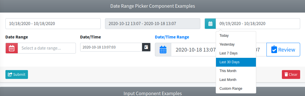
{{-- Minimal --}}
<x-adminlte-date-range name="drBasic"/>

{{-- Disabled with predefined config --}}
@php
$config = [
    "enableTime" => true,
    "dateFormat" => "Y-m-d H:i",
    "defaultDate" => ["js:new Date(Date.now() - 6*24*3600*1000)", "js:new Date()"],
];
@endphp
<x-adminlte-date-range name="drDisabled" :config="$config" disabled/>

{{-- Prepend slot and a preselected range --}}
<x-adminlte-date-range name="drCustomRanges" enable-default-ranges="Last 30 Days">
    <x-slot name="prependSlot">
        <div class="input-group-text text-bg-info bg-gradient">
            <i class="bi bi-calendar-range"></i>
        </div>
    </x-slot>
</x-adminlte-date-range>

{{-- Label and placeholder --}}
<x-adminlte-date-range name="drPlaceholder" placeholder="Select a date range..."
    label="Date Range">
    <x-slot name="prependSlot">
        <div class="input-group-text text-bg-danger bg-gradient">
            <i class="bi bi-calendar-range"></i>
        </div>
    </x-slot>
</x-adminlte-date-range>

{{-- SM size with single date/time config --}}
@php
$config = [
    "mode" => "single",
    "enableTime" => true,
    "enableSeconds" => true,
    "time_24hr" => true,
    "dateFormat" => "Y-m-d H:i:S",
    "minDate" => "2000-01-01",
    "maxDate" => "js:new Date()",
];
@endphp
<x-adminlte-date-range name="drSizeSm" label="Date/Time" igroup-size="sm" :config="$config">
    <x-slot name="appendSlot">
        <div class="input-group-text text-bg-dark">
            <i class="bi bi-calendar-day"></i>
        </div>
    </x-slot>
</x-adminlte-date-range>

{{-- LG size with some config and add-ons --}}
@php
$config = [
    "enableTime" => true,
    "time_24hr" => true,
    "dateFormat" => "Y-m-d H:i",
    "minDate" => "2000-01-01",
];
@endphp
<x-adminlte-date-range name="drSizeLg" label="Date/Time Range" label-class="text-primary"
    igroup-size="lg" :config="$config">
    <x-slot name="prependSlot">
        <div class="input-group-text text-primary">
            <i class="bi bi-calendar-range"></i>
        </div>
    </x-slot>
    <x-slot name="appendSlot">
        <x-adminlte-button theme="outline-primary" label="Review" icon="bi bi-clipboard-check"/>
    </x-slot>
</x-adminlte-date-range>
Use the next image as reference to check how every example is rendered. Please, note the image was taken with an older package version (the calendar popup is now rendered by Flatpickr), and that the elements were wrapped inside a Bootstrap Grid System to organize them.
Required Plugin Configuration
The Flatpickr entry is already available on the plugins section of the configuration file published by the package:
'plugins' => [
    ...
    'Flatpickr' => [
        'active' => false,
        'files' => [
            [
                'type' => 'js',
                'asset' => false,
                'location' => '//cdn.jsdelivr.net/npm/flatpickr@4.6.13/dist/flatpickr.min.js',
            ],
            [
                'type' => 'css',
                'asset' => false,
                'location' => '//cdn.jsdelivr.net/npm/flatpickr@4.6.13/dist/flatpickr.min.css',
            ],
        ],
    ],
    ...
],
If you prefer to serve the plugin files locally, install the npm package and publish it into the public/vendor folder, then point the location values to the published files and set 'asset' => true:
npm i flatpickr@^4.6
php artisan adminlte:plugins install --plugin=flatpickr
Finally, you need to use the @section('plugins.Flatpickr', true) sentence on the blade file where you expect to use the component.
InputColor
IMPORTANT
No plugin is required anymore. Bootstrap 5 provides a native color control (form-control form-control-color), so the Bootstrap Colorpicker jQuery plugin used on AdminLTE v3 was dropped.
This component represents a color picker input and extends from the base Input Group Component, so all the attributes from it will be inherited. When you enable an addon icon, this icon will automatically be set to show the picked color (the component keeps every .input-group-text > i element of the group in sync with the selected value). The component also defines next additional attributes:
| Attribute | Description | Type | Default | Required |
|---|---|---|---|---|
| config | [Deprecated] Array with the legacy plugin configuration parameters. It is accepted for backward compatibility and completely ignored | array | [] | no |
| enable-old-support | Enable auto retrievement and filling with the submitted value in case of validation errors | any | null | no |
IMPORTANT
The enable-old-support property offers a similar behavior as using the Laravel old() helper explicitly by your own.
WARNING
A native color input only understands a 6 digits hexadecimal notation. The component validates the value attribute (and the old submitted value) against the #rrggbb pattern, lowercases it, and falls back to #000000 when it does not match. So, values like rgb(50, 100, 50) or a named color, which were valid on AdminLTE v3, will be discarded. The same applies to the legacy data-color, data-format and data-horizontal attributes: they are just forwarded to the input element and have no effect.
All other attributes you define will be inserted directly on the underlying input element.
Examples
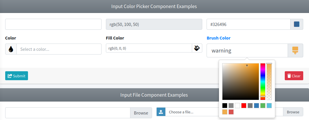
{{-- Minimal --}}
<x-adminlte-input-color name="icBasic"/>

{{-- Disabled with predefined value --}}
<x-adminlte-input-color name="icDisabled" value="#326432" disabled/>

{{-- Append slot, the icon follows the picked color --}}
<x-adminlte-input-color name="icAddon" value="#326496">
    <x-slot name="appendSlot">
        <div class="input-group-text">
            <i class="bi bi-square-fill"></i>
        </div>
    </x-slot>
</x-adminlte-input-color>

{{-- With a label --}}
<x-adminlte-input-color name="icLabeled" label="Color">
    <x-slot name="prependSlot">
        <div class="input-group-text">
            <i class="bi bi-droplet-fill"></i>
        </div>
    </x-slot>
</x-adminlte-input-color>

{{-- SM size --}}
<x-adminlte-input-color name="icSizeSm" label="Fill Color" igroup-size="sm" value="#ffc107">
    <x-slot name="appendSlot">
        <div class="input-group-text">
            <i class="bi bi-paint-bucket"></i>
        </div>
    </x-slot>
</x-adminlte-input-color>

{{-- LG size --}}
<x-adminlte-input-color name="icSizeLg" label="Brush Color" label-class="text-primary"
    igroup-size="lg" value="#0d6efd">
    <x-slot name="appendSlot">
        <div class="input-group-text">
            <i class="bi bi-brush"></i>
        </div>
    </x-slot>
</x-adminlte-input-color>
Use the next image as reference to check how every example is rendered. Please, note the image was taken with an older package version, the color popup is now the one provided by the browser.
TIP
If you need an advanced color picker (alpha channel, swatches, multiple formats, ...), AdminLTE v4 recommends the jQuery free Pickr plugin, which you can publish with npm i @simonwep/pickr followed by php artisan adminlte:plugins install --plugin=pickr, and then initialize on your own over the component id.
InputDate
IMPORTANT
This component requires the Flatpickr plugin, so be sure to enable it on the blade file where you use the component with @section('plugins.Flatpickr', true). Read more on the plugins configuration section. The legacy Tempus Dominus and Moment plugins are not used anymore (both required jQuery).
This component represents a date and time selector and extends from the base Input Group Component, so all the attributes from it will be inherited. The component also defines next additional attributes:
| Attribute | Description | Type | Default | Required |
|---|---|---|---|---|
| config | Array with the plugin configuration parameters | array | [] | no |
| enable-old-support | Enable auto retrievement and filling with the submitted value in case of validation errors | any | null | no |
IMPORTANT
The enable-old-support property offers a similar behavior as using the Laravel old() helper explicitly by your own.
The available plugin configuration (for the config option) are those explained on the Flatpickr options documentation. You can assign a javascript expression to a particular configuration prepending the js: string token. All other attributes you define will be inserted directly on the underlying input element.
The component sets allowInput to true by default, so the user can also type the date manually (this matches the behavior of the legacy plugin). You can overwrite it through the config attribute.
Legacy Tempus Dominus Properties
The next legacy properties are still accepted, and are translated into their Flatpickr counterpart:
| Legacy property | Translated into |
|---|---|
format | dateFormat |
defaultDate | defaultDate |
minDate, maxDate | minDate, maxDate |
disabledDates | disable |
enabledDates | enable |
inline | inline |
The next legacy properties became no-ops, they are accepted for backward compatibility and silently dropped: icons, buttons, collapse, sideBySide, toolbarPlacement, widgetPositioning, widgetParent, useCurrent, calendarWeeks, viewMode, keepOpen, focusOnShow, debug, allowInputToggle, extraFormats, keepInvalid, ignoreReadonly, tooltips, useStrict, daysOfWeekDisabled, stepping and timeZone.
NOTE
The icons and buttons properties keep a default value (now based on Bootstrap Icons, for example 'date' => 'bi bi-calendar') only so that reading them from an existing configuration does not break. Flatpickr renders its own calendar chrome and does not use them.
WARNING
The date format tokens are not the Moment.js ones anymore. Flatpickr uses its own formatting tokens, so 'format' => 'YYYY-MM-DD' has to be rewritten as 'dateFormat' => 'Y-m-d'. Localized shortcuts like L or LT do not exist.
NOTE
Alternatively, you can make all the configuration from Javascript using the id or name property of the component as the selector for the id attribute, instead of using the config property of the component. The component stores the created instance on the _flatpickr_instance property of the input element, so you can call el._flatpickr_instance.destroy() before creating your own.
Examples
{{-- Minimal --}}
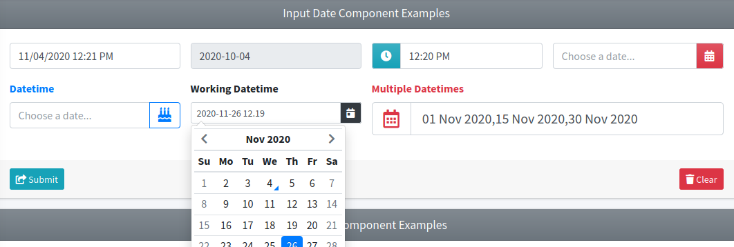
<x-adminlte-input-date name="idBasic"/>

{{-- Disabled with predefined value --}}
@php
$config = ['dateFormat' => 'Y-m-d'];
@endphp
<x-adminlte-input-date name="idDisabled" value="2020-10-04" :config="$config" disabled/>

{{-- Placeholder, time only and prepend icon --}}
@php
$config = ['noCalendar' => true, 'enableTime' => true, 'dateFormat' => 'H:i'];
@endphp
<x-adminlte-input-date name="idTimeOnly" :config="$config" placeholder="Choose a time...">
    <x-slot name="prependSlot">
        <div class="input-group-text text-bg-info bg-gradient">
            <i class="bi bi-clock"></i>
        </div>
    </x-slot>
</x-adminlte-input-date>

{{-- Placeholder, date only and append icon --}}
@php
$config = ['dateFormat' => 'Y-m-d'];
@endphp
<x-adminlte-input-date name="idDateOnly" :config="$config" placeholder="Choose a date...">
    <x-slot name="appendSlot">
        <div class="input-group-text text-bg-danger bg-gradient">
            <i class="bi bi-calendar-event"></i>
        </div>
    </x-slot>
</x-adminlte-input-date>

{{-- With Label --}}
@php
$config = ['enableTime' => true, 'time_24hr' => true, 'dateFormat' => 'd/m/Y H:i'];
@endphp
<x-adminlte-input-date name="idLabel" :config="$config" placeholder="Choose a date..."
    label="Datetime" label-class="text-primary">
    <x-slot name="appendSlot">
        <x-adminlte-button theme="outline-primary" icon="bi bi-calendar-heart"
            title="Set to Birthday"/>
    </x-slot>
</x-adminlte-input-date>

{{-- SM size, restricted to the current month and to week days --}}
@php
$config = [
    'enableTime' => true,
    'time_24hr' => true,
    'dateFormat' => 'Y-m-d H:i',
    'minDate' => 'js:new Date(new Date().getFullYear(), new Date().getMonth(), 1)',
    'maxDate' => 'js:new Date(new Date().getFullYear(), new Date().getMonth() + 1, 0)',
    'disable' => ['js:(date) => [0, 6].includes(date.getDay())'],
];
@endphp
<x-adminlte-input-date name="idSizeSm" label="Working Datetime" igroup-size="sm"
    :config="$config" placeholder="Choose a working day...">
    <x-slot name="appendSlot">
        <div class="input-group-text text-bg-dark">
            <i class="bi bi-calendar-day"></i>
        </div>
    </x-slot>
</x-adminlte-input-date>

{{-- LG size with multiple dates --}}
@php
$config = [
    'mode' => 'multiple',
    'conjunction' => ', ',
    'dateFormat' => 'd M Y',
];
@endphp
<x-adminlte-input-date name="idSizeLg" label="Multiple Datetimes" label-class="text-danger"
    igroup-size="lg" placeholder="Multidate..." :config="$config">
    <x-slot name="prependSlot">
        <div class="input-group-text">
            <i class="bi bi-calendar-week text-danger"></i>
        </div>
    </x-slot>
</x-adminlte-input-date>
Use the next image as reference to check how every example is rendered. Please, note the image was taken with an older package version (the calendar popup is now rendered by Flatpickr), and that the elements were wrapped inside a Bootstrap Grid System to organize them.
Required Plugin Configuration
The plugin setup is exactly the same one described for the DateRange component, both components share the Flatpickr plugin key.
InputFileKrajee
IMPORTANT
This component requires the krajee-bootstrap-file-input plugin, so be sure to first setup the plugin on the package configuration file, read more on the plugins configuration section. The plugin can be installed manually inside the public/vendor folder or you can point the plugin entry to the CDN files listed on the plugin site. Remember to also load jQuery yourself, before the plugin files.
WARNING
The Krajee file input plugin still requires jQuery, which AdminLTE v4 does not bundle anymore. The component initialization code is guarded: when neither jQuery nor the plugin are present, the element stays a plain Bootstrap 5 file input and nothing breaks. If you want a jQuery free alternative, AdminLTE v4 recommends FilePond or Dropzone, both installable with php artisan adminlte:plugins install --plugin=filepond (or --plugin=dropzone).
This component represents an advanced file-input component with file preview and other features. The component accepts all the attributes of the base Input Group Component. The component also defines the next additional attributes:
NOTE
Unlike the other components of this page, this one does not render a Bootstrap input group, the plugin builds its own widget instead. As a consequence the inherited igroup-size and igroup-class attributes are ignored here, together with the three inherited slots (see the warning at the end of this section).
| Attribute | Description | Type | Default | Required |
|---|---|---|---|---|
| config | Array with the plugin configuration parameters | array | [] | no |
| preset-mode | Used to make specific plugin configuration for some particular scenarios. The current supported set of values are: 'avatar' and 'minimalist' | string | null | no |
NOTE
The enable-old-support attribute is not supported here, due to security reasons related to file inputs.
WARNING
The prependSlot, appendSlot and bottomSlot slots are silently discarded by this component. Unlike every other form component, it does not extend the base layout: the Krajee plugin builds its own input-group structure, which would conflict with the one of the layout. Content placed in those slots therefore renders nowhere. Put your add-ons around the component instead.
The available plugin configuration are those explained on the plugin documentation. All other attributes you define will be inserted directly on the underlying input element, so you can also use data-* attributes to configure the plugin.
To keep the plugin aligned with AdminLTE v4, the component applies the next defaults, all of them overridable through the config attribute:
bsVersionis set to'5', so the plugin generates Bootstrap 5 markup.themeis set to'bs5', the plugin theme that relies on the Bootstrap Icons used by AdminLTE v4. Remember to import the theme files of the plugin.languageis set to the currentconfig('app.locale')value. Remember to import the related locale file of the plugin.
WARNING
The explorer-fa5 and the other Font Awesome based themes of the plugin are not the default anymore. If you still want to use one of them, set it explicitly on the config attribute and load both the theme files and the Font Awesome stylesheet.
NOTE
Alternatively, you can make all the configuration from Javascript/jQuery using the id or name property of the component as the selector for the id attribute, instead of using the config property of the component. However, you may need to invoke the destroy method first.
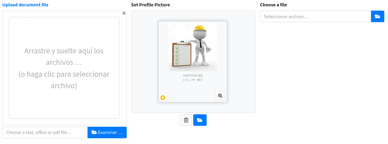
Examples
{{-- Basic --}}
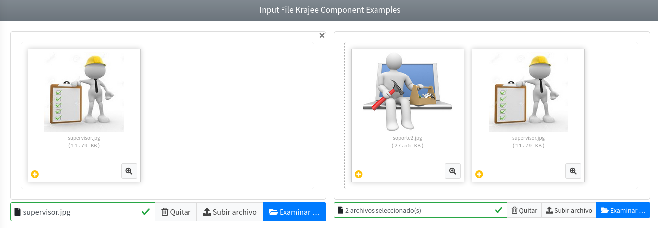
<x-adminlte-input-file-krajee name="kifBasic"/>

{{-- With placeholder, SM size multiple and data-* options --}}
<x-adminlte-input-file-krajee id="kifPholder" name="kifPholder[]"
    igroup-size="sm" data-msg-placeholder="Choose multiple files..."
    data-show-cancel="false" data-show-close="false" multiple/>

{{-- With a label, some plugin config, and error feedback disabled --}}
@php
$config = [
    'allowedFileTypes' => ['text', 'office', 'pdf'],
    'browseOnZoneClick' => true,
];
@endphp
<x-adminlte-input-file-krajee name="kifLabel" label="Upload document file"
    data-msg-placeholder="Choose a text, office or pdf file..."
    label-class="text-primary" :config="$config" disable-feedback/>

{{-- With the avatar preset-mode --}}
<x-adminlte-input-file-krajee name="kifAvatar" label="Set Profile Picture"
    preset-mode="avatar"/>

{{-- With the minimalist preset-mode --}}
<x-adminlte-input-file-krajee name="kifMinimalist" label="Choose a file"
    preset-mode="minimalist"/>
Use the next images as reference to check how every example is rendered. Please, note in the images the elements were wrapped inside a Bootstrap Grid System to organize them.
Required Plugin Configuration
To use this component you need to install and enable the required krajee-file-input plugin. You can manually download and install the plugin locally on the public/vendor/krajee-fileinput/ folder. Please, note there is no artisan command to install this plugin.
After installed on public/vendor/krajee-fileinput/ folder, you can use the next plugin configuration as a reference. However, note the set of included plugin files may change depending on your needs, and that jQuery must be loaded before the plugin files:
'plugins' => [
    ...
    'KrajeeFileinput' => [
        'active' => false,
        'files' => [
            [
                'type' => 'css',
                'asset' => true,
                'location' => 'vendor/krajee-fileinput/css/fileinput.min.css',
            ],
            [
                'type' => 'js',
                'asset' => true,
                'location' => 'vendor/krajee-fileinput/js/fileinput.min.js',
            ],
            [
                'type' => 'js',
                'asset' => true,
                'location' => 'vendor/krajee-fileinput/themes/bs5/theme.min.js',
            ],
            [
                'type' => 'js',
                'asset' => true,
                'location' => 'vendor/krajee-fileinput/js/locales/es.js',
            ],
        ],
    ],
    ...
],
Finally, you need to use the @section('plugins.KrajeeFileinput', true) sentence on the blade file where you expect to use the component. Alternatively, you can choose to use the plugin files from a CDN instead of installing the plugin locally.
InputSlider
IMPORTANT
This component requires the NoUiSlider plugin, so be sure to enable it on the blade file where you use the component with @section('plugins.NoUiSlider', true). Read more on the plugins configuration section. The legacy bootstrap-slider plugin is not used anymore.
This component represents a slider input and extends from the base Input Group Component, so all the attributes from it will be inherited. The component also defines next additional attributes:
| Attribute | Description | Type | Default | Required |
|---|---|---|---|---|
| color | The slider color. One of the available html colors, or any CSS color value | string | null | no |
| config | Array with the plugin configuration parameters | array | [] | no |
| disabled | Renders a disabled slider. A shortcut of the plugin disabled state | any | null | no |
| enable-old-support | Enable auto retrievement and filling with the submitted value in case of validation errors | any | null | no |
| max | The upper bound. A shortcut of the plugin range.max option | number | 10 | no |
| min | The lower bound. A shortcut of the plugin range.min option | number | 0 | no |
| slider-attributes | Extra attributes for the div element the plugin renders into, as key => value pairs | array | [] | no |
| step | The increment between two selectable values. A shortcut of the plugin step option | number | null | no |
| value | The initial value (or a comma separated pair, for a two handles slider). A shortcut of the plugin start option | string | the lower bound | no |
IMPORTANT
The enable-old-support property offers a similar behavior as using the Laravel old() helper explicitly by your own.
TIP
The plugin mutates the DOM of the slider element, so a Livewire re-render would wipe its markup. Use slider-attributes to exclude that element:
<x-adminlte-input-slider name="range" :slider-attributes="['wire:ignore' => '']"/>The validation state (aria-invalid and aria-describedby) is emitted on that same element, since it is the one the user actually interacts with.
The available plugin configuration (for the config attribute) are those explained on the noUiSlider options documentation.
WARNING
noUiSlider renders into a plain div, not into an input. Because of that, the component renders a hidden input that holds the value submitted with the form, plus a div that holds the slider. The hidden input is kept in sync with the slider on every update event, and the value of a multi-handle slider is submitted as a comma separated string.
The config['id'] property is the id of the div that holds the slider (it defaults to "{$id}-slider"), it is not the id of the underlying input.
The four shortcut attributes above (value, min, max and step) plus disabled are the plain HTML attributes you would write on a range input, so a slider needs no config at all for the common cases.
WARNING
The data-slider-* attributes of the legacy plugin are not supported anymore, they are just forwarded to the hidden input and have no effect. Use the config attribute or the standard HTML attributes instead.
Legacy bootstrap-slider Properties
The next legacy properties are still accepted, and are translated into their noUiSlider counterpart:
| Legacy property | Translated into |
|---|---|
min, max | range: {min, max} (defaults to 0 and 10) |
step | step |
value | start |
range (boolean) | a dual handle slider through the connect option |
orientation | orientation |
reversed, rtl | direction: 'rtl' |
tooltip | tooltips (false when the value is 'hide') |
enabled | when false, the slider is rendered disabled |
id | the id of the DOM element holding the slider |
NOTE
The range key is ambiguous: on the legacy plugin it was a boolean enabling a dual handle slider, while on noUiSlider it holds the min / max definition. When you pass an array it is forwarded to noUiSlider as is; when you pass true it is interpreted as the legacy dual handle flag.
The next legacy properties became no-ops, they are accepted for backward compatibility and silently dropped: precision, tooltip_split, tooltip_position, handle, selection, natural_arrow_keys, ticks, ticks_positions, ticks_labels, ticks_snap_bounds, ticks_tooltip, scale, focus, labelledby, rangeHighlights, lock_to_ticks and formatter.
NOTE
Alternatively, you can make all the plugin configuration from Javascript using the config['id'] value as the selector for the slider element, instead of using the config property of the component. However, you may need to invoke the destroy method first.
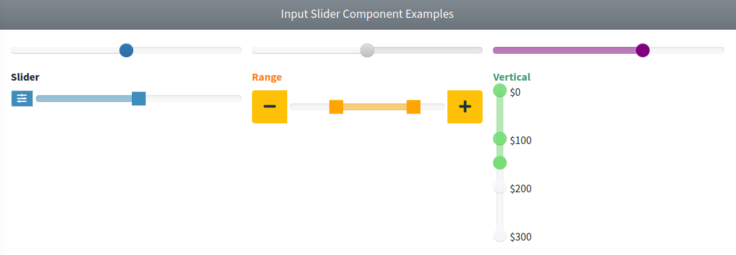
Examples
{{-- Minimal --}}
<x-adminlte-input-slider name="isMin"/>

{{-- Disabled --}}
<x-adminlte-input-slider name="isDisabled" disabled/>

{{-- With min, max, step and value --}}
<x-adminlte-input-slider name="isMinMax" min=5 max=15 step=0.5 value=11.5 color="purple"/>

{{-- Label, prepend icon and sm size --}}
<x-adminlte-input-slider name="isSizeSm" label="Slider" igroup-size="sm" color="#3c8dbc">
    <x-slot name="prependSlot">
        <div class="input-group-text text-bg-info">
            <i class="bi bi-sliders"></i>
        </div>
    </x-slot>
</x-adminlte-input-slider>

{{-- With slots, range mode and lg size --}}
@php
$config = [
    'range' => ['min' => 0, 'max' => 10],
    'start' => [3, 8],
    'connect' => [false, true, false],
    'tooltips' => true,
];
@endphp
<x-adminlte-input-slider name="isSizeLg" label="Range" igroup-size="lg"
    color="orange" label-class="text-warning" :config="$config">
    <x-slot name="prependSlot">
        <x-adminlte-button theme="warning" icon="bi bi-dash-lg" title="Decrement"/>
    </x-slot>
    <x-slot name="appendSlot">
        <x-adminlte-button theme="warning" icon="bi bi-plus-lg" title="Increment"/>
    </x-slot>
</x-adminlte-input-slider>

{{-- Vertical slider --}}
@php
$config = [
    'orientation' => 'vertical',
    'range' => ['min' => 0, 'max' => 300],
    'start' => [150],
    'step' => 50,
    'tooltips' => true,
];
@endphp
<x-adminlte-input-slider name="isVertical" label="Vertical" color="#77dd77"
    label-class="text-success" :config="$config"/>
Use the next images as reference to check how every example is rendered. Please, note the images were taken with an older package version (the slider is now rendered by noUiSlider), and that the elements were wrapped inside a Bootstrap Grid System to organize them.
Required Plugin Configuration
The NoUiSlider entry is already available on the plugins section of the configuration file published by the package:
'plugins' => [
    ...
    'NoUiSlider' => [
        'active' => false,
        'files' => [
            [
                'type' => 'js',
                'asset' => false,
                'location' => '//cdn.jsdelivr.net/npm/nouislider@15.8.1/dist/nouislider.min.js',
            ],
            [
                'type' => 'css',
                'asset' => false,
                'location' => '//cdn.jsdelivr.net/npm/nouislider@15.8.1/dist/nouislider.min.css',
            ],
        ],
    ],
    ...
],
If you prefer to serve the plugin files locally, install the npm package and publish it into the public/vendor folder, then point the location values to the published files and set 'asset' => true:
npm i nouislider@^15.8
php artisan adminlte:plugins install --plugin=noUiSlider
Finally, you need to use the @section('plugins.NoUiSlider', true) sentence on the blade file where you expect to use the component.
InputSwitch
IMPORTANT
No plugin is required anymore. Bootstrap 5.3 provides a native switch control (form-check form-switch with role="switch"), so the Bootstrap Switch jQuery plugin used on AdminLTE v3 was dropped.
This component represents a switch input and extends from the base Input Group Component, so all the attributes from it will be inherited. The component also defines next additional attributes:
| Attribute | Description | Type | Default | Required |
|---|---|---|---|---|
| config | Array with the legacy plugin configuration parameters. Only a few of them are still honoured (see below) | array | [] | no |
| enable-old-support | Enable auto retrievement and filling with the submitted value in case of validation errors | any | null | no |
| is-checked | To specify whether the switch should be active or not | bool | null | no |
IMPORTANT
The enable-old-support property offers a similar behavior as using the Laravel old() helper explicitly by your own. The is-checked property may be used as an alternative to the HTML checked attribute.
Legacy Bootstrap Switch Properties
The next legacy properties of the config attribute are still honoured:
| Legacy property | Effect |
|---|---|
state | The initial checked state of the switch (the is-checked attribute writes into it) |
disabled | Renders the switch disabled |
readonly | Renders the switch readonly |
onColor | The color of the checked state. Only the eight Bootstrap 5.3 theme names are accepted (primary, secondary, success, info, warning, danger, light and dark), any other value is ignored |
labelText, onText | The visible label rendered next to the switch (labelText takes precedence) |
Every other legacy property became a no-op, it is accepted for backward compatibility and silently ignored, among them: size, animate, handleWidth, labelWidth, inverse, offColor, offText, indeterminate, radioAllOff, wrapperClass and baseClass.
NOTE
The data-* attributes of the legacy plugin (data-on-color, data-off-text, ...) are just forwarded to the underlying input element and have no effect either. Use the config attribute instead.
TIP
The igroup-size attribute still works: the component ships the CSS that resizes the native switch on input-group-sm and input-group-lg groups.
All other attributes you define will be inserted directly on the underlying input element.
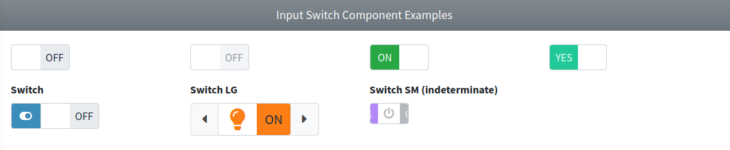
Examples
{{-- Minimal --}}
<x-adminlte-input-switch name="iswMin"/>

{{-- Disabled --}}
<x-adminlte-input-switch name="iswDisabled" disabled/>

{{-- Checked with a custom color --}}
@php($config = ['onColor' => 'success'])
<x-adminlte-input-switch name="iswColor" :config="$config" is-checked/>

{{-- With a visible label next to the switch --}}
@php($config = ['onColor' => 'info', 'labelText' => 'Enable notifications'])
<x-adminlte-input-switch name="iswText" :config="$config" is-checked/>

{{-- Label, and prepend icon --}}
<x-adminlte-input-switch name="iswPrepend" label="Switch">
    <x-slot name="prependSlot">
        <div class="input-group-text text-bg-info">
            <i class="bi bi-toggle-on"></i>
        </div>
    </x-slot>
</x-adminlte-input-switch>

{{-- Label, slots and lg size --}}
@php
$config = [
    'onColor' => 'warning',
    'state' => true,
    'labelText' => 'Lights on',
];
@endphp
<x-adminlte-input-switch name="iswSizeLG" label="Switch LG" igroup-size="lg"
    :config="$config">
    <x-slot name="appendSlot">
        <x-adminlte-button icon="bi bi-caret-right-fill" title="On"/>
    </x-slot>
    <x-slot name="prependSlot">
        <x-adminlte-button icon="bi bi-caret-left-fill" title="Off"/>
    </x-slot>
</x-adminlte-input-switch>

{{-- SM size with a readonly switch --}}
@php
$config = [
    'onColor' => 'dark',
    'onText' => 'Powered',
    'readonly' => true,
    'state' => true,
];
@endphp
<x-adminlte-input-switch name="iswSizeSM" label="Switch SM (readonly)"
    igroup-size="sm" :config="$config"/>
Use the next images as reference to check how every example is rendered. Please, note the images were taken with an older package version, the switch is now the native Bootstrap 5.3 control.
SelectBs
IMPORTANT
This component requires the TomSelect plugin, so be sure to enable it on the blade file where you use the component with @section('plugins.TomSelect', true). Read more on the plugins configuration section. The legacy bootstrap-select plugin is not used anymore (it required jQuery).
This component represents an enhanced option selector, backed by Tom Select. The plugin includes features like search, placeholder, tagging and customized options, and the component extends from the base Input Group Component, so all the attributes from it will be inherited. The component also defines next additional attributes:
| Attribute | Description | Type | Default | Required |
|---|---|---|---|---|
| config | Array with the plugin configuration parameters | array | [] | no |
| enable-old-support | Enable auto retrievement and filling with the submitted value in case of validation errors | any | null | no |
IMPORTANT
The enable-old-support property offers a similar behavior as using the Laravel old() helper explicitly by your own.
TIP
This component degrades gracefully: when the Tom Select plugin is not loaded, the element stays a native Bootstrap 5 form-select and keeps working as a normal select.
The available plugin configuration are those explained on the Tom Select settings documentation. All other attributes you define will be inserted directly on the underlying select element. When the select carries the multiple attribute and no plugins setting is given, the component enables the Tom Select remove_button plugin by default.
Legacy bootstrap-select Properties
The next legacy properties are still accepted, and are translated into their Tom Select counterpart:
| Legacy property | Translated into |
|---|---|
title | placeholder |
noneSelectedText | placeholder |
maxOptions | maxOptions |
maxItems | maxItems |
The next legacy properties became no-ops, they are accepted for backward compatibility and silently dropped: style, styleBase, container, dropupAuto, header, hideDisabled, iconBase, liveSearch, liveSearchNormalize, liveSearchPlaceholder, liveSearchStyle, mobile, multipleSeparator, selectedTextFormat, selectOnTab, showContent, showIcon, showSubtext, showTick, size, tickIcon, width, windowPadding, virtualScroll, actionsBox, countSelectedText, deselectAllText, selectAllText, doneButton, doneButtonText, dropdownAlignRight and noneResultsText.
NOTE
Dropping liveSearch is not a loss of functionality: Tom Select searches by default. The same applies to showTick, the selected options are always highlighted.
WARNING
The data-icon and data-subtext attributes that bootstrap-select supported on each <option> element are not supported by Tom Select out of the box. To render custom option markup, use the Tom Select render templates through the config attribute.
NOTE
Optionally, you can make all the configuration from Javascript using the id or name property of the component as the selector for the id attribute, instead of using the config property of the component. The component stores the created instance on the tomselect property of the select element, so you can call el.tomselect.destroy() before creating your own.
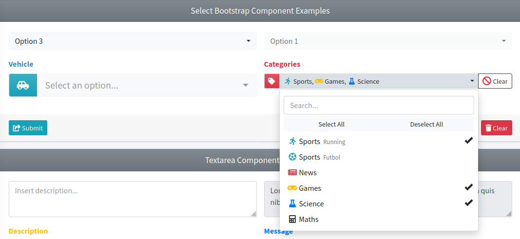
Examples
{{-- Minimal --}}
<x-adminlte-select-bs name="selBsBasic">
    <option>Option 1</option>
    <option disabled>Option 2</option>
    <option selected>Option 3</option>
</x-adminlte-select-bs>

{{-- Disabled --}}
<x-adminlte-select-bs name="selBsDisabled" disabled>
    <option>Option 1</option>
    <option>Option 2</option>
</x-adminlte-select-bs>

{{-- With prepend slot, label and a placeholder --}}
@php($config = ['placeholder' => 'Select an option...'])
<x-adminlte-select-bs name="selBsVehicle" label="Vehicle" label-class="text-info"
    igroup-size="lg" :config="$config">
    <x-slot name="prependSlot">
        <div class="input-group-text text-bg-info bg-gradient">
            <i class="bi bi-car-front"></i>
        </div>
    </x-slot>
    <option></option>
    <option>Car</option>
    <option>Motorcycle</option>
</x-adminlte-select-bs>

{{-- With multiple slots, plugin config parameter and custom options --}}
@php
    $config = [
        "placeholder" => "Select multiple options...",
        "maxItems" => 4,
        "plugins" => ["remove_button", "clear_button"],
    ];
@endphp
<x-adminlte-select-bs id="selBsCategory" name="selBsCategory[]" label="Categories"
    label-class="text-danger" igroup-size="sm" :config="$config" multiple>
    <x-slot name="prependSlot">
        <div class="input-group-text text-bg-danger bg-gradient">
            <i class="bi bi-tag"></i>
        </div>
    </x-slot>
    <x-slot name="appendSlot">
        <x-adminlte-button theme="outline-dark" label="Clear" icon="bi bi-slash-circle text-danger"/>
    </x-slot>
    <option>Sports</option>
    <option>News</option>
    <option>Games</option>
    <option>Science</option>
    <option>Maths</option>
</x-adminlte-select-bs>
Use the next images as reference to check how every example is rendered. Please, note the images were taken with an older package version (the dropdown is now rendered by Tom Select), and that the elements were wrapped inside a Bootstrap Grid System to organize them.
Required Plugin Configuration
The TomSelect entry is already available on the plugins section of the configuration file published by the package. Note the stylesheet is the Bootstrap 5 build of the plugin:
'plugins' => [
    ...
    'TomSelect' => [
        'active' => false,
        'files' => [
            [
                'type' => 'js',
                'asset' => false,
                'location' => '//cdn.jsdelivr.net/npm/tom-select@2.3.1/dist/js/tom-select.complete.min.js',
            ],
            [
                'type' => 'css',
                'asset' => false,
                'location' => '//cdn.jsdelivr.net/npm/tom-select@2.3.1/dist/css/tom-select.bootstrap5.min.css',
            ],
        ],
    ],
    ...
],
If you prefer to serve the plugin files locally, install the npm package and publish it into the public/vendor folder, then point the location values to the published files and set 'asset' => true:
npm i tom-select@^2.3
php artisan adminlte:plugins install --plugin=tomSelect
Finally, you need to use the @section('plugins.TomSelect', true) sentence on the blade file where you expect to use the component.
TextEditor
IMPORTANT
This component requires the Quill plugin, so be sure to enable it on the blade file where you use the component with @section('plugins.Quill', true). Read more on the plugins configuration section. The legacy Summernote plugin is not used anymore (it required jQuery).
This component represents a WYSIWYG editor (a rich text editor that shows the formatted result while you type) and extends from the base Input Group Component, so all the attributes and the three slots (prependSlot, appendSlot and bottomSlot) from it are inherited and rendered. On top of them, the default slot seeds the initial content of the editor. The component also defines next additional attributes:
| Attribute | Description | Type | Default | Required |
|---|---|---|---|---|
| config | Array with the plugin configuration parameters | array | [] | no |
| disabled | Renders a read only editor. Mapped to the plugin readOnly option | any | null | no |
| enable-old-support | Enable auto retrievement and filling with the submitted value in case of validation errors | any | null | no |
| placeholder | The hint shown while the editor is empty. Mapped to the plugin placeholder option | string | null | no |
| readonly | Renders a read only editor. Mapped to the plugin readOnly option | any | null | no |
IMPORTANT
The enable-old-support property offers a similar behavior as using the Laravel old() helper explicitly by your own.
The available plugin configuration are those explained on the Quill configuration documentation (theme, modules, formats, placeholder, readOnly, bounds, debug, ...). The disabled, readonly and placeholder HTML attributes are supported and mapped to the plugin readOnly and placeholder options.
WARNING
Quill renders into a plain div, not into a textarea. Because of that, the component renders a hidden textarea (with the d-none class) that holds the value submitted with the form, plus a div that holds the editor. The textarea is kept in sync on every text-change event and also right before the form is submitted, so the latest content is always sent even when the editor was never focused.
The component applies the next defaults, both overridable through the config attribute:
themeis set to'snow'.modules.toolbaris set to a default toolbar with the text styles, the lists, the headings, the colors, the alignment, the link / blockquote / code-block buttons and the clean button.
Legacy Summernote Properties
The height legacy property is still honoured: a numeric value is interpreted as pixels and it sets the min-height of the editing area (a string value is used as is, so you can also pass '20rem').
Every other legacy property became a no-op, it is accepted for backward compatibility and silently dropped: width, minHeight, maxHeight, focus, airMode, toolbar, popover, lang, dialogsInBody, dialogsFade, disableDragAndDrop, shortcuts, tabsize, styleTags, fontNames, fontNamesIgnoreCheck, fontSizes, colors, colorsName, lineHeights, tableClassName, insertTableMaxSize, callbacks, codeviewFilter, codeviewIframeFilter, spellCheck, disableResize, disableResizeEditor, followingToolbar and toolbarPosition.
WARNING
In particular, the Summernote toolbar array is not compatible with Quill and is dropped. Define the toolbar with the Quill syntax through config['modules']['toolbar'] instead.
NOTE
Optionally, you can make all the configuration from Javascript using the <id>-editor element as the target, instead of using the config property of the component.
Examples
{{-- Minimal --}}
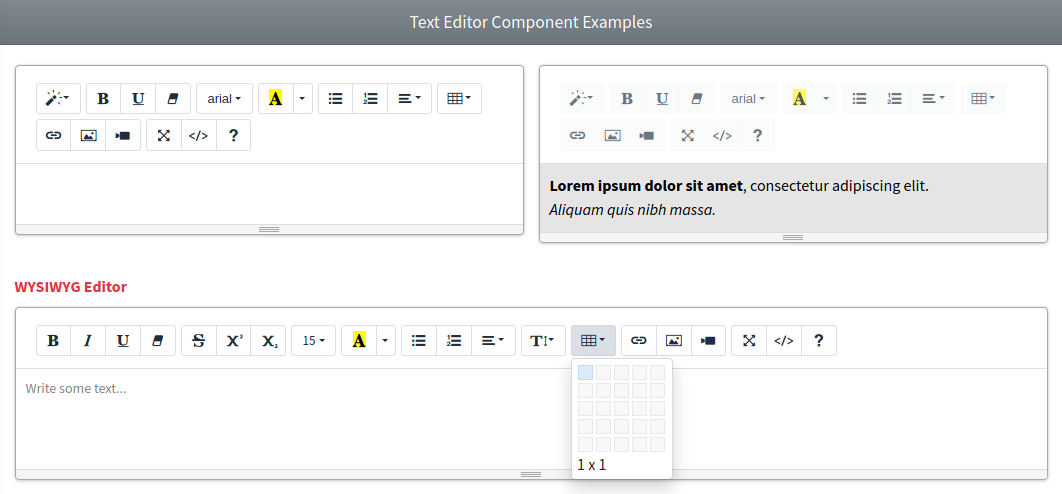
<x-adminlte-text-editor name="teBasic"/>

{{-- Disabled with content --}}
<x-adminlte-text-editor name="teDisabled" disabled>
    <b>Lorem ipsum dolor sit amet</b>, consectetur adipiscing elit.
    <br>
    <i>Aliquam quis nibh massa.</i>
</x-adminlte-text-editor>

{{-- With placeholder, sm size, label and a custom toolbar --}}
@php
$config = [
    "height" => 200,
    "modules" => [
        "toolbar" => [
            ["bold", "italic", "underline", "strike"],
            [["list" => "ordered"], ["list" => "bullet"]],
            [["header" => [1, 2, 3, false]]],
            [["color" => []], ["background" => []]],
            ["link", "blockquote", "code-block"],
            ["clean"],
        ],
    ],
];
@endphp
<x-adminlte-text-editor name="teConfig" label="WYSIWYG Editor" label-class="text-danger"
    igroup-size="sm" placeholder="Write some text..." :config="$config"/>
Use the next images as reference to check how every example is rendered. Please, note the images were taken with an older package version, the editor is now rendered by Quill.
Required Plugin Configuration
The Quill entry is already available on the plugins section of the configuration file published by the package:
'plugins' => [
    ...
    'Quill' => [
        'active' => false,
        'files' => [
            [
                'type' => 'js',
                'asset' => false,
                'location' => '//cdn.jsdelivr.net/npm/quill@2.0.3/dist/quill.js',
            ],
            [
                'type' => 'css',
                'asset' => false,
                'location' => '//cdn.jsdelivr.net/npm/quill@2.0.3/dist/quill.snow.css',
            ],
        ],
    ],
    ...
],
If you prefer to serve the plugin files locally, install the npm package and publish it into the public/vendor folder, then point the location values to the published files and set 'asset' => true:
npm i quill@^2.0
php artisan adminlte:plugins install --plugin=quill
NOTE
The configuration above loads the snow theme stylesheet. If you switch the theme option to 'bubble', remember to load the quill.bubble.css file instead.
Finally, you need to use the @section('plugins.Quill', true) sentence on the blade file where you expect to use the component.