Widget Components
These components are classified under the Widget category and represents some of the available AdminLTE widgets. At next you can see the list of available components:
The Stylesheet Utilities section at the end documents the AdminLTE v4 helper classes that are meant to be added to your own markup (avatar sizes and table modifiers) instead of being wrapped in a component.
About the theme Attribute
Every widget component below accepts a theme attribute (and some of them an icon-theme, progress-theme or badge attribute) with a color name. On AdminLTE v4 the colors are resolved as follows:
- The eight Bootstrap 5.3 theme colors (
primary,secondary,success,danger,warning,info,lightanddark) always work, they render astext-bg-{color},card-{color},callout-{color},alert-{color},btn-{color}orbg-{color}classes depending on the widget. - Any color of the AdminLTE v4 extended palette (
navy,midnight,slate,steel,graphite,sky,teal,olive,amber,orange,pink,fuchsia,violetandindigo) requires theassets.extended_colorsoption of the assets configuration to be enabled, so that theadminlte-colors.cssstylesheet is loaded. The AdminLTE palette stylesheet does not provide thealert-{color}andbtn-{color}families, so the package generates them for every extended color from the custom properties that the same stylesheet defines. This means the extended colors also work on the Alert component and on the Button component. - The AdminLTE v3 color names are still accepted and are translated on the fly into their v4 equivalent, as shown on the next table.
| v3 name | v4 name | v3 name | v4 name |
|---|---|---|---|
lightblue | sky | blue | primary |
maroon | pink | red | danger |
purple | violet | green | success |
lime | olive | yellow | warning |
gray | secondary | cyan | info |
gray-dark | dark |
NOTE
The translation is skipped when the assets.extended_colors_v3_aliases option is enabled, because in that case the adminlte-colors-v3.css stylesheet is loaded and the old names exist as real CSS classes.
WARNING
The bg-gradient-{color} classes are not part of the AdminLTE v4 core stylesheet anymore, they only exist on the extended colors stylesheet. No component paints a gradient on your behalf, so the portable way to get one is to combine the color class with the Bootstrap bg-gradient helper yourself, for example class="bg-gradient" on a component that already renders a text-bg-{color} class.
Alert
This component represents an AdminLTE styled alert notification. The following attributes are available:
| Attribute | Description | Type | Default | Required |
|---|---|---|---|---|
| icon | An icon for the alert (Bootstrap Icons by default) | string | null | no |
| dismissable | Setup the alert as dismissable, a button will be available to dismiss the alert | any | null | no |
| theme | A theme color: dark, light, primary, secondary, info, success, warning, danger or any color of the AdminLTE extended palette like sky or teal. See About the theme Attribute | string | null | no |
| title | The title for the alert | string | null | no |
Any other attribute you define will be directly inserted into the underlying div.alert element. So, for example, you can define a class, onclick, id or any other attribute you may need.
When a theme is set and no icon is given, a default Bootstrap Icon is picked for the theme:
| Theme | Default icon | Theme | Default icon |
|---|---|---|---|
dark | bi bi-lightning-fill | info | bi bi-info-circle-fill |
light | bi bi-lightbulb | success | bi bi-check-circle-fill |
primary | bi bi-bell-fill | warning | bi bi-exclamation-triangle-fill |
secondary | bi bi-tag-fill | danger | bi bi-x-octagon-fill |
NOTE
The extended palette colors have no default icon, so pass an icon yourself when you theme an alert with one of them. An empty value (icon="") suppresses the default icon of a Bootstrap theme.
NOTE
The alert is rendered with the Bootstrap 5 markup: the dismiss control is a button.btn-close with data-bs-dismiss="alert", and a dismissable alert also gets the fade and show classes so the closing animation works. When no theme is given, the alert gets a plain border instead of a colored background.
Slots
- default slot: The body of the alert, everything you write between the opening and the closing tag of the component. It accepts markup.
Examples
{{-- Minimal --}}
<x-adminlte-alert>Minimal example</x-adminlte-alert>

{{-- Minimal with title and dismissable --}}
<x-adminlte-alert title="Well done!" dismissable>
    Minimal example
</x-adminlte-alert>

{{-- Minimal with icon only --}}
<x-adminlte-alert icon="bi bi-person">
    User has logged in!
</x-adminlte-alert>

{{-- Themes --}}
<x-adminlte-alert theme="light" title="Tip">
    Light theme alert!
</x-adminlte-alert>
<x-adminlte-alert theme="dark" title="Important">
    Dark theme alert!
</x-adminlte-alert>
<x-adminlte-alert theme="primary" title="Primary Notification">
    Primary theme alert!
</x-adminlte-alert>
<x-adminlte-alert theme="secondary" icon="" title="Secondary Notification">
    Secondary theme alert!
</x-adminlte-alert>
<x-adminlte-alert theme="info" title="Info">
    Info theme alert!
</x-adminlte-alert>
<x-adminlte-alert theme="success" title="Success">
    Success theme alert!
</x-adminlte-alert>
<x-adminlte-alert theme="warning" title="Warning">
    Warning theme alert!
</x-adminlte-alert>
<x-adminlte-alert theme="danger" title="Danger">
    Danger theme alert!
</x-adminlte-alert>

{{-- Custom --}}
<x-adminlte-alert class="text-bg-teal text-uppercase" icon="bi bi-hand-thumbs-up-fill"
    title="Done" dismissable>
    Your payment was complete!
</x-adminlte-alert>
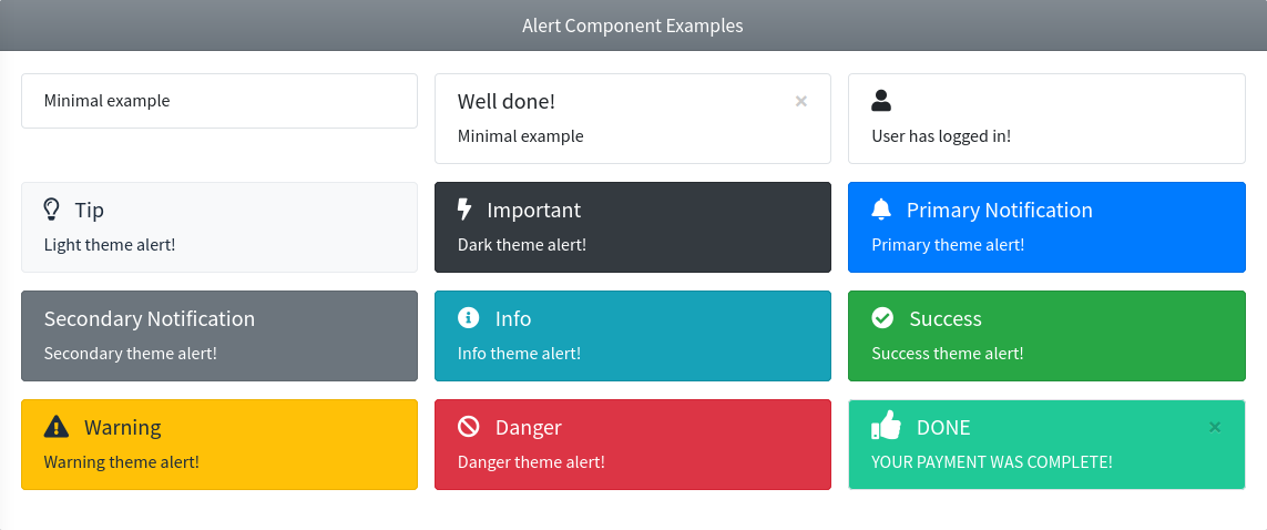
Use the next image as reference to check how every example is rendered. Please, note in the image the alerts were wrapped inside a Bootstrap Grid System to organize them.
Callout
This component represents an AdminLTE styled callout notification. The following attributes are available:
| Attribute | Description | Type | Default | Required |
|---|---|---|---|---|
| icon | An icon for the callout (Bootstrap Icons by default) | string | null | no |
| theme | A theme color: primary, secondary, info, success, warning, danger, light or dark. See About the theme Attribute | string | null | no |
| title | The title for the callout | string | null | no |
| title-class | Extra classes for the title container (replaces the default mb-1 class) | string | null | no |
| url | An URL for the callout. When provided, a callout-link styled anchor is rendered after the callout content | string | null | no |
| url-text | The text/label of the callout link. Defaults to the url value | string | null | no |
Any other attribute you define will be directly inserted into the underlying div.callout element. So, for example, you can define a class, onclick, id or any other attribute you may need.
The Callout Link
The AdminLTE v4 stylesheet provides a .callout-link class, which renders a bold anchor painted with the emphasis color of the callout theme (--bs-callout-link-color). Use the url attribute to get one:
<x-adminlte-callout theme="warning" title="Quota" url="/billing" url-text="Upgrade your plan">
    You are close to the limit of your current plan.
</x-adminlte-callout>
NOTE
The emphasis color is only defined by the themed callout variants (callout-primary, callout-info, ...). On a callout without a theme, the link keeps the color it inherits and only the bold weight of .callout-link applies.
Inline links inside the callout content are styled too (the .callout a rule paints them with the theme link color), so you only need the url attribute for the trailing call to action. You can also write your own <a class="callout-link"> anywhere inside the default slot.
Slots
- linkSlot: Replaces the text of the callout link, for example to add an icon to it. It requires the
urlattribute, which is what renders the anchor.
<x-adminlte-callout theme="info" title="Docs" url="/docs">
    Read the reference before going on.
    <x-slot name="linkSlot"><i class="bi bi-arrow-right-short"></i> Take me there</x-slot>
</x-adminlte-callout>
Examples
{{-- Minimal --}}
<x-adminlte-callout>Minimal example</x-adminlte-callout>

{{-- themes --}}
<x-adminlte-callout theme="info" title="Information">
    Info theme callout!
</x-adminlte-callout>
<x-adminlte-callout theme="success" title="Success">
    Success theme callout!
</x-adminlte-callout>
<x-adminlte-callout theme="warning" title="Warning">
    Warning theme callout!
</x-adminlte-callout>
<x-adminlte-callout theme="danger" title="Danger">
    Danger theme callout!
</x-adminlte-callout>

{{-- Custom --}}
<x-adminlte-callout theme="success" icon="bi bi-hand-thumbs-up-fill" title="Done">
    <i>Your payment was complete!</i>
</x-adminlte-callout>
<x-adminlte-callout theme="danger" title-class="text-danger text-uppercase"
    icon="bi bi-exclamation-circle-fill" title="Payment Error">
    <i>There was an error on the payment procedure!</i>
</x-adminlte-callout>
<x-adminlte-callout theme="info" title-class="fw-bold"
    icon="bi bi-bell-fill" title="Notification">
    This is a notification.
</x-adminlte-callout>
<x-adminlte-callout theme="warning" title-class="text-uppercase"
    icon="bi bi-flower1" title="observation">
    <i>A styled observation for the user.</i>
</x-adminlte-callout>

{{-- With a callout link --}}
<x-adminlte-callout theme="primary" icon="bi bi-info-circle-fill" title="New release"
    url="/changelog" url-text="See what changed">
    A new version of the application is available.
</x-adminlte-callout>
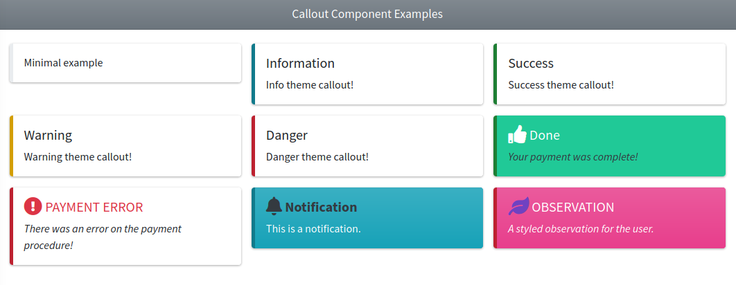
Use the next image as reference to check how every example is rendered. Please, note in the image the callouts were wrapped inside a Bootstrap Grid System to organize them.
Card
This component represents an AdminLTE card box. The following attributes are available:
| Attribute | Description | Type | Default | Required |
|---|---|---|---|---|
| body-class | Additional classes for the card-body container | string | null | no |
| collapsible | Enables a collapsible card with a button to collapse/expand it. Use the 'collapsed' string value to initiate the card on collapsed mode | any | null | no |
| disabled | Disables the card (an overlay will show over the card) | any | null | no |
| footer-class | Additional classes for the card-footer container | string | null | no |
| header-class | Additional classes for the card-header container | string | null | no |
| icon | An icon for the card header (Bootstrap Icons by default) | string | null | no |
| maximizable | Enables a maximizable card with a button to maximize it. Use the 'maximized' string value to initiate the card on maximized mode | any | null | no |
| removable | Enables a removable card with a button to remove it | any | null | no |
| theme | The card theme: light, dark, primary, secondary, info, success, warning, danger or any color of the AdminLTE extended palette like sky or teal. See About the theme Attribute | string | null | no |
| theme-mode | The theme mode (full or outline) | string | null | no |
| title | The title for the card header | string | null | no |
| title-class | Additional classes for the card title element | string | null | no |
| title-tag | The tag of the card title element. One of h1 to h6, div or span. Any other value falls back to the default | string | h3 | no |
| tabs | A set of tabs rendered as a nav-tabs navigation in the card header. See Cards with Tabs | array | null | no |
Any other attribute you define will be directly inserted into the underlying div.card element. So, for example, you can define extra classes on the card by using class, or use onclick, id or any other attribute you may need.
NOTE
Default spacing. The AdminLTE v4 stylesheet gives the cards no bottom margin of their own, so the component adds a mb-4 utility to the div.card element, which is what every card of the AdminLTE reference layouts carries.
The default is only added when you do not provide a bottom margin yourself. A mb-* or my-* class (values 0 to 5, or auto) on the class attribute wins and suppresses the default:
<x-adminlte-card title="Spaced"/>             {{-- class="card mb-4" --}}
<x-adminlte-card title="Flush" class="mb-0"/> {{-- class="card mb-0" --}}
<x-adminlte-card title="Roomy" class="my-5"/> {{-- class="card my-5" --}}
This check exists because the Bootstrap spacing utilities are all declared with !important at the same specificity, so simply adding a second margin class would not reliably override the first one — the winner would be decided by the order of the rules in the stylesheet, not by the order you wrote them.
The ProfileWidget component follows the same rule, since it is a card too.
NOTE
The theme-mode values render as follows on AdminLTE v4:
outline→card card-{theme} card-outline. The card title stays plain (card-title), on AdminLTE v4 the theme color of an outline card is only painted on the top border.full→card text-bg-{theme}, since the AdminLTE v3bg-gradient-{color}classes are not part of the v4 core stylesheet anymore. Addclass="bg-gradient"yourself if you want the gradient back.- No
theme-mode→card card-{theme}.
Card Tools
The collapse, remove and maximize buttons are handled by the AdminLTE v4 card plugin, which is driven by the data-lte-toggle attribute (the v3 data-card-widget attribute does not exist anymore):
| Attribute | Enabled by |
|---|---|
data-lte-toggle="card-collapse" | collapsible |
data-lte-toggle="card-remove" | removable |
data-lte-toggle="card-maximize" | maximizable |
If you add your own card tool buttons through the toolsSlot, use those attribute values.
NOTE
The disabled attribute no longer renders the AdminLTE v3 .overlay element (it was removed on v4). The overlay is now built with Bootstrap 5 utilities and shows a bi bi-slash-circle icon.
The btn-tool class of the AdminLTE v4 stylesheet is declared as .btn-tool:not(.btn-tool-custom), so adding btn-tool-custom next to it keeps the compact tool sizing while opting out of the muted colors, letting your own Bootstrap button classes win:
<x-adminlte-card title="Card with a colored tool" collapsible>
    <x-slot name="toolsSlot">
        <button type="button" class="btn btn-tool btn-tool-custom btn-danger">
            <i class="bi bi-trash"></i>
        </button>
    </x-slot>
    Body...
</x-adminlte-card>
The component never emits btn-tool-custom on the collapse, remove and maximize buttons on purpose: those are the AdminLTE tool buttons and are expected to stay muted. The class is therefore only relevant for the buttons you write in the toolsSlot, which is markup you own entirely, so it needs no attribute of its own.
Card States
The AdminLTE v4 card plugin toggles a set of resting state classes on the div.card element. Two of them can be set from the component, so a card renders already on that state:
| Class | Set by | Effect |
|---|---|---|
collapsed-card | collapsible="collapsed" | The card body and footer start hidden. |
maximized-card | maximizable="maximized" | The card starts fixed to the viewport at full size. |
was-collapsed | collapsible="collapsed" and maximizable="maximized" | Added automatically, it is the flag the plugin uses to keep the body of a maximized card visible and to return to the collapsed state when the card is restored. |
expanding-card | — | Not exposed, see the note below. |
{{-- Starts maximized, the tool button restores it --}}
<x-adminlte-card title="Maximized Card" theme="primary" maximizable="maximized">
    This card covers the viewport as soon as the page loads...
</x-adminlte-card>
Any other value of maximizable (including a bare maximizable attribute) only adds the tool button, exactly as before.
NOTE
The AdminLTE plugin also sets maximized-card on the <html> element to lock the page scroll while a card is maximized. Since no click took place on an initially maximized card, the component pushes a one line script into the js stack that does it, so the initial state behaves like the toggled one. The script is only pushed when a card actually uses maximizable="maximized".
NOTE
expanding-card is deliberately not exposed. It is not a resting state: the card plugin adds it when the expand animation starts and removes it when the animation ends. The only rules that read it are the .card-tabs:not(.expanding-card).collapsed-card ones, which keep the tabs navigation of a collapsed tabbed card from being restyled mid animation. Rendering it in the initial markup would leave a collapsed tabbed card stuck in the animating look until the first toggle, so the component leaves it to the plugin.
Card Utilities
| Class | Effect |
|---|---|
height-control | Caps the card body at 300px and scrolls it. |
.card .nav.flex-column | A vertical nav inside a card gets dividers between the items and none after the last one. |
The height-control rule of the stylesheet is .card.height-control .card-body, so it belongs on the card element, which the plain class attribute already reaches (every unknown attribute is merged into the div.card):
<x-adminlte-card title="Long list" class="height-control">
    A very long content that scrolls inside the card body...
</x-adminlte-card>
No dedicated attribute is provided for it, since class="height-control" is not longer than an attribute would be and composes with the rest of your utility classes.
Slots
- default slot: The body of the card, the content of the
div.card-bodyelement. - toolsSlot: Use this slot to add extra elements on the card header.
- footerSlot: Use this slot to fill the card footer.
- titleSlot: Use this slot when the title needs markup (a badge, a link, an inline form). It replaces the
titleattribute and keeps theiconand the card tools in place. - headerSlot: Use this slot to replace the whole header content, both the title and the tools. This is the escape hatch for a header layout the attributes cannot express.
- tabsSlot: Use this slot to provide your own
ul.nav.nav-tabsnavigation instead of the generated one. Providing it turns the card into a tabbed card on its own. See Cards with Tabs.
Cards with Tabs
AdminLTE v4 provides a tabbed card layout, where the header holds a Bootstrap nav-tabs navigation instead of a title. Pass the tabs through the tabs attribute, and place one .tab-pane per tab in the card body:
<x-adminlte-card theme="primary" theme-mode="outline" :tabs="[
    ['id' => 'tab-home', 'label' => 'Home', 'icon' => 'bi bi-house'],
    ['id' => 'tab-profile', 'label' => 'Profile'],
    ['id' => 'tab-about', 'label' => 'About', 'active' => true],
]">
    <div class="tab-pane fade" id="tab-home" role="tabpanel" tabindex="0">Home pane</div>
    <div class="tab-pane fade" id="tab-profile" role="tabpanel" tabindex="0">Profile pane</div>
    <div class="tab-pane fade show active" id="tab-about" role="tabpanel" tabindex="0">About pane</div>
</x-adminlte-card>
Every entry accepts an id, a label, an optional icon and an optional active flag. When no entry is flagged, the first one is activated. The identifiers are sanitized down to letters, digits, _ and -, and an entry left without a usable one gets a generated identifier.
The card body is wrapped in a div.tab-content automatically, and the card gets the card-tabs class (or card-outline-tabs with theme-mode="outline").
NOTE
The panes are plain Bootstrap markup, so the id of each pane has to match the id of its tab, and the initially visible one carries show active. The tab switching itself is handled by the Bootstrap tab plugin.
Examples
{{-- Minimal with a title / no body --}}
<x-adminlte-card title="A card without body"/>

{{-- Minimal without header / body only --}}
<x-adminlte-card theme="olive" theme-mode="outline">
    A card without header...
</x-adminlte-card>

{{-- Disabled --}}
<x-adminlte-card title="Disabled Card" theme="teal" disabled>
    A disabled card with teal theme...
</x-adminlte-card>

{{-- Themes --}}
<x-adminlte-card title="Dark Card" theme="dark" icon="bi bi-moon-fill">
    A dark theme card...
</x-adminlte-card>
<x-adminlte-card title="Sky Card" theme="sky" theme-mode="outline"
    icon="bi bi-envelope" header-class="text-uppercase rounded-bottom border-info"
    removable>
    A removable card with outline sky theme...
</x-adminlte-card>
<x-adminlte-card title="Violet Card" theme="violet" icon="bi bi-fan" removable collapsible>
    A removable and collapsible card with violet theme...
</x-adminlte-card>
<x-adminlte-card title="Success Card" theme="success" theme-mode="full"
    icon="bi bi-hand-thumbs-up" collapsible="collapsed">
    A collapsible card with full success theme and collapsed...
</x-adminlte-card>
<x-adminlte-card title="Info Card" theme="info" icon="bi bi-bell" collapsible removable maximizable>
    An info theme card with all the tool buttons...
</x-adminlte-card>

{{-- States and utilities --}}
<x-adminlte-card title="Maximized Card" theme="primary" maximizable="maximized">
    A card that starts covering the viewport...
</x-adminlte-card>
<x-adminlte-card title="Scrollable Card" theme="secondary" class="height-control">
    A card whose body is capped at 300px and scrolls...
</x-adminlte-card>

{{-- Complex / Extra tool / Footer --}}
<x-adminlte-card title="Form Card" theme="pink" theme-mode="outline"
    class="shadow" header-class="bg-body-secondary"
    footer-class="border-top rounded"
    icon="bi bi-bell" collapsible removable maximizable>
    <x-slot name="toolsSlot">
        <select class="form-select form-select-sm w-auto">
            <option>Skin 1</option>
            <option>Skin 2</option>
            <option>Skin 3</option>
        </select>
    </x-slot>
    <x-adminlte-input name="User" placeholder="Username"/>
    <x-adminlte-input name="Pass" type="password" placeholder="Password"/>
    <x-slot name="footerSlot">
        <x-adminlte-button class="d-flex ms-auto" theme="light" label="submit"
            icon="bi bi-box-arrow-in-right"/>
    </x-slot>
</x-adminlte-card>
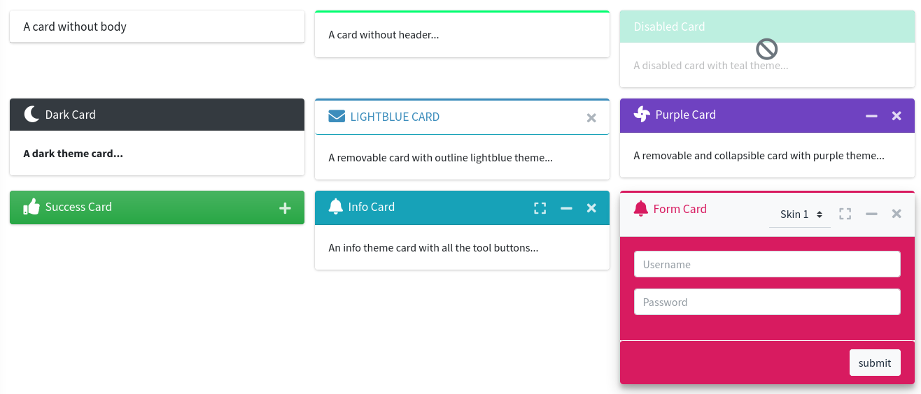
Use the next image as reference to check how every example is rendered. Please, note in the image the cards were wrapped inside a Bootstrap Grid System to organize them.
Direct Chat
These components represent an AdminLTE direct chat widget, a card holding a conversation and a contacts pane that slides over it. The widget is built out of three cooperating components:
x-adminlte-direct-chat: the card itself, it holds both sliding panes.x-adminlte-direct-chat-msg: one message of the conversation.x-adminlte-direct-chat-contact: one entry of the contacts pane.
The following attributes are available on the direct chat container:
| Attribute | Description | Type | Default | Required |
|---|---|---|---|---|
| badge | The content of the badge shown on the card header, usually the amount of unread messages | string | null | no |
| badge-theme | The theme of the header badge. Falls back to the widget theme | string | null | no |
| body-class | Additional classes for the card-body container | string | null | no |
| collapsible | Enables a collapsible card with a button to collapse/expand it. Use the 'collapsed' string value to initiate the card on collapsed mode | any | null | no |
| contacts-light | Enables the light style of the contacts pane, which paints it over the subtle light background instead of over the inverted one | any | null | no |
| contacts-open | Initiates the widget with the contacts pane already slid in | any | null | no |
| footer-class | Additional classes for the card-footer container | string | null | no |
| header-class | Additional classes for the card-header container | string | null | no |
| height | The height of both panes. A bare number is taken as pixels | string|int | null | no |
| icon | An icon for the card header (Bootstrap Icons by default) | string | null | no |
| maximizable | Enables a maximizable card with a button to maximize it | any | null | no |
| removable | Enables a removable card with a button to remove it | any | null | no |
| theme | The widget theme: light, dark, primary, secondary, info, success, warning, danger or any color of the AdminLTE extended palette like sky or teal. See About the theme Attribute | string | primary | no |
| timestamp-mode | The contrast mode of the message timestamps (light or dark). Any other value leaves the stylesheet default in place | string | null | no |
| title | The title for the card header | string | null | no |
Any other attribute you define will be directly inserted into the underlying div.card.direct-chat element. So, for example, you can define extra classes on the card by using class, or use onclick, id or any other attribute you may need.
The following attributes are available on the direct chat message:
| Attribute | Description | Type | Default | Required |
|---|---|---|---|---|
| end | Marks the message as an outgoing one. The whole entry is mirrored and the bubble is painted with the theme color of the enclosing widget | any | null | no |
| img | The avatar of the author of the message | string | null | no |
| name | The name of the author of the message | string | null | no |
| timestamp | The timestamp of the message | string | null | no |
The default slot holds the text of the message, which is rendered as the div.direct-chat-text bubble. Any other attribute you define will be directly inserted into the underlying div.direct-chat-msg element.
The following attributes are available on the direct chat contact:
| Attribute | Description | Type | Default | Required |
|---|---|---|---|---|
| date | The date of the last message exchanged with the contact | string | null | no |
| img | The avatar of the contact | string | null | no |
| msg | An excerpt of the last message exchanged with the contact. The default slot takes precedence over this attribute | string | null | no |
| name | The name of the contact | string | null | no |
| url | An url for the contact. When defined, the whole entry is wrapped inside a link | string | null | no |
Any other attribute you define will be directly inserted into the underlying li element of the contacts list.
IMPORTANT
The theme attribute defaults to primary here, unlike on the other widgets. The bubble of an end message is painted through the --lte-direct-chat-color and --lte-direct-chat-bg custom properties, and those are only declared by the .direct-chat-{color} variants. A widget left without a theme would render its outgoing bubbles transparent.
NOTE
Both panes share the height. The messages pane and the contacts pane are stacked one over the other inside the card body, so the component always writes the same height on both of them. A mismatch makes the contacts pane slide in misaligned, which is why the height is a single attribute of the container instead of one per pane.
A bare number is taken as pixels (height="250" → height: 250px), and the px, rem, em, vh and % units are accepted as well. Any other value is dropped, so no arbitrary text can reach the generated style attribute. Without the attribute, both panes keep the 250px default of the stylesheet.
NOTE
The widget is a card, so it follows the same mb-4 default spacing rule described on the Card component, and its collapse, remove and maximize buttons use the very same data-lte-toggle hooks.
Contacts Pane
The contacts pane and its toggle button are only rendered when the contactsSlot is filled, since without contacts there is nothing to slide in. The pane is driven by the AdminLTE v4 DirectChat plugin, which listens for the data-lte-toggle="chat-pane" attribute the component puts on the button, and toggles the direct-chat-contacts-open class on the card.
If you add your own toggle button through the toolsSlot, use that attribute value. The contacts-open attribute renders the same class the plugin toggles, so a pane that starts open keeps working with the button.
Slots
The direct chat container provides the following slots:
- The default slot holds the conversation, it is rendered inside the
div.direct-chat-messagespane. - contactsSlot: Use this slot to fill the contacts pane. The component wraps it in the
ul.contacts-listelement, so the slot has to holdlientries, which is what thex-adminlte-direct-chat-contactcomponent renders. - footerSlot: Use this slot to fill the card footer, usually with the message input form.
- toolsSlot: Use this slot to add extra elements on the card header.
Examples
{{-- Minimal --}}
<x-adminlte-direct-chat title="Direct Chat">
    <x-adminlte-direct-chat-msg name="Alexander Pierce" timestamp="23 Jan 2:00 pm"
        img="/img/user1-128x128.jpg">
        Is this template really for free? That's unbelievable!
    </x-adminlte-direct-chat-msg>
    <x-adminlte-direct-chat-msg name="Sarah Bullock" timestamp="23 Jan 2:05 pm"
        img="/img/user3-128x128.jpg" end>
        You better believe it!
    </x-adminlte-direct-chat-msg>
</x-adminlte-direct-chat>

{{-- Complete --}}
<x-adminlte-direct-chat title="Direct Chat" theme="info" badge="3"
    badge-theme="warning" height="250" timestamp-mode="light" contacts-light
    collapsible removable>

    <x-adminlte-direct-chat-msg name="Alexander Pierce" timestamp="23 Jan 2:00 pm"
        img="/img/user1-128x128.jpg">
        Working with AdminLTE on a great new app! Wanna join?
    </x-adminlte-direct-chat-msg>

    <x-adminlte-direct-chat-msg name="Sarah Bullock" timestamp="23 Jan 6:10 pm"
        img="/img/user3-128x128.jpg" end>
        I would love to.
    </x-adminlte-direct-chat-msg>

    <x-slot name="contactsSlot">
        <x-adminlte-direct-chat-contact name="Count Dracula" url="/chats/1"
            img="/img/user1-128x128.jpg" date="2/28/2023"
            msg="How have you been? I was..."/>
        <x-adminlte-direct-chat-contact name="Sarah Doe" url="/chats/2"
            img="/img/user7-128x128.jpg" date="2/23/2023"
            msg="I will be waiting for..."/>
        <x-adminlte-direct-chat-contact name="Nadia Jolie" url="/chats/3"
            img="/img/user3-128x128.jpg" date="2/20/2023"
            msg="I'll call you back at..."/>
    </x-slot>

    <x-slot name="footerSlot">
        <form action="/chats/1/messages" method="post">
            @csrf
            <div class="input-group">
                <input type="text" name="message" class="form-control"
                    placeholder="Type Message ...">
                <button type="submit" class="btn btn-primary">Send</button>
            </div>
        </form>
    </x-slot>

</x-adminlte-direct-chat>
Info Box
This component represents an AdminLTE info box widget. The following attributes are available:
| Attribute | Description | Type | Default | Required |
|---|---|---|---|---|
| icon | An icon for the info box (Bootstrap Icons by default) | string | null | no |
| icon-theme | The icon wrapper theme (same values as theme property) | string | null | no |
| description | A long text/description for the info box | string | null | no |
| progress | Enables a progress bar for the box. The value should be an integer with the percentage of the progress bar | int | null | no |
| progress-theme | The progress bar theme (same values as theme property). When the box is themed and no value is given, the bar inherits the box contrast color | string | null | no |
| text | A short text/description for the info box | string | null | no |
| theme | The info box theme: light, dark, primary, secondary, info, success, warning, danger or any color of the AdminLTE extended palette like sky or teal. See About the theme Attribute | string | null | no |
| title | A title/header for the info box | string | null | no |
| url | An url for the info box. By default, will be placed on the title | string | null | no |
| url-target | The target element where to place the url: title or text | string | 'title' | no |
| more | A label for the info-box-more link, rendered below the content | string | null | no |
Any other attribute you define will be directly inserted into the underlying div.info-box element. So, for example, you can define extra classes using the class attribute, use the onclick, the id or any other attribute you may need.
WARNING
The AdminLTE v3 gradient-{color} theme values (for example theme="gradient-teal") are not supported anymore, they would render an invalid text-bg-gradient-teal class. Use a plain theme name and add the Bootstrap bg-gradient helper through the class attribute instead.
Slots
The title and text attributes are escaped, so they cannot carry markup. Use the slots when the reference layouts do, for example for the unit of a number:
- titleSlot: Replaces the
titleattribute and fills thespan.info-box-textelement. - textSlot: Replaces the
textattribute and fills thespan.info-box-numberelement. - moreSlot: Replaces the
moreattribute, thespan.info-box-moreextra line rendered below the description. - default slot: Extra free content appended at the end of the
div.info-box-contentelement.
<x-adminlte-info-box icon="bi bi-bookmark" theme="info">
    <x-slot name="titleSlot">Bookmarks</x-slot>
    <x-slot name="textSlot">10 <small>%</small></x-slot>
</x-adminlte-info-box>
A slot wins over the attribute of the same name, and the url/url-target wiring keeps working on both.
Javascript Utility Class
This component also provides a Javascript utility class called _AdminLTE_InfoBox. You can use this class to interact or update an already rendered info box element. To use the class, first you need to assign an id attribute to your info box element, then you create an object using the id attribute previously assigned in the class constructor, for example:
{{-- On the blade file... --}}
<x-adminlte-info-box id="myInfoBox" title="Title" .../>{{-- On the 'js' section (or stack) of the same blade file... --}}
@push('js')
<script>
document.addEventListener('DOMContentLoaded', function () {
window.myInfoBox = new _AdminLTE_InfoBox("myInfoBox");
});
</script>
@endpushNOTE
The utility class is defined by the small script the component pushes into the js stack of the layout, so it only exists on the pages where the component is actually rendered, and only after the document is ready. That is why the object is created inside a DOMContentLoaded listener, and why your own script has to be pushed into the same js section of the layout. The same applies to the _AdminLTE_Progress, _AdminLTE_SmallBox and _AdminLTE_Toast classes described further below.
Then you can use the next methods from the instantiated object:
myInfoBox.update(data): To update the data of the info box element. The data should be an object with the new attributes, the supported object keys are:title,text,description,iconandprogress(see examples for more details). Theurlattribute may be updated too.
Examples
{{-- Minimal with title, text and icon --}}
<x-adminlte-info-box title="Title" text="some text" icon="bi bi-star"/>

{{-- Themes --}}
<x-adminlte-info-box title="Views" text="424" icon="bi bi-eye" theme="teal" class="bg-gradient"/>

<x-adminlte-info-box title="Downloads" text="1205" icon="bi bi-download" icon-theme="violet"/>

<x-adminlte-info-box title="528" text="User Registrations" icon="bi bi-person-plus"
    theme="primary" class="bg-gradient" icon-theme="light"/>

<x-adminlte-info-box title="Tasks" text="75/100" icon="bi bi-list-task" theme="warning"
    icon-theme="dark" progress=75 progress-theme="dark"
    description="75% of the tasks have been completed"/>

{{-- Updatable --}}
<x-adminlte-info-box title="Reputation" text="0/1000" icon="bi bi-award"
    theme="danger" id="ibUpdatable" progress=0 progress-theme="teal"
    description="0% reputation completed to reach next level"/>

@push('js')
<script>

    document.addEventListener('DOMContentLoaded', function () {

        let iBox = new _AdminLTE_InfoBox('ibUpdatable');

        let updateIBox = () =>
        {
            // Update data.
            let rep = Math.floor(1000 * Math.random());
            let idx = rep < 100 ? 0 : (rep > 500 ? 2 : 1);
            let progress = Math.round(rep * 100 / 1000);
            let text = rep + '/1000';
            let icon = 'bi bi-award ' + ['text-primary', 'text-light', 'text-warning'][idx];
            let description = progress + '% reputation completed to reach next level';

            let data = {text, icon, description, progress};
            iBox.update(data);
        };

        setInterval(updateIBox, 5000);
    })

</script>
@endpush
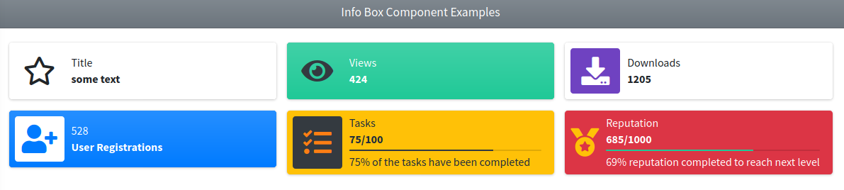
Use the next image as reference to check how every example is rendered. Please, note in the image the elements were wrapped inside a Bootstrap Grid System to organize them.
Post
This component represents a post of a feed, the block the AdminLTE v4 reference layouts use for the entries of a social wall or of an activity stream. It renders the div.post wrapper, and, when any author data is given, a User Block as its header. The following attributes are available:
| Attribute | Description | Type | Default | Required |
|---|---|---|---|---|
| description | A short description below the author name, usually a timestamp or the context of the entry | string | null | no |
| img | The avatar of the author | string | null | no |
| name | The name of the author. Providing any of name, img or description is what makes the header appear | string | null | no |
| size | The size of the author user block. The only accepted value is sm, which shrinks the avatar and the fonts, as the comments of a feed do. Any other value is ignored | string | null | no |
| url | An url for the author. When defined, the name is wrapped inside a link | string | null | no |
Any other attribute you define will be directly inserted into the underlying div.post element. So, for example, you can define a class, id or any other attribute you may need.
Slots
- default slot: The body of the post, the text and the markup of the entry.
- footerSlot: The actions row rendered at the end of the post, usually a set of links (Share, Like, …).
Examples
{{-- A post with an author and an actions row --}}
<x-adminlte-post name="Jonathan Burke Jr." description="Shared publicly · 7:30 PM today"
img="{{ asset('vendor/adminlte/dist/assets/img/user1-128x128.jpg') }}"
url="{{ url('profiles/1') }}">
<p>
Lorem ipsum represents a long-held tradition for designers, typographers
and the like.
</p>
<x-slot name="footerSlot">
<a href="#" class="link-body-emphasis text-sm me-2">
<i class="bi bi-share me-1"></i> Share
</a>
<a href="#" class="link-body-emphasis text-sm">
<i class="bi bi-heart me-1"></i> Like
</a>
</x-slot>
</x-adminlte-post>
{{-- A small post, the shape used for the comments of a feed --}}
<x-adminlte-post name="Adam Jones" description="Posted 5 photos · 5:30 PM today"
img="{{ asset('vendor/adminlte/dist/assets/img/user7-128x128.jpg') }}" size="sm">
Look at these!
</x-adminlte-post>
{{-- Without any author data, only the wrapper and the content are rendered --}}
<x-adminlte-post>
A plain entry of the feed.
</x-adminlte-post>NOTE
A post is meant to live inside the body of a Card, which is what gives it its separators and spacing on the reference layouts.
Profile Col Item, Profile Row Item
Both of these components represents an item for the AdminLTE profile widget. The main difference is that on the profile-col-item the elements are stacked vertically, while on the profile-row-item the element are stacked horizontally. The following attributes are available:
| Attribute | Description | Type | Default | Required |
|---|---|---|---|---|
| badge | A badge theme for the text attribute. When used, the text attribute will be wrapped inside a badge of the configured theme. | string | null | no |
| icon | An icon for the item (Bootstrap Icons by default) | string | null | no |
| text | The text/description for the item | string | null | no |
| text-tooltip | An extra tooltip (the HTML title attribute) for the text of the item | string | null | no |
| title | The title/header for the item | string | null | no |
| size | The item size. Used to wrap the item inside a col-size div | integer | 4 (col item) / 12 (row item) | no |
| url | An url for the item. By default, it'll be placed on the title attribute | string | null | no |
| url-target | The target element where to place the url: title (default) or text | string | 'title' | no |
| layout-type | Only on the profile-row-item: default keeps the historic markup, nav emits the AdminLTE v4 reference markup. See The nav Row Layout | string | 'default' | no |
The available themes for the badge are: light, dark, primary, secondary, info, success, warning, danger or any color of the AdminLTE v4 extended palette like sky or teal. See About the theme Attribute for the details, the badge is rendered with the Bootstrap 5 badge text-bg-{theme} classes.
TIP
You may prepend the pill- token to a theme (for example, pill-primary) to get a pill badge instead of a normal badge (it adds the Bootstrap 5 rounded-pill class).
NOTE
On the profile-row-item the text is right aligned with the Bootstrap 5 float-end class (the Bootstrap 4 float-right class does not exist anymore).
Any other attribute you define will be directly inserted into the underlying div.col-<size> element. So, for example, you can define class, onclick, id or any other attribute you may need. To see usage examples, check the Profile Widget Component.
Slots
- textSlot: Replaces the escaped
textattribute, for a badge, an icon or any other markup.
The nav Row Layout
The AdminLTE v4 reference layouts build the footer list of a profile widget as a ul.nav.flex-column of list items, which is what the .card .nav.flex-column > li divider rule of the stylesheet expects. The historic markup of this package uses a grid row instead, so the dividers never appear and the item is a non-interactive span.
Set layout-type="nav" on the profile-row-item to get the reference markup. The items then have to be wrapped in the list yourself, and the footer needs p-0 so the rows are not padded twice:
<x-adminlte-profile-widget name="Nadia Carmichael" desc="Lead Developer"
    theme="lightblue" img="vendor/adminlte/dist/assets/img/AdminLTELogo.png"
    layout-type="classic" footer-class="p-0">
    <ul class="nav flex-column w-100">
        <x-adminlte-profile-row-item layout-type="nav" title="Projects" url="#">
            <x-slot name="textSlot"><span class="badge text-bg-primary">31</span></x-slot>
        </x-adminlte-profile-row-item>
        <x-adminlte-profile-row-item layout-type="nav" title="Tasks" url="#">
            <x-slot name="textSlot"><span class="badge text-bg-info">5</span></x-slot>
        </x-adminlte-profile-row-item>
    </ul>
</x-adminlte-profile-widget>
The default layout stays the default, so existing views are unaffected.
Profile Widget
This component represents an AdminLTE profile widget. The following attributes are available:
| Attribute | Description | Type | Default | Required |
|---|---|---|---|---|
| cover | A cover image url for the profile header section (overlays the theme) | string | null | no |
| desc | A description for the user profile | string | null | no |
| footer-class | Extra classes for the profile footer (to customize the footer section) | string | null | no |
| icon | To setup the default icon that will be used when no image is provided | string | 'bi bi-person-fill' | no |
| img | An image url for the user profile | string | null | no |
| header-class | Extra classes for the profile header (to customize the header section) | string | null | no |
| layout-type | The profile header layout type (modern or classic). | string | 'modern' | no |
| name | The user name of the profile | string | null | no |
| theme | The profile header theme: light, dark, primary, secondary, info, success, warning, danger or any color of the AdminLTE extended palette like sky or teal. See About the theme Attribute | string | null | no |
Any other attribute you define will be directly inserted into the underlying div.card element, which also carries a widget-user class on the modern layout or a widget-user-2 class on the classic one. So, for example, you can define class, onclick, id or any other attribute you may need.
Slots
- default slot: The content of the footer section of the widget, usually a set of Profile Col Item or Profile Row Item elements, but any custom content works too.
Examples
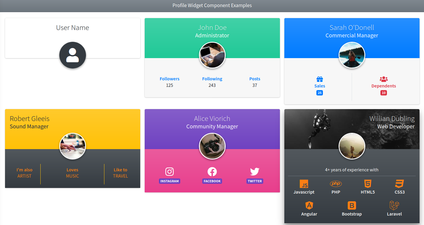
Some examples with modern (default) layout:
{{-- Minimal with a name --}}
<x-adminlte-profile-widget name="User Name"/>

{{-- Themes --}}
<x-adminlte-profile-widget name="John Doe" desc="Administrator" theme="teal"
    img="https://picsum.photos/id/1/100">
    <x-adminlte-profile-col-item title="Followers" text="125" url="#"/>
    <x-adminlte-profile-col-item title="Following" text="243" url="#"/>
    <x-adminlte-profile-col-item title="Posts" text="37" url="#"/>
</x-adminlte-profile-widget>

<x-adminlte-profile-widget name="Sarah O'Donell" desc="Commercial Manager" theme="primary"
    img="https://picsum.photos/id/1011/100">
    <x-adminlte-profile-col-item class="text-primary border-end" icon="bi bi-gift fs-4"
        title="Sales" text="25" size=6 badge="primary"/>
    <x-adminlte-profile-col-item class="text-danger" icon="bi bi-people fs-4" title="Dependents"
        text="10" size=6 badge="danger"/>
</x-adminlte-profile-widget>

<x-adminlte-profile-widget name="Robert Gleeis" desc="Sound Manager" theme="warning"
    img="https://picsum.photos/id/304/100" header-class="text-start"
    footer-class="text-bg-dark bg-gradient">
    <x-adminlte-profile-col-item title="I'm also" text="Artist" size=3
        class="text-warning border-end border-warning"/>
    <x-adminlte-profile-col-item title="Loves" text="Music" size=6
        class="text-warning border-end border-warning"/>
    <x-adminlte-profile-col-item title="Like to" text="Travel" size=3
        class="text-warning"/>
</x-adminlte-profile-widget>

<x-adminlte-profile-widget name="Alice Viorich" desc="Community Manager" theme="violet"
    img="https://picsum.photos/id/454/100" footer-class="text-bg-pink bg-gradient">
    <x-adminlte-profile-col-item icon="bi bi-instagram fs-3" text="Instagram" badge="violet" size=4/>
    <x-adminlte-profile-col-item icon="bi bi-facebook fs-3" text="Facebook" badge="violet" size=4/>
    <x-adminlte-profile-col-item icon="bi bi-twitter-x fs-3" text="X" badge="violet" size=4/>
</x-adminlte-profile-widget>

{{-- Custom --}}
<x-adminlte-profile-widget class="shadow" name="Willian Dubling" desc="Web Developer"
    img="https://picsum.photos/id/177/100" cover="https://picsum.photos/id/541/550/200"
    header-class="text-white text-end" footer-class="text-bg-dark bg-gradient">
    <x-adminlte-profile-row-item title="4+ years of experience with"
        class="text-center border-bottom border-secondary"/>
    <x-adminlte-profile-col-item title="Javascript" icon="bi bi-filetype-js fs-3 text-warning" size=3/>
    <x-adminlte-profile-col-item title="PHP" icon="bi bi-filetype-php fs-3 text-warning" size=3/>
    <x-adminlte-profile-col-item title="HTML5" icon="bi bi-filetype-html fs-3 text-warning" size=3/>
    <x-adminlte-profile-col-item title="CSS3" icon="bi bi-filetype-css fs-3 text-warning" size=3/>
    <x-adminlte-profile-col-item title="Bootstrap" icon="bi bi-bootstrap fs-3 text-warning" size=4/>
    <x-adminlte-profile-col-item title="Databases" icon="bi bi-database fs-3 text-warning" size=4/>
    <x-adminlte-profile-col-item title="Git" icon="bi bi-git fs-3 text-warning" size=4/>
</x-adminlte-profile-widget>
Use the next image as reference to check how every example is rendered. Please, note in the image the elements were wrapped inside a Bootstrap Grid System to organize them.
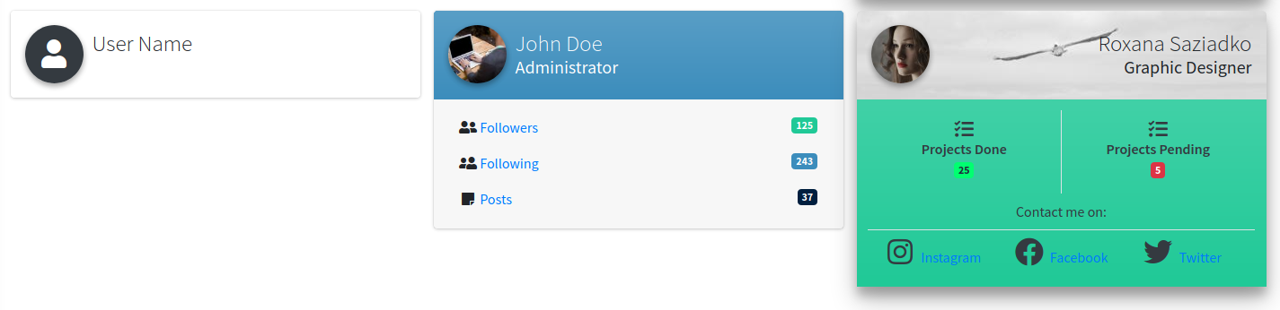
Some examples with classic layout:
{{-- Layout Classic / Minimal --}}
<x-adminlte-profile-widget name="User Name" layout-type="classic"/>

{{-- Layout Classic / Theme --}}
<x-adminlte-profile-widget name="John Doe" desc="Administrator" theme="sky"
    img="https://picsum.photos/id/1/100" layout-type="classic">
    <x-adminlte-profile-row-item icon="bi bi-people" title="Followers" text="125"
        url="#" badge="teal"/>
    <x-adminlte-profile-row-item icon="bi bi-person-check" title="Following"
        text="243" url="#" badge="sky"/>
    <x-adminlte-profile-row-item icon="bi bi-sticky" title="Posts" text="37"
        url="#" badge="navy"/>
</x-adminlte-profile-widget>

{{-- Layout Classic / Custom --}}
<x-adminlte-profile-widget name="Roxana Saziadko" desc="Graphic Designer" class="shadow"
    img="https://picsum.photos/id/1027/100" cover="https://picsum.photos/id/130/550/200"
    layout-type="classic" header-class="text-end" footer-class="text-bg-teal bg-gradient">
    <x-adminlte-profile-col-item class="border-end" icon="bi bi-list-task fs-4"
        title="Projects Done" text="25" size=6 badge="olive"/>
    <x-adminlte-profile-col-item icon="bi bi-list-task fs-4"
        title="Projects Pending" text="5" size=6 badge="danger"/>
    <x-adminlte-profile-row-item title="Contact me on:" class="text-center border-bottom"/>
    <x-adminlte-profile-row-item icon="bi bi-instagram fs-3" title="Instagram"
        url="#" size=4/>
    <x-adminlte-profile-row-item icon="bi bi-facebook fs-3" title="Facebook"
        url="#" size=4/>
    <x-adminlte-profile-row-item icon="bi bi-twitter-x fs-3" title="X"
        url="#" size=4/>
</x-adminlte-profile-widget>
Use the next image as reference to check how every example is rendered. Please, note in the image the elements were wrapped inside a Bootstrap Grid System to organize them.
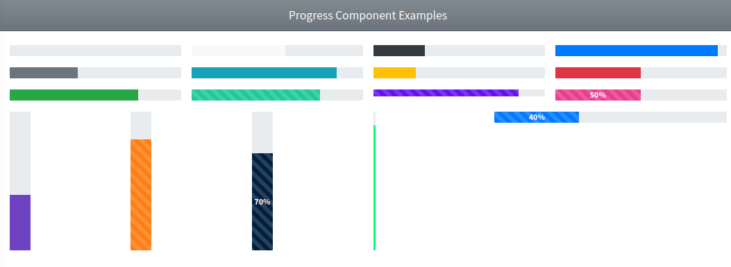
Progress
This component represents an AdminLTE styled progress bar. The following attributes are available:
| Attribute | Description | Type | Default | Required |
|---|---|---|---|---|
| animated | Enables the animated mode on the progress bar | any | null | no |
| segments | A set of segments rendered as a Bootstrap progress-stacked track. See Stacked Progress Bars | array | null | no |
| size | The progress bar size (sm, xs or xxs) | string | null | no |
| striped | Enables stripes on the progress bar | any | null | no |
| theme | The progress bar theme: light, dark, primary, secondary, info, success, warning, danger or any color of the AdminLTE extended palette like sky or teal. See About the theme Attribute. Set it to an empty value to inherit the color of the container | string | info | no |
| value | The progress bar percentage value (integer between 0 and 100) | int | 0 | no |
| vertical | Enables vertical mode on the progress bar | any | null | no |
| with-label | Enables a percentage label on the progress bar | any | null | no |
Any other attribute you define will be directly inserted into the underlying div.progress element. So, for example, you can define a class, onclick, id or any other attribute you may need.
NOTE
Default spacing. The AdminLTE v4 stylesheet gives the progress bars no margin of their own, so the component adds a mb-2 utility to the .progress element, which is what the AdminLTE reference layouts use to separate stacked progress bars.
The default is only added when you do not provide a bottom margin yourself. A mb-* or my-* class (values 0 to 5, or auto) on the class attribute wins and suppresses the default:
<x-adminlte-progress value="40"/>            {{-- class="progress mb-2" --}}
<x-adminlte-progress value="40" class="mb-0"/> {{-- class="progress mb-0" --}}
<x-adminlte-progress value="40" class="my-4"/> {{-- class="progress my-4" --}}
This check exists because the Bootstrap spacing utilities are all declared with !important at the same specificity, so simply adding a second margin class would not reliably override the first one — the winner would be decided by the order of the rules in the stylesheet, not by the order you wrote them.
NOTE
The component emits the Bootstrap 5.3 progress markup: the role="progressbar" and the aria-value* attributes live on the .progress wrapper (not on the inner .progress-bar element as on Bootstrap 4). The theme is rendered as a text-bg-{theme} class on the inner bar, which is what the AdminLTE reference layouts use, and which keeps the label readable over the light theme colors such as warning.
Slots
- labelSlot: Replaces the built-in percentage label. Useful for a ratio label such as
160/200.
<x-adminlte-progress :value="80" theme="primary" with-label>
    <x-slot name="labelSlot">160/200</x-slot>
</x-adminlte-progress>
NOTE
A label provided through the slot is owned by your application, so the setValue() method of the Javascript helper below leaves it untouched. Only the built-in percentage label is refreshed automatically.
Stacked Progress Bars
Bootstrap 5.3 stacks several bars in one track with the progress-stacked layout, where every segment is a .progress element of its own carrying the percentage, and the .progress-bar inside it always fills its track. Pass the segments through the segments attribute to get that markup:
<x-adminlte-progress id="myStacked" :segments="[
    ['value' => 15, 'theme' => 'success', 'label' => 'Docs'],
    ['value' => 30, 'theme' => 'info', 'label' => 'Images'],
    ['value' => 20, 'theme' => 'warning', 'label' => 'Other'],
]"/>
Every entry accepts the following keys, and a bare number is accepted as a shorthand for ['value' => n]:
| Key | Description | Default |
|---|---|---|
| value | The percentage of the segment (an integer between 0 and 100) | 0 |
| theme | The theme color of the segment. Set it to an empty value to inherit the color of the container | the theme attribute of the component |
| label | The text shown inside the segment. It is also used as its accessible label | the percentage when with-label is set, empty otherwise |
| striped | Enables stripes on the segment | the striped attribute of the component |
| animated | Enables the animated mode on the segment | the animated attribute of the component |
The segments attribute was preferred over nesting several <x-adminlte-progress> components inside a wrapper, because the stacked layout is not a set of independent progress bars: the percentage moves from the .progress-bar to the .progress track, the inner bar becomes full width, and each track needs the aria attributes that the single bar mode puts on the wrapper. A nested syntax would need a different rendering mode on the child anyway, and the segments of a stacked bar are almost always built from one data set.
NOTE
The size, class and any other attribute you define still apply to the div.progress-stacked container, and the size class is repeated on every segment track, since the height of a .progress element is not inherited from the stacked container.
The vertical attribute is ignored on a stacked bar. The vertical mode is an AdminLTE modifier of a single .progress track (.progress.vertical) and the Bootstrap stacked layout has no vertical counterpart.
The labelSlot is ignored too, the labels of a stacked bar come from the label key of each segment.
Javascript Utility Class
This component also provides a Javascript utility class called _AdminLTE_Progress. You can use this class to interact or update an already rendered progress bar element. To use the class, first you need to assign an id attribute to your progress bar element, then you create an object using the id attribute previously assigned in the class constructor, for example:
{{-- On the blade file... --}}
<x-adminlte-progress id="myProgress" .../>// On your Javascript code...
let myProgress = new _AdminLTE_Progress("myProgress");Then you can use the next methods from the instantiated object:
myProgress.getValue(index = 0): To get the current progress bar value.myProgress.setValue(value, index = 0): To update the progress bar value. The value should be an integer.
On a stacked progress bar the index argument selects the segment to read or update (0 is the first one), and the percentage is moved to the segment track, which is where the stacked layout keeps it:
let myProgress = new _AdminLTE_Progress("myStacked");

myProgress.setValue(45, 1); // Update the second segment
Examples
{{-- Minimal --}}
<x-adminlte-progress/>

{{-- themes --}}
<x-adminlte-progress theme="light" value=55/>
<x-adminlte-progress theme="dark" value=30/>
<x-adminlte-progress theme="primary" value=95/>
<x-adminlte-progress theme="secondary" value=40/>
<x-adminlte-progress theme="info" value=85/>
<x-adminlte-progress theme="warning" value=25/>
<x-adminlte-progress theme="danger" value=50/>
<x-adminlte-progress theme="success" value=75/>

{{-- Custom (the extended palette requires 'assets.extended_colors') --}}
<x-adminlte-progress theme="teal" value=75 animated/>
<x-adminlte-progress size="sm" theme="indigo" value=85 animated/>
<x-adminlte-progress theme="pink" value=50 animated with-label/>

{{-- Vertical --}}
<x-adminlte-progress theme="violet" value=40 vertical/>
<x-adminlte-progress theme="orange" value=80 vertical animated/>
<x-adminlte-progress theme="navy" value=70 vertical striped with-label/>
<x-adminlte-progress theme="olive" size="xxs" value=90 vertical/>

{{-- Stacked --}}
<x-adminlte-progress :segments="[15, 30, 20]"/>
<x-adminlte-progress size="sm" :segments="[
    ['value' => 25, 'theme' => 'success'],
    ['value' => 35, 'theme' => 'warning', 'striped' => true],
    ['value' => 15, 'theme' => 'danger', 'animated' => true],
]"/>
<x-adminlte-progress with-label :segments="[
    ['value' => 40, 'theme' => 'primary', 'label' => 'Used'],
    ['value' => 25, 'theme' => 'sky'],
]"/>

{{-- Dinamic Change --}}
<x-adminlte-progress id="pbDinamic" value="5" theme="sky" animated with-label/>
{{-- Update the previous progress bar every 2 seconds, incrementing by 10% each step --}}
@push('js')
<script>
    document.addEventListener('DOMContentLoaded', function () {

        let pBar = new _AdminLTE_Progress('pbDinamic');

        let inc = (val) => {
            let v = pBar.getValue() + val;
            return v > 100 ? 0 : v;
        };

        setInterval(() => pBar.setValue(inc(10)), 2000);
    })
</script>
@endpush
Use the next image as reference to check how every example is rendered. Please, note in the image the elements were wrapped inside a Bootstrap Grid System to organize them.
Progress Group
This component represents an AdminLTE progress group, a labelled progress bar with a current/total counter, like the ones used on the Goal Completion panel of the AdminLTE dashboard. The following attributes are available:
| Attribute | Description | Type | Default | Required |
|---|---|---|---|---|
| label | The label/description of the group | string | null | no |
| max | The maximum value of the group | int | 100 | no |
| size | The progress bar size (sm, xs or xxs) | string | 'sm' | no |
| theme | The progress bar theme: light, dark, primary, secondary, info, success, warning, danger or any color of the AdminLTE extended palette like sky or teal. See About the theme Attribute. Set it to an empty value to inherit the color of the container | string | 'primary' | no |
| value | The current value of the group | int | 0 | no |
Any other attribute you define will be directly inserted into the underlying div.progress-group element. So, for example, you can define a class, onclick, id or any other attribute you may need.
The percentage of the bar is derived from the value and max attributes (value / max), and is always clamped to the [0, 100] range. A max value of zero (or lower) renders an empty bar instead of raising a division by zero error.
Slots
- default slot: When filled, it replaces the
current/totalcounter placed at the end of the label line, which is useful to render a unit or a different notation.
NOTE
The bar is a nested Progress component, so the _AdminLTE_Progress javascript utility class works on a progress group too. The .progress-group element already provides the bottom spacing, so the nested bar is rendered with a mb-0 class instead of the default mb-2 one. The theme is rendered as a text-bg-{theme} class on the inner bar, exactly like on a standalone Progress.
Javascript Utility Class
Assign an id attribute to the progress group and use the _AdminLTE_Progress class described on the Progress section with that same id, for example:
{{-- On the blade file... --}}
<x-adminlte-progress-group id="myGroup" label="Add Products to Cart" :value="160" :max="200"/>// On your Javascript code...
let myGroup = new _AdminLTE_Progress("myGroup");
myGroup.setValue(90);The nested progress bar also gets its own progress-{id} identifier (progress-myGroup on the previous example), so it can be targeted directly when needed.
Examples
{{-- Minimal --}}
<x-adminlte-progress-group label="Add Products to Cart" :value="160" :max="200"/>

{{-- Themes --}}
<x-adminlte-progress-group label="Complete Purchase" :value="310" :max="400" theme="danger"/>
<x-adminlte-progress-group label="Visit Premium Page" :value="480" :max="800" theme="success"/>
<x-adminlte-progress-group label="Send Inquiries" :value="250" :max="500" theme="warning"/>

{{-- Custom bar size (the extended palette requires 'assets.extended_colors') --}}
<x-adminlte-progress-group label="Disk Usage" :value="34" :max="50" theme="teal" size="xs"/>

{{-- Custom counter through the default slot --}}
<x-adminlte-progress-group label="Storage" :value="34" :max="50" theme="indigo">
    <b>34</b> of 50 GB
</x-adminlte-progress-group>
Ribbon
This component represents an AdminLTE ribbon, a diagonal banner pinned to the top corner of a positioned parent. A Card is already positioned, any other container needs the Bootstrap position-relative class (and overflow-hidden when it has rounded corners). The following attributes are available:
| Attribute | Description | Type | Default | Required |
|---|---|---|---|---|
| label | The label of the ribbon | string | null | no |
| size | The ribbon size (lg or xl) | string | null | no |
| theme | The ribbon theme: light, dark, primary, secondary, info, success, warning, danger or any color of the AdminLTE extended palette like sky or teal. See About the theme Attribute | string | null | no |
| url | An url for the ribbon. When defined, the label is wrapped inside a link that inherits the contrast color of the theme | string | null | no |
Any other attribute you define will be directly inserted into the underlying div.ribbon-wrapper element. So, for example, you can define a class, onclick, id or any other attribute you may need.
Slots
- default slot: When filled, it replaces the
labelattribute, which is useful to place markup (an icon, for example) inside the banner.
NOTE
The banner is clipped to the corner, so only about 64px of the label are readable at the default size, roughly six characters. Use size="lg" or size="xl" for longer words.
Without a theme, the ribbon is painted with the secondary background color of the active color mode.
Examples
{{-- On a card --}}
<x-adminlte-card title="New arrivals" theme="light">
    <x-adminlte-ribbon label="New" theme="primary"/>
    Card content.
</x-adminlte-card>

{{-- Themes --}}
<x-adminlte-ribbon label="Draft" theme="secondary"/>
<x-adminlte-ribbon label="Live" theme="success"/>
<x-adminlte-ribbon label="Hot" theme="danger"/>
<x-adminlte-ribbon label="Beta" theme="warning"/>

{{-- Sizes --}}
<x-adminlte-ribbon label="Large" theme="success" size="lg"/>
<x-adminlte-ribbon label="X-Large" theme="danger" size="xl"/>

{{-- Wrapping a link --}}
<x-adminlte-ribbon label="Linked" theme="info" size="lg" url="/offers"/>

{{-- Outside a card --}}
<div class="position-relative overflow-hidden rounded border bg-body p-4">
    <x-adminlte-ribbon label="New" theme="warning"/>
    Any positioned element.
</div>

{{-- With markup through the default slot --}}
<x-adminlte-ribbon theme="violet" size="lg">
    <i class="bi bi-star-fill" aria-hidden="true"></i> Top
</x-adminlte-ribbon>
Small Box
This component represents an AdminLTE small box widget. The following attributes are available:
| Attribute | Description | Type | Default | Required |
|---|---|---|---|---|
| icon | An icon for the small box (Bootstrap Icons by default) | string | null | no |
| loading | Enables a loading animation (an overlay with a Bootstrap spinner) | any | null | no |
| text | The text/description for the small box | string | null | no |
| theme | The small box theme: light, dark, primary, secondary, info, success, warning, danger or any color of the AdminLTE extended palette like sky or teal. See About the theme Attribute | string | null | no |
| title | The title/header for the small box | string | null | no |
| url | An url for the small box. When enabled, a link-styled footer section will be visible pointing to that url | string | null | no |
| url-text | A text/label associated with the footer url | string | null | no |
| footer-icon | The icon of the footer link. Pass an empty string to drop it | string | 'bi bi-arrow-right-circle' | no |
Any other attribute you define will be directly inserted into the underlying div.small-box element. So, for example, you can define extra classes using the class attribute, use the onclick, the id or any other attribute you may need.
NOTE
The AdminLTE v3 .overlay element does not exist on v4, so the loading overlay is now built with Bootstrap 5 utilities and renders a spinner-border element. The small-box-overlay class is kept only as a hook for the Javascript helper below. The footer link arrow is now a bi bi-arrow-right-circle icon.
NOTE
Footer link contrast. Suppressing the underline of the footer link needs a Bootstrap link-* class, and that class also decides the text color. So the component picks link-dark on the theme colors whose background is light (info, warning, light, and their v3 aliases) and link-light on every other one, exactly like the AdminLTE reference layouts do. The contrast correction of the v3 palette is taken into account.
Slots
The title and text attributes are escaped, so use the slots when they need markup, as the reference layouts do:
- titleSlot: Replaces the
titleattribute and fills theh3element. - textSlot: Replaces the
textattribute and fills thepelement. - footerSlot: Replaces the content of the footer. With an
urlit stays a link, without one it renders a plaindiv.small-box-footer.
<x-adminlte-small-box theme="warning" icon="bi bi-graph-up" url="/reports">
    <x-slot name="titleSlot">53<sup class="fs-5">%</sup></x-slot>
    <x-slot name="textSlot">Bounce rate</x-slot>
</x-adminlte-small-box>
Javascript Utility Class
This component also provides a Javascript utility class called _AdminLTE_SmallBox. You can use this class to interact or update an already rendered small box element. To use the class, first you need to assign an id attribute to your small box element, then you create an object using the id attribute previously assigned in the class constructor, for example:
{{-- On the blade file... --}}
<x-adminlte-small-box id="mySmallBox" title="Title" .../>// On your Javascript code...
let mySmallBox = new _AdminLTE_SmallBox("mySmallBox");Then you can use the next methods from the instantiated object:
mySmallBox.toggleLoading(): To toggle the loading animation of the small box.mySmallBox.update(data): To update the data of the small box element. The data should be an object with the new attributes, the supported object keys are:title,text,iconandurl(see examples for more details).
Examples
{{-- Minimal with title, text and icon --}}
<x-adminlte-small-box title="Title" text="some text" icon="bi bi-star"/>

{{-- Loading --}}
<x-adminlte-small-box title="Loading" text="Loading data..." icon="bi bi-bar-chart"
    theme="info" url="#" url-text="More info" loading/>

{{-- Themes --}}
<x-adminlte-small-box title="424" text="Views" icon="bi bi-eye"
    theme="teal" url="#" url-text="View details"/>

<x-adminlte-small-box title="Downloads" text="1205" icon="bi bi-download"
    theme="violet"/>

<x-adminlte-small-box title="528" text="User Registrations" icon="bi bi-person-plus"
    theme="primary" url="#" url-text="View all users"/>

{{-- Updatable --}}
<x-adminlte-small-box title="0" text="Reputation" icon="bi bi-award"
    theme="danger" url="#" url-text="Reputation history" id="sbUpdatable"/>

@push('js')
<script>

    document.addEventListener('DOMContentLoaded', function () {

        let sBox = new _AdminLTE_SmallBox('sbUpdatable');

        let updateBox = () =>
        {
            // Stop loading animation.
            sBox.toggleLoading();

            // Update data.
            let rep = Math.floor(1000 * Math.random());
            let idx = rep < 100 ? 0 : (rep > 500 ? 2 : 1);
            let text = 'Reputation - ' + ['Basic', 'Silver', 'Gold'][idx];
            let icon = 'bi bi-award ' + ['text-primary', 'text-light', 'text-warning'][idx];
            let url = ['url1', 'url2', 'url3'][idx];

            let data = {text, title: rep, icon, url};
            sBox.update(data);
        };

        let startUpdateProcedure = () =>
        {
            // Simulate loading procedure.
            sBox.toggleLoading();

            // Wait and update the data.
            setTimeout(updateBox, 2000);
        };

        setInterval(startUpdateProcedure, 10000);
    })

</script>
@endpush
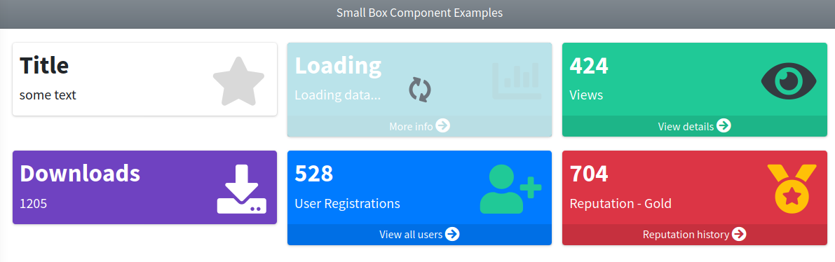
Use the next image as reference to check how every example is rendered. Please, note in the image the elements were wrapped inside a Bootstrap Grid System to organize them.
User Block
This component represents an AdminLTE user block, the avatar plus name plus description header used by the social and feed widgets. The following attributes are available:
| Attribute | Description | Type | Default | Required |
|---|---|---|---|---|
| description | A short description for the block, usually a timestamp or the context of the entry | string | null | no |
| img | The user image of the block | string | null | no |
| name | The user name of the block | string | null | no |
| size | The user block size (sm). The small size shrinks the avatar and the font sizes, it is the one used on the comments of a feed | string | null | no |
| url | An url for the block. When defined, the user name is wrapped inside a link | string | null | no |
Any other attribute you define will be directly inserted into the underlying div.user-block element. So, for example, you can define extra classes using the class attribute, use the onclick, the id or any other attribute you may need.
Slots
- default slot: When filled, it is rendered as the
span.commentelement of the block, below the description.
NOTE
The avatar is only rendered when an img attribute is given, and it uses the name attribute as its alternative text. Every other section of the block is omitted as well when its attribute is not defined.
Inside a .card-header, the AdminLTE v4 stylesheet floats the user block automatically, so it can stand in for the card title without pushing the card tools to the next line.
Examples
{{-- Minimal --}}
<x-adminlte-user-block name="Jonathan Burke Jr." img="/img/user1-128x128.jpg"/>
{{-- With a description and a link on the name --}}
<x-adminlte-user-block name="Jonathan Burke Jr." img="/img/user1-128x128.jpg"
description="Shared publicly · 7:30 PM today" url="/profiles/1"/>
{{-- As the header of a social card --}}
<div class="card">
<div class="card-header">
<x-adminlte-user-block name="Jonathan Burke Jr." img="/img/user1-128x128.jpg"
description="Shared publicly · 7:30 PM today" url="/profiles/1"/>
</div>
<div class="card-body">
I took this photo this morning. What do you guys think?
</div>
</div>
{{-- Small size with a comment (the feed entries) --}}
<x-adminlte-user-block size="sm" name="Maria Gonzales" img="/img/user4-128x128.jpg"
description="Posted 5 minutes ago" url="/profiles/4" class="mb-3">
It is a long established fact that a reader will be distracted by the
readable content of a page.
</x-adminlte-user-block>
<x-adminlte-user-block size="sm" name="Nora Havisham" img="/img/user5-128x128.jpg"
description="Posted 27 minutes ago" url="/profiles/5">
The point of using Lorem Ipsum is that it has a more-or-less normal
distribution of letters.
</x-adminlte-user-block>Timeline
These components represent an AdminLTE timeline. A timeline is built out of three cooperating components:
x-adminlte-timeline: the timeline container, it draws the vertical line.x-adminlte-timeline-label: an optional date separator placed between the entries.x-adminlte-timeline-item: one entry of the timeline.
IMPORTANT
The x-adminlte-timeline-label and x-adminlte-timeline-item components must be direct children of the x-adminlte-timeline component. The AdminLTE v4 stylesheet styles them with the .timeline > .time-label and .timeline > div child selectors, so they lose their layout when wrapped inside an extra element.
The following attributes are available on the timeline container:
| Attribute | Description | Type | Default | Required |
|---|---|---|---|---|
| end-icon | An icon for the entry that closes the timeline (Bootstrap Icons by default). When defined, an extra entry holding only that icon is appended to the timeline | string | null | no |
| end-icon-theme | A theme color for the closing icon: light, dark, primary, secondary, info, success, warning, danger or any color of the AdminLTE extended palette like sky or teal. See About the theme Attribute | string | null | no |
| inverse | Enables the inverse style, the entries drop their shadow and get a plain border instead | any | null | no |
Any other attribute you define will be directly inserted into the underlying div.timeline element. So, for example, you can define a class, onclick, id or any other attribute you may need.
The following attributes are available on the timeline label:
| Attribute | Description | Type | Default | Required |
|---|---|---|---|---|
| label | The text for the label. When not defined, the content of the default slot is used instead | string | null | no |
| theme | A theme color: light, dark, primary, secondary, info, success, warning, danger or any color of the AdminLTE extended palette like sky or teal. See About the theme Attribute | string | null | no |
Any other attribute you define will be directly inserted into the underlying div.time-label element.
The following attributes are available on the timeline item:
| Attribute | Description | Type | Default | Required |
|---|---|---|---|---|
| header | The text for the item header. The headerSlot takes precedence over this attribute | string | null | no |
| icon | An icon for the round marker attached to the timeline line (Bootstrap Icons by default) | string | null | no |
| icon-theme | A theme color for the round marker: light, dark, primary, secondary, info, success, warning, danger or any color of the AdminLTE extended palette like sky or teal. See About the theme Attribute | string | null | no |
| no-border | Removes the separator line between the item header and the item body. Useful on the items that have neither body nor footer | any | null | no |
| time | The time (or elapsed time) shown on the top right corner of the item | string | null | no |
| time-icon | An icon shown next to the time. Use an empty value to render the time without any icon | string | bi bi-clock-fill | no |
| url | An URL for the item | string | null | no |
| url-target | The target element of the item for the URL (header or time) | string | header | no |
Any other attribute you define will be directly inserted into the underlying wrapper of the item, which is the element that the .timeline > div selector styles. So, for example, you can define a class, onclick, id or any other attribute you may need.
NOTE
The AdminLTE v3 .no-border modifier of the timeline header does not exist on the v4 stylesheet anymore. The no-border attribute renders the Bootstrap 5 border-bottom-0 utility instead, which gives the same result.
NOTE
The round marker is always rendered, even when no icon is given, because it is the dot that attaches the entry to the vertical line of the timeline. The marker and the time icon are decorative, so they get an aria-hidden="true" attribute, and the time gets a translated screen reader label (the timeline_time translation key).
Slots
The timeline item provides the following slots:
- headerSlot: Use this slot to fill the item header with markup, for example to place a link inside a sentence. It takes precedence over the
headerattribute. - footerSlot: Use this slot to fill the item footer, usually with a set of buttons.
The default slot of the item fills the item body, and the default slot of the timeline holds its entries.
Examples
{{-- Minimal --}}
<x-adminlte-timeline>
    <x-adminlte-timeline-item icon="bi bi-envelope" icon-theme="primary"
        time="12:05" header="A new email arrived"/>
</x-adminlte-timeline>

{{-- Complete --}}
<x-adminlte-timeline end-icon="bi bi-clock-fill" end-icon-theme="secondary">

    <x-adminlte-timeline-label label="10 Feb. 2023" theme="danger"/>

    <x-adminlte-timeline-item icon="bi bi-envelope" icon-theme="primary"
        time="12:05" url="/mail/1">
        <x-slot name="headerSlot">
            <a href="/users/1">Support Team</a> sent you an email
        </x-slot>
        Etsy doostang zoodles disqus groupon greplin oooj voxy zoodles.
        <x-slot name="footerSlot">
            <a class="btn btn-primary btn-sm">Read more</a>
            <a class="btn btn-danger btn-sm">Delete</a>
        </x-slot>
    </x-adminlte-timeline-item>

    <x-adminlte-timeline-item icon="bi bi-person" icon-theme="success"
        time="5 mins ago" header="Sarah Young accepted your friend request"
        no-border/>

    <x-adminlte-timeline-label label="3 Jan. 2023" theme="success"/>

    <x-adminlte-timeline-item icon="bi bi-camera" icon-theme="primary"
        time="2 days ago" header="Mina Lee uploaded new photos"
        time-icon="bi bi-calendar-event">
        <img src="/imgs/photo1.jpg" alt="A photo of the event"/>
        <img src="/imgs/photo2.jpg" alt="..."/>
    </x-adminlte-timeline-item>

</x-adminlte-timeline>

{{-- Inverse style --}}
<x-adminlte-timeline inverse>
    <x-adminlte-timeline-item icon="bi bi-chat-text-fill" icon-theme="warning"
        time="27 mins ago" header="Jay White" url="/posts/1"
        url-target="header">
        Take me to your leader!
    </x-adminlte-timeline-item>
</x-adminlte-timeline>
Toast
This component represents an AdminLTE styled Bootstrap toast, a lightweight notification that floats over the page. The following attributes are available:
| Attribute | Description | Type | Default | Required |
|---|---|---|---|---|
| autohide | Whether the toast hides itself after the delay time. When not provided, the Bootstrap default is used (the toast hides itself) | bool | null | no |
| delay | The time (in milliseconds) the toast stays visible before hiding itself. When not provided, the Bootstrap default is used (5000) | int | null | no |
| icon | An icon for the toast header (Bootstrap Icons by default) | string | null | no |
| id | The id of the toast. It is required to target the toast from a trigger control or from the javascript utility class | string | null | no |
| position | The screen position of the container holding the toast: top-start, top-center, top-end, middle-start, middle-center, middle-end, bottom-start, bottom-center or bottom-end. An unknown value falls back to the default | string | bottom-end | no |
| theme | A theme color: dark, light, primary, secondary, info, success, warning or danger. See About the theme Attribute | string | null | no |
| time | A timestamp hint shown on the right side of the toast header, for example 11 mins ago | string | null | no |
| title | The title for the toast header | string | null | no |
Any other attribute you define will be directly inserted into the underlying div.toast element. So, for example, you can define a class, onclick or any other attribute you may need.
Slots
- default slot: The body of the toast.
IMPORTANT
The .toast-{color} variants are provided by the AdminLTE v4 core stylesheet and only exist for the eight Bootstrap 5.3 theme colors. The extended palette does not ship a toast family, so a color like sky or teal renders a class that has no styling attached to it.
NOTE
All the toasts sharing a position are collected into one single .toast-container element, so they stack on the screen instead of overlapping. The container is rendered only once per position and the toasts are moved into it on DOMContentLoaded, which means you can declare a toast anywhere on your view.
NOTE
When neither a title, an icon nor a time is provided, the toast is rendered with the headerless Bootstrap markup: the body and the dismiss button are placed side by side. The dismiss button is always available and its label uses the close translation key.
Toast Triggers
Bootstrap does not provide a declarative way to show a toast, so the component ships a small delegated listener that wires any control carrying the data-bs-toggle="toast" and data-bs-target="{id}" attributes (the same convention used by the AdminLTE v4 reference pages):
<x-adminlte-toast id="savedToast" theme="success" title="Saved"/>

<button type="button" class="btn btn-success" data-bs-toggle="toast"
    data-bs-target="#savedToast">Save</button>
Javascript Utility Class
This component also provides a Javascript utility class called _AdminLTE_Toast. You can use this class to show, hide or update an already rendered toast element. To use the class, first you need to assign an id attribute to your toast, then you create an object using the id attribute previously assigned in the class constructor, for example:
{{-- On the blade file... --}}
<x-adminlte-toast id="myToast" .../>// On your Javascript code...
let myToast = new _AdminLTE_Toast("myToast");Then you can use the next methods from the instantiated object:
myToast.show(data): To show the toast. The data argument is optional, when provided the toast content is updated before showing it.myToast.hide(): To hide the toast.myToast.update(data): To update the toast content. The data argument should be an object that may hold atitle, atime, aniconand abodyproperty. Note the text properties are written as plain text, any markup on them is not interpreted.myToast.getInstance(): To get the underlyingbootstrap.Toastinstance, ornullwhen the toast (or Bootstrap itself) is not available.
Examples
{{-- Minimal --}}
<x-adminlte-toast id="basicToast">Hello, world!</x-adminlte-toast>

{{-- With a header --}}
<x-adminlte-toast id="mailToast" title="AdminLTE" icon="bi bi-envelope"
    time="11 mins ago">
    You have a new message.
</x-adminlte-toast>

{{-- Themed, placed on the top right corner and kept on screen --}}
<x-adminlte-toast id="errorToast" theme="danger" title="Error"
    icon="bi bi-x-octagon-fill" position="top-end" :autohide="false">
    The record could not be saved.
</x-adminlte-toast>

{{-- Themed, centered on the top of the screen and hidden after 3 seconds --}}
<x-adminlte-toast id="savedToast" theme="success" title="Saved"
    icon="bi bi-check-circle" time="just now" position="top-center"
    autohide :delay="3000">
    The record was saved.
</x-adminlte-toast>
Stylesheet Utilities
Not everything the AdminLTE v4 stylesheet offers deserves a component. The classes below are plain opt-in utilities: you add them to markup you already write, so a component wrapper around them would be more typing, not less. They are documented here because they are the ones the widgets above are most often combined with.
Avatar Sizes
The AdminLTE v4 stylesheet provides three fixed width helpers for the avatar images used by the User Block, the Profile Widget, the Timeline and the user menu:
| Class | Width | Height |
|---|---|---|
img-size-32 | 32px | auto |
img-size-50 | 50px | auto |
img-size-64 | 64px | auto |
The height is always auto, so the image keeps its aspect ratio. Combine them with the Bootstrap rounded-circle utility for a round avatar:
<img src="/img/user.jpg" class="img-size-50 rounded-circle" alt="Avatar">NOTE
These are utility classes on an <img> element you own, so no component exposes them as an attribute. The components that render an avatar for you already size it on their own (the User Block does it through the size attribute, which is read by the .user-block rules of the stylesheet), so reach for img-size-* on the images you place yourself, for example inside the body of a Card or in a Timeline entry.
Table Extras
The AdminLTE v4 stylesheet adds a handful of modifiers on top of the Bootstrap .table classes. They all go on the <table> element itself:
| Class | Effect |
|---|---|
table-head-fixed | Makes the first thead row sticky at the top of the scrolling container. It follows the light/dark mode, since the background comes from --bs-body-bg. |
table-valign-middle | Vertically centers the content of every thead and tbody cell. |
no-border | Removes the borders of the table and of every th and td. |
table-accessible | Emphasizes the header cells (bolder, subtle background), adds a 2px separator under a th[scope="col"] and next to a th[scope="row"], and styles the <caption> as a heading placed above the table. |
<table class="table table-hover table-valign-middle table-accessible">
    <caption>Monthly orders</caption>
    <thead>
        <tr><th scope="col">Order</th><th scope="col">Status</th></tr>
    </thead>
    <tbody>
        <tr><th scope="row">#1</th><td>Shipped</td></tr>
    </tbody>
</table>
Tables Inside a Card
A table placed inside a card body with no padding is a special case the stylesheet takes care of. The .card-body.p-0 .table rule gives the first and the last cell of every row the horizontal padding the card body dropped, so the table content stays aligned with the card header:
<x-adminlte-card title="Latest orders" body-class="p-0">
    <table class="table table-hover table-valign-middle">
        ...
    </table>
</x-adminlte-card>
Use body-class="p-0" to get it. As a general rule, every *-class attribute of a component targets its own container (header-class the card header, body-class the card body, footer-class the card footer), while a plain class attribute always lands on the outermost element, the card itself. The table-head-fixed modifier needs a scrolling container to stick to, so combine it with a height cap on the body:
<x-adminlte-card title="Latest orders" body-class="p-0" class="height-control">
    <table class="table table-head-fixed table-valign-middle">
        ...
    </table>
</x-adminlte-card>
NOTE
No wrapper component is provided for these modifiers. A table is written as plain markup (or comes from the Datatables component), and every class above is a single word added to it, so a component would only stand between you and the markup.