Tool Components
These components are classified under the Tool category. At next you can see the list of available components:
| Components |
|---|
| Datatables, Modal |
Datatables
IMPORTANT
This component requires the Datatables plugin to be enabled on the package configuration file. Read more on the plugins configuration section, and use the @section('plugins.Datatables', true) sentence on the blade file where you expect to use the component.
WARNING
The Datatables plugin still requires jQuery, which AdminLTE v4 does not bundle anymore. The component initialization code is guarded: when neither jQuery nor the plugin are present, a warning is written to the browser console and the element stays a plain Bootstrap 5 table. The jQuery free alternative recommended by AdminLTE v4 is Tabulator, which is already available as the Tabulator plugin key on the configuration file (this package does not provide a blade component for it yet, you have to initialize it on your own).
This component represents a wrapper around the well known Datatables plugin. The component defines the next set of attributes:
| Attribute | Description | Type | Default | Required |
|---|---|---|---|---|
| beautify | When enabled, the table cells will be vertically and horizontally centered. | any | null | no |
| bordered | When enabled, borders will be displayed around the table | any | null | no |
| compressed | When enabled, the table will be compressed using less white space between cells and rows | any | null | no |
| config | Array with the plugin configuration parameters | array | [] | no |
| footer-theme | The table footer theme (light or dark) | string | null | no |
| heads | An array with the headers (titles) for the table columns. Each header can be a string or an array with next properties: label, width, no-export and classes | array | - | yes |
| head-theme | The table head theme (light or dark) | string | null | no |
| hoverable | When enabled, a hover effect will be available for the table rows | any | null | no |
| id | The table identification (id) attribute | string | - | yes |
| striped | When enabled, a striped effect will be available for the table rows | any | null | no |
| theme | The table theme, rendered as a Bootstrap 5 table-{theme} class (light, dark, primary, secondary, success, info, warning or danger) | string | null | no |
| with-buttons | When enabled, a set of tool buttons for exporting the data of the table will be available | any | null | no |
| wrapper-class | Additional classes for the div.table-responsive wrapper | string | null | no |
| wrapper-attributes | Extra attributes for the div.table-responsive wrapper, as key => value pairs. Use it to put wire:ignore on the scroll container of a Livewire app | array | [] | no |
| with-footer | Enables a footer with header cells. The footer can be fully customized using the footerCallback option | any | null | no |
The available options for the config attribute are those explained on the plugin documentation. You can define each header of the heads attribute with an inner array, the next properties are available:
label: for the column title.width: to define the column width percentage.no-export: to disable data export for the column (useful for columns with buttons or actions).classes: to add extra classes for the column title.
All other extra attributes you define will be inserted directly on the underlying table element. The whole table is wrapped inside a div.table-responsive element, which is reachable through the wrapper-class and wrapper-attributes options.
NOTE
The width:100% style of the table is a default, so a style attribute of your own wins over it.
NOTE
The head-theme and footer-theme attributes are rendered as the Bootstrap 5 table-{theme} class on the <thead> / <tfoot> elements (the Bootstrap 4 thead-light / thead-dark classes do not exist anymore).
IMPORTANT
The with-buttons attribute needs the Datatables Buttons extension, which is a separate plugin. Enable it together with the base plugin on the blade file:
@section('plugins.Datatables', true)
@section('plugins.DatatablesButtons', true)
The DatatablesButtons plugin loads the extension, its Bootstrap 5 styling, the HTML5 and print button sets, plus JSZip (needed by the excel export) and pdfmake (needed by the pdf one). Drop the two last files from the plugin configuration when you do not export to those formats.
To serve them from your own domain instead of the CDN, publish them with php artisan adminlte:plugins install --plugin=datatablesButtons.
NOTE
When the with-buttons attribute is enabled, the export buttons are rendered with Bootstrap Icons: bi bi-printer (print), bi bi-filetype-csv (CSV), bi bi-file-earmark-excel (Excel) and bi bi-file-earmark-pdf (PDF). Their tooltips are translated, see the accessibility strings.
NOTE
To place the export buttons, the component writes a Datatables 2.x layout option (topStart: buttons, topEnd: search, bottomStart: info, bottomEnd: paging). It is only written when the with-buttons attribute is enabled: without it the plugin keeps its own default layout. The dom option of the 1.x releases is deprecated in the pinned version, but it is still honored when you pass it explicitly on the config attribute, in which case the component adds no layout of its own (the same happens when you provide your own layout).
NOTE
You can always do all the plugin configuration from Javascript/jQuery using the id property of the component as the selector for the id attribute, instead of using the config property of the component. However, you may need to invoke the destroy method first.
Slots
- default slot: The rows of the table, the content of the
tbodyelement. Fill it with your own<tr>elements, usually generated with a@foreachloop over your dataset. Leave it empty and the plugin renders its own empty state message.
Examples
{{-- Setup data for datatables --}}
@php
$heads = [
    'ID',
    'Name',
    ['label' => 'Phone', 'width' => 40],
    ['label' => 'Actions', 'no-export' => true, 'width' => 5],
];

$btnEdit = '<button class="btn btn-sm btn-secondary text-primary mx-1 shadow" title="Edit">
                <i class="bi bi-pencil"></i>
            </button>';
$btnDelete = '<button class="btn btn-sm btn-secondary text-danger mx-1 shadow" title="Delete">
                  <i class="bi bi-trash"></i>
              </button>';
$btnDetails = '<button class="btn btn-sm btn-secondary text-info mx-1 shadow" title="Details">
                   <i class="bi bi-eye"></i>
               </button>';

$config = [
    'data' => [
        [22, 'John Bender', '+02 (123) 123456789', '<nobr>'.$btnEdit.$btnDelete.$btnDetails.'</nobr>'],
        [19, 'Sophia Clemens', '+99 (987) 987654321', '<nobr>'.$btnEdit.$btnDelete.$btnDetails.'</nobr>'],
        [3, 'Peter Sousa', '+69 (555) 12367345243', '<nobr>'.$btnEdit.$btnDelete.$btnDetails.'</nobr>'],
    ],
    'order' => [[1, 'asc']],
    'columns' => [null, null, null, ['orderable' => false]],
];
@endphp

{{-- Minimal example / fill data using the component slot --}}
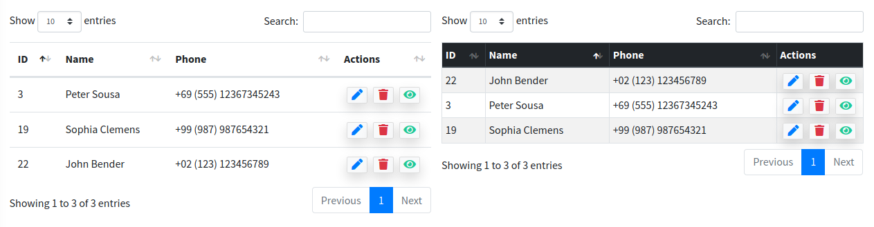
<x-adminlte-datatable id="table1" :heads="$heads">
    @foreach($config['data'] as $row)
        <tr>
            @foreach($row as $cell)
                <td>{!! $cell !!}</td>
            @endforeach
        </tr>
    @endforeach
</x-adminlte-datatable>

{{-- Compressed with style options / fill data using the plugin config --}}
<x-adminlte-datatable id="table2" :heads="$heads" head-theme="dark" :config="$config"
    striped hoverable bordered compressed/>
IMPORTANT
Please, note the differences between the previous two examples, on the first one the rows and cells were manually constructed using loops over the available dataset. On the second example, the dataset is passed directly to the underlying plugin using the $config['data'] property. You can't mix both strategies, use one or another.
Use the next image as reference to check how every example is rendered. Please, note in the image the tables were wrapped inside a Bootstrap Grid System to organize them. This same consideration is valid for all the other examples below.
The next examples reuse the $heads and the $config variables defined on the first example above, they are not repeated on every block:
{{-- Themes --}}
<x-adminlte-datatable id="table3" :heads="$heads" :config="$config" theme="info" striped hoverable/>

<x-adminlte-datatable id="table4" :heads="$heads" theme="danger" :config="$config"
    striped hoverable/>

<x-adminlte-datatable id="table5" :heads="$heads" :config="$config" theme="light" striped hoverable/>

<x-adminlte-datatable id="table6" :heads="$heads" head-theme="light" theme="dark" :config="$config"
    striped hoverable with-footer footer-theme="light" beautify/>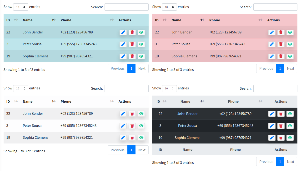
{{-- With buttons --}}
<x-adminlte-datatable id="table7" :heads="$heads" head-theme="light" theme="warning" :config="$config"
    striped hoverable with-buttons/>

{{-- With buttons + customization --}}
@php
$config['dom'] = '<"row" <"col-sm-7" B> <"col-sm-5 d-flex justify-content-end" i> >
                  <"row" <"col-12" tr> >
                  <"row" <"col-sm-12 d-flex justify-content-start" f> >';
$config['paging'] = false;
$config["lengthMenu"] = [ 10, 50, 100, 500];
@endphp

<x-adminlte-datatable id="table8" :heads="$heads" head-theme="dark" :config="$config"
    striped hoverable with-buttons/>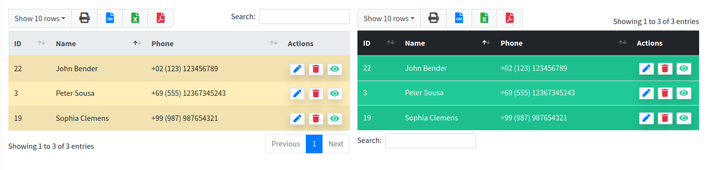
Required Plugin Configuration
The Datatables entry is already available on the plugins section of the configuration file published by the package, and it points to a CDN. Note it uses the Bootstrap 5 integration files of the plugin:
'plugins' => [
    ...
    'Datatables' => [
        'active' => false,
        'files' => [
            [
                'type' => 'js',
                'asset' => false,
                'location' => '//cdn.datatables.net/2.1.8/js/dataTables.min.js',
            ],
            [
                'type' => 'js',
                'asset' => false,
                'location' => '//cdn.datatables.net/2.1.8/js/dataTables.bootstrap5.min.js',
            ],
            [
                'type' => 'css',
                'asset' => false,
                'location' => '//cdn.datatables.net/2.1.8/css/dataTables.bootstrap5.min.css',
            ],
        ],
    ],
    ...
],
Remember that you also have to make jQuery available on the page before those files (the package does not provide it).
If you prefer to serve the plugin files locally, install the npm package and publish it into the public/vendor folder, then point the location values to the published files and set 'asset' => true:
npm i datatables.net@^2.1 datatables.net-bs5
php artisan adminlte:plugins install --plugin=datatables
For the export buttons, install the Buttons extension as well:
npm i datatables.net-buttons@^4.0 datatables.net-buttons-bs5 jszip pdfmake
php artisan adminlte:plugins install --plugin=datatablesButtons
NOTE
The datatablesPlugins key of AdminLTE v3 was renamed to datatablesButtons. The old key is still accepted by the console command and redirects to the new one.
Finally, you need to use the @section('plugins.Datatables', true) sentence on the blade file where you expect to use the component, plus @section('plugins.DatatablesButtons', true) when you use the export buttons.
Modal
This component represents an AdminLTE modal notification. The following attributes are available:
| Attribute | Description | Type | Default | Required |
|---|---|---|---|---|
| disable-animations | Disables the show/hide modal fade animations | any | null | no |
| icon | An icon for the modal header (Bootstrap Icons by default) | string | null | no |
| id | The modal id attribute, used to target the modal and show it | string | - | yes |
| scrollable | Enables a scrollable modal. Use this when the modal content is large | any | null | no |
| size | The modal size: sm, lg, xl, fullscreen or a responsive fullscreen-{breakpoint}-down value (sm, md, lg, xl, xxl) | string | null | no |
| dialog-class | Additional classes for the div.modal-dialog element | string | null | no |
| disable-footer | Renders the modal without a footer | any | null | no |
| static-backdrop | Enables a static backdrop. The modal will not close when clicking outside it | any | null | no |
| theme | The modal theme, rendered as a text-bg-{theme} class on the modal header: light, dark, primary, secondary, info, success, warning, danger or any color of the AdminLTE extended palette like sky or teal | string | null | no |
| title | The title for the modal header | string | null | no |
| v-centered | Enables a vertically centered modal | any | null | no |
Any other attribute you define will be directly inserted into the underlying div.modal element. For example, you may define a class, onclick, or any other attribute you may need.
Slots
- default slot: The body of the modal, the content of the
div.modal-bodyelement. - footerSlot: Use this slot to customize the modal footer.
Use the disable-footer attribute when the modal needs no footer at all. Without it, a footer with a single close button is rendered.
NOTE
The aria-labelledby attribute is only emitted when a title is given. Pointing it at an empty heading would declare an empty accessible name, which is worse than declaring none.
IMPORTANT
The modal is built with the Bootstrap 5 markup and data attributes: use data-bs-toggle="modal" and data-bs-target="#id" to open it, and data-bs-dismiss="modal" to close it (the Bootstrap 4 data-toggle, data-target and data-dismiss attributes do not work anymore). The close control of the header is a button.btn-close, and the static-backdrop attribute emits data-bs-backdrop="static" together with data-bs-keyboard="false".
NOTE
Bootstrap 5.3 resolves the color of the btn-close control from the active color mode, so when the theme paints a dark header the component adds data-bs-theme="dark" to the header, and the close icon keeps enough contrast. Whether a color is dark is derived from the palette itself: every theme color except info, warning and light (and their v3 aliases cyan and yellow) paints a light text on a dark background. The contrast correction of the v3 palette is taken into account, so the v3 color aliases are covered too.
NOTE
Just like the widget components, this component maps the AdminLTE v3 color names on the fly, so a theme="lightblue" value renders text-bg-sky. See About the theme Attribute for the complete translation table. The literal v3 name (text-bg-lightblue) is only emitted when the assets.extended_colors_v3_aliases option is enabled, since in that case the old names exist as real CSS classes and no mapping is applied. Remember that any color outside the eight Bootstrap ones also requires assets.extended_colors to be enabled.
Examples
{{-- Minimal --}}
<x-adminlte-modal id="modalMin" title="Minimal"/>
{{-- Example button to open modal --}}
<x-adminlte-button label="Open Modal" data-bs-toggle="modal" data-bs-target="#modalMin"/>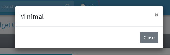
{{-- Themed --}}
<x-adminlte-modal id="modalViolet" title="Theme Violet" theme="violet"
    icon="bi bi-lightning-charge-fill" size='lg' disable-animations>
    This is a violet theme modal without animations.
</x-adminlte-modal>
{{-- Example button to open modal --}}
<x-adminlte-button label="Open Modal" data-bs-toggle="modal" data-bs-target="#modalViolet"
    class="text-bg-violet"/>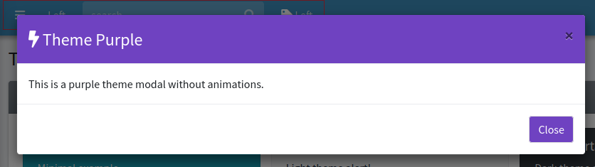
{{-- Custom --}}
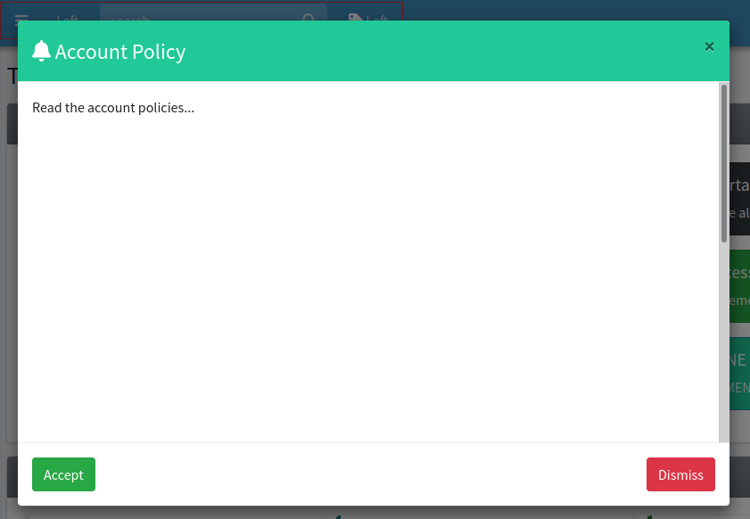
<x-adminlte-modal id="modalCustom" title="Account Policy" size="lg" theme="teal"
    icon="bi bi-bell" v-centered static-backdrop scrollable>
    <div style="height:800px;">Read the account policies...</div>
    <x-slot name="footerSlot">
        <x-adminlte-button class="me-auto" theme="success" label="Accept"/>
        <x-adminlte-button theme="danger" label="Dismiss" data-bs-dismiss="modal"/>
    </x-slot>
</x-adminlte-modal>
{{-- Example button to open modal --}}
<x-adminlte-button label="Open Modal" data-bs-toggle="modal" data-bs-target="#modalCustom"
    class="text-bg-teal"/>