The next set of configuration options enables you to change the layout and style of your admin panel.
| Layout & Styling Configuration |
|---|
| Layout |
| Auth View Classes |
| Admin Panel Classes |
| Sidebar |
| Control Sidebar |
Layout
It's possible to change the admin panel layout, you can use a top navigation (navbar) only layout, a boxed layout with sidebar, or enable the fixed mode for the sidebar, the navbar or the footer.
CAUTION
Currently, you cannot use a boxed layout with a fixed navbar or a fixed footer. Also, do not enable layout_topnav and layout_boxed at the same time. Anything else can be mixed together.
The following config options are available:
layout_topnavEnables/Disables the top navigation only layout, this will remove the sidebar and put all your links at the top navbar. Can't be mixed with
layout_boxed.
TIP
When enabling layout_topnav, the recommendation is to also tune the classes_topnav_nav configuration to add the class navbar-expand-md or navbar-expand-lg instead of navbar-expand, in order to get a correct functionality of the hamburger button at low screen sizes.
layout_boxedEnables/Disables the boxed layout that stretches width only to 1250px. Can't be mixed with
layout_topnav.layout_fixed_sidebarEnables/Disables the fixed mode for the sidebar. Can't be mixed with
layout_topnav.layout_fixed_navbarEnables/Disables the fixed mode for the navbar (top navigation), here you can use a value of
trueor anarrayfor responsive usage. Can't be mixed withlayout_boxed.layout_fixed_footerEnables/Disables the fixed mode for the footer, here you can use a value of
trueor anarrayfor responsive usage. Can't be mixed withlayout_boxed.layout_dark_modeEnables/Disables the dark mode, set this option to the boolean
trueto enable the dark mode.
IMPORTANT
The layout_dark_mode configuration is only available for package version v3.6.0 or greater.
Responsive Usage
When using an array on the layout_fixed_navbar or layout_fixed_footer configuration options, you can disable or enable the fixed layout for specific viewport sizes.
The following keys are available to use inside the array, you can set them to true or false:
| Key | Description |
|---|---|
xs | Represent screens from 0px to 575.99px width |
sm | Represent screens from 576px to 767.99px width |
md | Represent screens from 768px to 991.99px width |
lg | Represent screens from 992px to 1199.99px width |
xl | Represent screens from 1200px or more width |
Examples:
['xs' => true, 'lg' => false]:The element will be fixed from mobile to small tablet (<= 991.99px).
['lg' => true]:The element will be fixed starting from desktop (>= 992px).
['xs' => true, 'md' => false, 'xl' => true]:The element will be fixed for mobile (<= 767.99px) and extra large desktops (>= 1200px) but not for a small tablet and normal desktop (>= 768px & <= 1199.99px)
Authentication Views Classes
You can change the look and behavior of the authentication views (login, register, email verification, etc). The following config options are available:
classes_auth_cardExtra classes for the card box. Classes will be added to the element
div.card.classes_auth_headerExtra classes for the card box header. Classes will be added to the element
div.card-header.classes_auth_bodyExtra classes for the card box body. Classes will be added to the element
div.card-body.classes_auth_footerExtra classes for the card box footer. Classes will be added to the element
div.card-footer.classes_auth_iconExtra classes for the icons (Font Awesome icons) used on the input fields.
classes_auth_btnExtra classes for the submit buttons.
Default Style
The set of current default values and the rendered look is the next one:
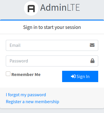
'classes_auth_card' => 'card-outline card-primary',
'classes_auth_header' => '',
'classes_auth_body' => '',
'classes_auth_footer' => '',
'classes_auth_icon' => '',
'classes_auth_btn' => 'btn-flat btn-primary',
However, you can customize the options as you want to get some particular themes, for example:
Dark Theme Style
A dark background with light buttons and icons.
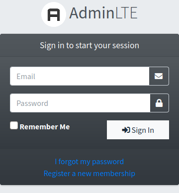
'classes_auth_card' => 'bg-gradient-dark',
'classes_auth_header' => '',
'classes_auth_body' => 'bg-gradient-dark',
'classes_auth_footer' => 'text-center',
'classes_auth_icon' => 'fa-fw text-light',
'classes_auth_btn' => 'btn-flat btn-light',
Lightblue Theme Style
A lightblue header background with lightblue icons.
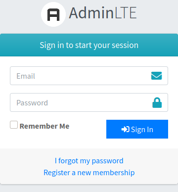
'classes_auth_card' => '',
'classes_auth_header' => 'bg-gradient-info',
'classes_auth_body' => '',
'classes_auth_footer' => 'text-center',
'classes_auth_icon' => 'fa-lg text-info',
'classes_auth_btn' => 'btn-flat btn-primary',
Admin Panel Classes
You can change the look and behavior of the admin panel by adding extra classes to the body, brand, sidebar, sidebar navigation, top navigation and top navigation container.
The following config options are available:
classes_bodyExtra classes for the body. From version v3.8.0 you may use the experimental
sidebar-hiddenclass to hide the sidebar.classes_brandExtra classes for the brand. Classes will be added to element
a.navbar-brandiflayout_topnavis used, otherwise they will be added to elementa.brand-link.classes_brand_textExtra classes for the brand text. Classes will be added to element
span.brand-text.classes_content_headerClasses for the content header container. Classes will be added to the container of the element
div.content-header. If you left this empty, a default classcontainerwill be used whenlayout_topnavis used, otherwisecontainer-fluidwill be used as default.classes_content_wrapperClasses for the content wrapper container. Classes will be added to the container of the element
div.content-wrapper.classes_contentClasses for the content container. Classes will be added to the container of the element
div.content. If you left this empty, a default classcontainerwill be used whenlayout_topnavis used, otherwisecontainer-fluidwill be used as default.classes_sidebarExtra classes for sidebar. Classes will be added to the element
aside.main-sidebar. There are some built-in classes you can use here to customize the sidebar theme:sidebar-dark-<color>sidebar-light-<color>
Where
<color>is an AdminLTE available color.classes_sidebar_navExtra classes for the sidebar navigation. Classes will be added to the element
ul.nav.nav-pills.nav-sidebar. There are some built-in classes that you can use here:nav-child-indentto indent the child items.nav-compactto get a compact navigation style.nav-flatto get a flat navigation style.nav-legacyto get a legacyv2navigation style.
classes_topnavExtra classes for the top navigation bar. Classes will be added to the element
nav.main-header.navbar. There are some built-in classes you can use here to customize the topnav theme:navbar-<color>
Where
<color>is an AdminLTE available color.
TIP
The recommendation is to combine the classes navbar-<color> with navbar-dark or navbar-light.
classes_topnav_navExtra classes for the top navigation. Classes will be added to the element
nav.main-header.navbar. When enablinglayout_topnavthe recommendation is to usenavbar-expand-mdto get items auto collapsed into an hamburger button on low screen sizes. Otherwise, stay withnavbar-expandclass.classes_topnav_containerExtra classes for top navigation bar container. Classes will be added to the
divwrapper inside elementnav.main-header.navbar.
Sidebar
You can modify the sidebar properties, for example you can disable the collapsed mini sidebar mode, start with a collapsed sidebar, enable sidebar auto collapse on a specific screen size, enable sidebar collapse remember option, change the scrollbar theme or auto hide option, disable the sidebar navigation accordion and change the sidebar animation speed.
The following configuration options are available:
sidebar_miniEnables/Disables the collapsed mini sidebar mode. You can use the
'lg'token to enable the sidebar mini mode for desktop and bigger screens (>= 992px), use the'md'token to enable it for small tablet and bigger screens (>= 768px), use the'xs'token to always enable the sidebar mini mode, or disable the sidebar mini mode at all with anullvalue.
IMPORTANT
For package versions previous or equal to v3.6.0 you need to use true in replacement of the 'lg' token. Also, the 'xs' token is only available for package versions greater than v3.6.0.
sidebar_collapseEnables/Disables the sidebar collapsed mode by default. If you set this option to
truethe sidebar will start on the collapsed mode.sidebar_collapse_auto_sizeEnables/Disables auto collapse of the sidebar by setting a minimum width bound that will be used to trigger the collapsed mode when reaching this bound or a lower size. The accepted values are:
falseto disable the feature or a positiveintegervalue representing the minimum width bound.sidebar_collapse_rememberEnables/Disables the collapsed remember script. If you set this option to
truethe state of the sidebar will be keep between page reloads.sidebar_collapse_remember_no_transitionEnables/Disables the transition animation effect for the sidebar after a page reload. This option will only have effect if
sidebar_collapse_rememberoption is enabled.sidebar_scrollbar_themeChanges the sidebar vertical scrollbar theme used when the sidebar is on the fixed mode. Possible values are:
'os-theme-light','os-theme-dark'or'os-theme-none'to hide the scrollbar.sidebar_scrollbar_auto_hideChanges the sidebar scrollbar auto hide trigger action. This option controls the possibility to hide the visible scrollbars automatically after a certain action. The possible values are:
'never'or'n': The scrollbars never get hidden automatically.'scroll'or's': The scrollbars get hidden automatically after a scroll.'leave'or'l': The scrollbars get hidden automatically after the mouse has left the host-element.'move'or'm': The scrollbars get hidden automatically after a scroll and after the mouse has stopped moving.
sidebar_nav_accordionEnables/Disables the sidebar accordion navigation feature. When enabled, any already opened menu will be collapsed when expanding another one.
sidebar_nav_animation_speedChanges the sidebar slide up/down animation speed (in milliseconds).
Control Sidebar (Right Sidebar)
Here you have the option to enable a right sidebar on all your views. When enabled, you can use the @section('right_sidebar') section to setup its content. The icon you configure will be displayed at the end of the top menu, and will toggle the visibility (show/hide) of the sidebar. The slide option will setup the sidebar to slide over the content with an animation, when false the sidebar will be shown over the content without any animation. You can also choose the sidebar theme (dark or light).
IMPORTANT
The right_sidebar section was named right-sidebar before version v3.14.0. So be sure to use the correct name depending on the package version you're using.
TIP
From version v3.14.0 the right sidebar will be automatically shown if you fill out the section right_sidebar on some of your views (no matter whether it was enabled or not in the configuration file). This feature gives you the possibility to show the right sidebar only on some particular views instead of showing it in all views.
The following configuration options are available:
right_sidebarEnables/Disables the right (control) sidebar.
right_sidebar_iconChanges the icon that will be used to toggle the right sidebar.
right_sidebar_themeChanges the theme of the right sidebar, the following options are available:
'dark'or'light'.right_sidebar_slideEnables/Disables the slide animation.
right_sidebar_pushEnables/Disables pushing the content instead of overlaying for the right sidebar.
right_sidebar_scrollbar_themeChange the right sidebar scrollbar theme. Possible values are:
'os-theme-light'(default),'os-theme-dark'or'os-theme-none'to hide the scrollbar.right_sidebar_scrollbar_auto_hideChanges the sidebar scrollbar auto hide trigger action. This option controls the possibility to hide the visible scrollbars automatically after a certain action. Default value is
'l'. The possible values are:'never'or'n': The scrollbars never get hidden automatically.'scroll'or's': The scrollbars get hidden automatically after a scroll.'leave'or'l': The scrollbars get hidden automatically after the mouse has left the host-element.'move'or'm': The scrollbars get hidden automatically after a scroll and after the mouse has stopped moving.