Special Menu Items
In this section we introduce some special menu items available for the sidebar and/or the top navbar. They are treated on a separate section because they requires special or uncommon configuration. You can see a summary of these special menu items on the next table:
| Special Item | Description |
|---|---|
| Sidebar Search | A custom search input for the sidebar. |
| Sidebar Menu Item Search | A search input over menu items for the sidebar. |
| Navbar Search | A custom search input for the top navbar. |
| Navbar Fullscreen Widget | A full screen toggle button for the top navbar. |
| Navbar Notification | A notification widget for the top navbar. |
| Navbar Darkmode Widget | A color mode (light / dark / auto) selector for the top navbar. |
Sidebar Search
It's possible to place a custom search input in your sidebar menu using an item with the following configuration of attributes:
[
    'type' => 'sidebar-custom-search',
    'text' => 'search',                // Placeholder for the underlying input.
    'url' => 'sidebar/search',         // The url used to submit the data ('#' by default).
    'method' => 'post',                // 'get' or 'post' ('get' by default).
    'input_name' => 'searchVal',       // Name for the underlying input ('adminlteSearch' by default).
    'id' => 'sidebarSearch'            // ID attribute for the underlying input (optional).
]
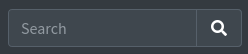
For the previous definition, you may now define a route and a controller to catch the submitted keywords as explained on the navbar search example. At next you can see an overview of the rendered search input item:
Sidebar Search Over Menu Items
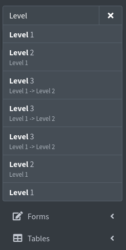
It's also possible to place a search input in your sidebar menu that will automatically search over the available menu items using the following configuration of attributes:
[
    'type' => 'sidebar-menu-search',
    'text' => 'search',                    // Placeholder for the underlying input.
    'id' => 'sidebarMenuSearch',           // ID attribute for the underlying input (optional).
    'empty_text' => 'No matching pages.',  // Message shown when nothing matches (optional).
]
Please, note the purpose of this item is to search over the set of available menu items in your sidebar and display the results automatically. It will not submit anything, so you don't need a route/controller definition for this item.
NOTE
On AdminLTE v4 the filtering is done by the built-in SidebarSearch plugin: the rendered input carries the data-lte-toggle="sidebar-search" attribute and a data-lte-target attribute pointing to the sidebar menu. Any data attribute you add to the menu item is forwarded to that input.
Check the next image for an overview:
Navbar Search
It's possible to add a search input in the top navbar using a menu item with the following configuration of attributes:
[
    'type' => 'navbar-search',
    'text' => 'search',          // Placeholder for the underlying input.
    'topnav_right' => true,      // Or "topnav => true" to place on the left.
    'url' => 'navbar/search',    // The url used to submit the data ('#' by default).
    'method' => 'post',          // 'get' or 'post' ('get' by default).
    'input_name' => 'searchVal', // Name for the underlying input ('adminlteSearch' by default).
    'id' => 'navbarSearch'       // ID attribute for the underlying input (optional).
]
On AdminLTE v4 the item is rendered as a navbar-search form placed inside the top navbar, with the input field and a submit button carrying a bi bi-search icon. Check next image for an overview:

Server Side Processing
For the previous definition, you may define a route and a controller to catch the submitted keywords, as shown below:
Route::match(
    ['get', 'post'],
    '/navbar/search',
    'SearchController@showNavbarSearchResults'
);<?php
namespace App\Http\Controllers;
use Illuminate\Http\Request;
use Illuminate\Support\Facades\Log;
class SearchController extends Controller
{
/**
* Show the navbar search results.
*
* @param Request $request
* @return View
*/
public function showNavbarSearchResults(Request $request)
{
// Check that the search keyword is present.
if (! $request->filled('searchVal')) {
return back();
}
// Get the search keyword.
$keyword = $request->input('searchVal');
Log::info("A navbar search was triggered with next keyword => {$keyword}");
// TODO: Create the search logic and return adequate response (maybe a view
// with the results).
// ...
}
}Navbar Fullscreen Widget
It's possible to place a full screen widget button in your top navbar using the following configuration of attributes:
[
    'type' => 'fullscreen-widget',
    'topnav_right' => true,       // Or "topnav => true" to place on the left.
]
You should note that the widget is automatically handled by the underlying AdminLTE template and there is no extra configuration for it. On AdminLTE v4 the item is rendered as a link with the data-lte-toggle="fullscreen" attribute and it swaps between the bi bi-arrows-fullscreen and the bi bi-fullscreen-exit icons.
Navbar Notification
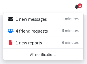
It's possible to place a notification icon in your top navbar. This item will be rendered as an icon with a notification badge. The item supports two modes: a default mode and a dropdown mode. On the default mode, a click on the icon will redirect you to the configured url or route attribute. On the dropdown mode a click on the icon will open a dropdown with a footer link to the configured url or route, and whose main content may be obtained from an external source when fetching data using an AJAX request. The item supports periodically updates of the badge, the badge color, the icon color and the dropdown main content using an AJAX request to another configurable url or route. The summary of the configuration options are the next ones:
[
    'type' => 'navbar-notification',
    'id' => 'my-notification',                // An ID attribute (required).
    'icon' => 'bi bi-bell-fill',              // An icon, Bootstrap Icons by default (required).
    'icon_color' => 'warning',                // The initial icon color (optional).
    'label' => 0,                             // The initial label for the badge (optional).
    'label_color' => 'danger',                // The initial badge color (optional).
    'url' => 'notifications/show',            // The url to access all notifications/elements (required).
    'topnav_right' => true,                   // Or "topnav => true" to place on the left (required).
    'dropdown_mode' => true,                  // Enables the dropdown mode (optional).
    'dropdown_flabel' => 'All notifications', // The label for the dropdown footer link (optional).
    'update_cfg' => [
        'url' => 'notifications/get',         // The url to periodically fetch new data (optional).
        'period' => 30,                       // The update period for get new data (in seconds, optional).
    ],
]
As mentioned, you can also use the route attribute (including optional parameters) in replacement of the url attribute to specify both, the route name for the redirect url or the route name for get new data (the one inside update_cfg). Example:
[
    'type' => 'navbar-notification',
    'id' => 'my-notification',
    ...
    'route' => 'notifications.show',
    ...
    'update_cfg' => [
        'route' => ['notifications.get', ['param' => 'val']],
        'period' => 30,
    ],
]
Also, note the update_cfg is optional, so you can implement your own update procedure for the item if you don't like the internal one.
Internal Updating Procedure
When fetching new data from the configured url or route (on the update_cfg array), the response should be a json containing any of the next properties (all optionals):
- label: The new label for the badge.
- label_color: The new color for the badge (applied as a
bg-{color}class). - icon_color: The new color for the icon (applied as a
text-{color}class). - dropdown: The new
HTMLfor the dropdown main content (only for dropdown mode).
So, you may define a route and a controller to catch the requests to the configured url or route. At next, you can see a basic example to get an overview:
// On the menu configuration...

[
    'type' => 'navbar-notification',
    'id' => 'my-notification',
    'icon' => 'bi bi-bell-fill',
    'url' => 'notifications/show',
    'topnav_right' => true,
    'dropdown_mode' => true,
    'dropdown_flabel' => 'All notifications',
    'update_cfg' => [
        'url' => 'notifications/get',
        'period' => 30,
    ],
]

// On the web routes...

Route::get(
    'notifications/get',
    [App\Http\Controllers\NotificationsController::class, 'getNotificationsData']
)->name('notifications.get');

// On a custom NotificationsController...

/**
 * Get the new notification data for the navbar notification.
 *
 * @param Request $request
 * @return Array
 */
public function getNotificationsData(Request $request)
{
    // For the sake of simplicity, assume we have a variable called
    // $notifications with the unread notifications. Each notification
    // have the next properties:
    // icon: An icon for the notification.
    // text: A text for the notification.
    // time: The time since notification was created on the server.
    // At next, we define a hardcoded variable with the explained format,
    // but you can assume this data comes from a database query.

    $notifications = [
        [
            'icon' => 'bi bi-envelope',
            'text' => rand(0, 10) . ' new messages',
            'time' => rand(0, 10) . ' minutes',
        ],
        [
            'icon' => 'bi bi-people text-primary',
            'text' => rand(0, 10) . ' friend requests',
            'time' => rand(0, 60) . ' minutes',
        ],
        [
            'icon' => 'bi bi-file-earmark text-danger',
            'text' => rand(0, 10) . ' new reports',
            'time' => rand(0, 60) . ' minutes',
        ],
    ];

    // Now, we create the notification dropdown main content.

    $dropdownHtml = '';

    foreach ($notifications as $key => $not) {
        $icon = "<i class='me-2 {$not['icon']}'></i>";

        $time = "<span class='float-end text-body-secondary small'>
                   {$not['time']}
                 </span>";

        $dropdownHtml .= "<a href='#' class='dropdown-item'>
                            {$icon}{$not['text']}{$time}
                          </a>";

        if ($key < count($notifications) - 1) {
            $dropdownHtml .= "<div class='dropdown-divider'></div>";
        }
    }

    // Return the new notification data.

    return [
        'label' => count($notifications),
        'label_color' => 'danger',
        'icon_color' => 'dark',
        'dropdown' => $dropdownHtml,
    ];
}
The result would be like the one shown below:
Navbar Darkmode Widget
IMPORTANT
Compared to the 3.x releases, this item is not a simple dark mode toggle anymore. By default it is the AdminLTE v4 color mode selector, a dropdown with three states: light, dark and auto (follow the operating system preference). The color mode is applied through the data-bs-theme attribute of the <html> element, as defined by Bootstrap 5.3.
The widget follows the color_mode.remember option: with it enabled (the default) you get the three-state selector, and with it disabled you get the legacy two-state toggle driven by the server side route of the package. You can force either shape with the dropdown_mode attribute.
It's possible to place the color mode widget in your top navbar using the following configuration of attributes:
[
    'type' => 'darkmode-widget',
    'topnav_right' => true,     // Or "topnav => true" to place on the left.
]
Also, you can setup the next optional properties to customize the icons and the icon colors:
'icon_disabled': The icon to use for the light color mode ('bi bi-sun-fill'by default). It is also the icon of the widget when dark mode is disabled on the legacy toggle.'icon_enabled': The icon to use for the dark color mode ('bi bi-moon-fill'by default). It is also the icon of the widget when dark mode is enabled on the legacy toggle.'icon_auto': The icon to use for the auto color mode ('bi bi-circle-half'by default). Only used on the color mode selector.'color_disabled': The color to use for the light mode icon (for example'warning'). It is emitted as atext-{color}class.'color_enabled': The color to use for the dark mode icon (for example'primary').'color_auto': The color to use for the auto mode icon.'dropdown_mode': Force the shape of the widget instead of deriving it fromcolor_mode.remember. Usetruefor the three-state color mode selector, orfalsefor the legacy two-state toggle. Left asnull(the default) it follows the configuration.
The default widget button will look like next one:

The Two Widget Modes
The widget renders one of two different markups, and the decision is taken from the color_mode.remember option of the config/adminlte.php file:
Value of color_mode.remember | Rendered widget |
|---|---|
true (default) | The color mode selector: a dropdown with the light, dark and auto entries. The click handling, the icon swapping and the persistence on the browser are done by the AdminLTE v4 color mode plugin, through the data-bs-theme-value and data-lte-theme-icon attributes. |
false | The legacy two-states toggle: a single button that switches between light and dark and notifies the server, so the preference is stored on the server side (see below). In this case the package also adds data-lte-color-mode="off" to the <html> element, which switches the AdminLTE v4 color mode plugin off entirely so that it cannot restore its own stored value and fight with the preference resolved on the server. Note this only applies when color_mode.default is 'light' or 'dark': the 'auto' mode needs the plugin in order to follow the operating system preference, so it is never switched off. |
The relevant options of the color_mode section are:
'color_mode' => [
    'default' => 'auto',        // The initial color mode: 'light', 'dark' or 'auto'.
    'remember' => true,         // Persist the choice on the browser (enables the selector).
    'no_flash_script' => true,  // Apply the stored color mode before the first paint.

    'theme_color' => [          // Colors used for the 'theme-color' meta tags.
        'light' => '#0d6efd',
        'dark' => '#1a1a1a',
    ],
],
Using the Underlying Component Directly
The widget is implemented by the <x-adminlte-navbar-darkmode-widget> blade component. Every attribute of the menu item configuration listed above is forwarded to it, using the kebab-case attribute name (icon_disabled becomes icon-disabled, dropdown_mode becomes dropdown-mode, and so on).
So, you can also place the component yourself on the content_top_nav_right section instead of using a menu item:
@section('content_top_nav_right')
    <x-adminlte-navbar-darkmode-widget
        icon-disabled="bi bi-brightness-high-fill"
        icon-enabled="bi bi-moon-stars-fill"
        icon-auto="bi bi-circle-half"
        color-auto="secondary"
        dropdown-mode/>
@stop
Persistence of Dark Mode State
NOTE
The events described below are only used by the legacy two-states toggle, that is, when color_mode.remember is set to false. When the color mode selector is active, the preference is stored on the browser by the AdminLTE v4 color mode plugin and no request is sent to the server.
Internally, the widget saves the dark mode preference into the session in order to keep the setup over multiple requests. However, this state will be lost when the session bag is destroyed. In the case you want to persist this state on some sort of storage tool (like a database), you will need to listen for the two events described below. The events page documents their payload and shows where a listener goes on a Laravel 12 application; the example below uses the older EventServiceProvider shape, which keeps working on the projects that still have that file.
- The widget dispatchs a special
DarkModeWasToggledevent every time the button is clicked. - The widget also dispatchs a
ReadingDarkModePreferenceevent when it is about to read dark mode preference to configure the layout. - Methods
enable()/disable()are provided within a special controller to initialize the state of the widget.
At next you can see an example of the logic needed on the app/Providers/EventServiceProvider.php file in order to interact with the dark mode widget. The example assumes the dark mode preference is stored on a database as an user preference.
<?php

namespace App\Providers;

use Illuminate\Foundation\Support\Providers\EventServiceProvider as ServiceProvider;
use Illuminate\Support\Facades\Event;
use Illuminate\Support\Facades\Log;
use JeroenNoten\LaravelAdminLte\Events\BuildingMenu;
use JeroenNoten\LaravelAdminLte\Events\DarkModeWasToggled;
use JeroenNoten\LaravelAdminLte\Events\ReadingDarkModePreference;

class EventServiceProvider extends ServiceProvider
{
    ...

    /**
     * Register any events for your application.
     *
     * @return void
     */
    public function boot()
    {
        // Register listener for ReadingDarkModePreference event. We use this
        // event to setup dark mode initial status for AdminLTE package.

        Event::listen(
            ReadingDarkModePreference::class,
            [$this, 'handleReadingDarkModeEvt']
        );

        // Register listener for DarkModeWasToggled AdminLTE event.

        Event::listen(
            DarkModeWasToggled::class,
            [$this, 'handleDarkModeWasToggledEvt']
        );
    }

    /**
     * Handle the ReadingDarkModePreference AdminLTE event.
     *
     * @param ReadingDarkModePreference $event
     * @return void
     */
    public function handleReadingDarkModeEvt(ReadingDarkModePreference $event)
    {
        // TODO: Implement the next method to get the dark mode preference for the
        // current authenticated user. Usually this preference will be stored on a database,
        // it is your task to get it.

        $darkModeCfg = $this->getDarkModeSettingFromDB();

        // Setup initial dark mode preference.

        if ($darkModeCfg) {
            $event->darkMode->enable();
        } else {
            $event->darkMode->disable();
        }
    }

    /**
     * Handle the DarkModeWasToggled AdminLTE event.
     *
     * @param DarkModeWasToggled $event
     * @return void
     */
    public function handleDarkModeWasToggledEvt(DarkModeWasToggled $event)
    {
        // Get the new dark mode preference (enabled or not).

        $darkModeCfg = $event->darkMode->isEnabled();

        if ($darkModeCfg) {
            Log::debug("Dark mode preference is now enabled!");
        } else {
            Log::debug("Dark mode preference is now disabled!");
        }

        // Store the new dark mode preference on the database.

        $this->storeDarkModeSettingOnDB($darkModeCfg);

        // TODO: Implement previous method to store the new dark mode
        // preference for the authenticated user. Usually this preference will
        // be stored on a database, it is your task to store it.
    }
}
TIP
The previous example shows how to manually register listeners for the events, but alternatively you can create Listeners Classes for those events too (the actual Laravel's state of the art). Read details on the Laravel Events Documentation.